The following syntax shows the .css definitions for the colors of the components in the map menu. You can replace any color
definition using a hexadecimal color value, an RGBA color value, or a color name. Some classes contain multiple background
color properties in order to support browsers that may require color definitions in different formats (hexadecimal or RGBA).
The default color definitions are the same in both formats.
/*MAIN MENU STYLES*/

/*main menu container colors*/
.mainMenuColor{
    border-color: #FFFFFF;
    border-left-color: #66b2ff;
    background: #66b2ff;
}

/*Color of the home button in the main menu when mouse hovers*/
.HomeButton .home:hover {
    background-color: #5390cf;
    background-color: rgba(83, 144, 207,1);
}

/*Color of the button in the main menu that invokes the table of contents widget when mouse hovers*/
.layersWidget:hover {
    background-color: #5390cf;
    background-color: rgba(83, 144, 207,1);
}

/*Color of the button in the main menu that invokes the selection widget when mouse hovers*/
.selectionWidget:hover {
    background-color: #5390cf;
    background-color: rgba(83, 144, 207,1);
}
/*Color of the button in the main menu that invokes the basemaps widget when mouse hovers*/
.basemapBtn:hover {
background-color: #5390cf;
background-color: rgba(83, 144, 207,1);
}
/*Color of the locate button in the main menu when mouse hovers*/
.LocateButton .zoomLocateButton:hover {
background-color: #5390cf;
background-color: rgba(83, 144, 207,1);
}
/*Color any button in the main menu when its corresponding widget is active*/
.WidgetOn {
background-color: #023858;
background-color: rgba(2, 56, 88,1);
}
/*Color any button in the main menu when its corresponding widget is active and mouse hovers*/
.WidgetOn:hover {
background-color: #023858;
background-color: rgba(2, 56, 88,1);
}
/*background color of the content area in the Table-Of-Contents widget*/
.tocContentColor{
background-color: #c9dbdf;
}
/*style of each layer container in the Table-Of-Contents widget*/
.lyrContainerColors{
background-color: white;
border-color: #00b2f3;
color: #66b2ff; /*text color. All child nodes will inherit this color*/
}
/*check boxes to turn On and Off layers in Table-Of-Contents widget*/
.lyrCheckBoxColors{
border-color: #66b2ff;
color: #66b2ff;
}
/* layer options box container background color*/
.optionsListColors{
background-color: rgba(243, 10, 21, 0.19);
}/*selection tools content background color*/
.stContentColor{
background-color: #c9dbdf;
}
/*number of selected features box*/
.selectionInfoColors{
color: #cd5c5c;
border-color: #cd5c5c;
}
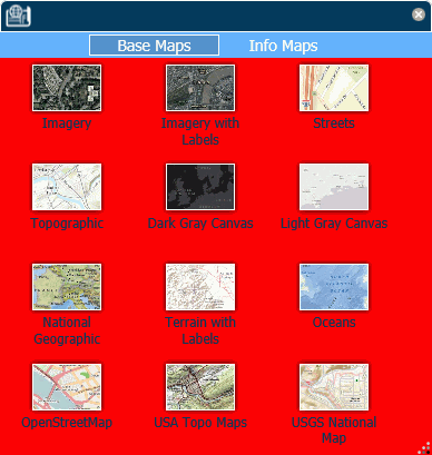
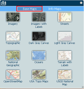
/*BASE MAPS WIDGET*/
/*basemaps and info-maps tabs background color */
.tabsHeaderColors{
background-color: #66b2ff;
}
/*base-maps and info-maps tabs buttons colors*/
.imTabsTitlesColors{
color: #ffffff;
background-color: transparent;
}
/*base-maps and info-maps tabs buttons active colors*/
.imActive{
background-color: #5390cf;
border: 1px solid white;
}
/*base-maps and info-maps tabs buttons hover colors*/
.imTabsTitles:hover{
background-color: #5390cf;
background-color: rgba(83, 144, 207,1);
}
/*base-maps and info-maps content area background color*/
.imContentColor{
background-color: #00ff00;
}
/*Title pane of all widgets*/
.dojoxFloatingPaneTitle {
background-color: #023858;
border-color: #ffffff;
}
/*title pane in the esri pop-up window*/
.esriPopup .titlePane{
background-color: #66b2ff; !important;
}
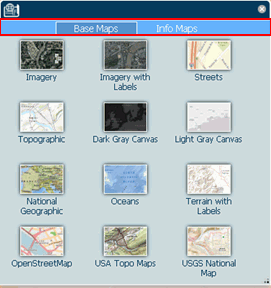
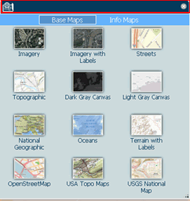
Example: Changing the Map Menu Background Color
Place the following CSS commands above the .internal_default CSS command on the Embedded CSS tab of the map object to make
the background color of the map menu cyan.
.mainMenuColor{
 border-color: #FFFFFF;
 border-left-color: #66b2ff;
 background: cyan;
 }
The menu generated when you run the HTML page is shown in the following image.
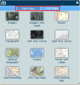
Example: Changing the Hover Color of the Home (Default Extent) and Layers Buttons
The following .HomeButton .home:hover class changes the background hover color of the Home (Default Extent) button to orange
and the .layersWidget:hover class changes the background hover color of the Layers (Table of Contents) widget to yellow.
.HomeButton .home:hover {
 background-color: orange;
 }
.layersWidget:hover {
 background-color: yellow;
 }
The following image shows the background hover color of the Home button:
The following image shows the background hover color of the Table of Contents button:
Example: Coloring a Button When its Widget is Active
The following .WidgetOn class makes any button green when its widget is active.
.WidgetOn {
background-color: green;
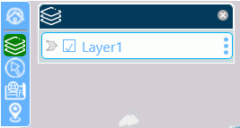
}The following image shows that the Table of Contents widget is green when the Table of Contents is open.
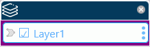
Example: Changing the Background Color of the Table of Contents Content Area
The following .tocContentColor class makes the area directly around the layer container purple.
.tocContentColor{
 background-color: purple;
The following image shows the Table of Contents widget with the background color purple.
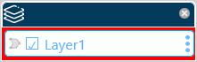
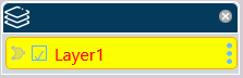
Example: Styling the Layer Containers
The following class definition makes the layer container background color yellow, the border orange, and the text red.
.lyrContainerColors{
 background-color: yellow;
 border-color: orange;
 color: red;
The following image shows a layer container whose background color is yellow, border color is orange, and text color is red
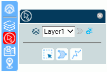
Example: Styling the Widget Title Panes
The following class definition makes the background color of the title pane burlywood and the border color navy.
.dojoxFloatingPaneTitle {
background-color: burlywood;
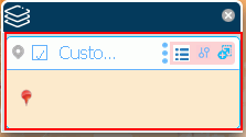
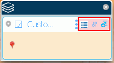
border-color: navy;The following image shows the selection widget. Its title pane has a navy border and burlywood background color.
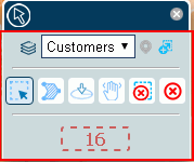
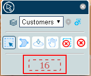
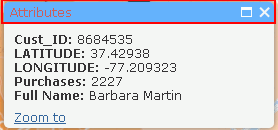
Example: Changing the Background Color of the Pop-up Window Title Panes
The following class definition makes the background color of the pop-up window title panes magenta.
 .esriPopup .titlePane{
 background-color: magenta;
 !important;
 }
The following image shows a pop-up window with a magenta title pane.