Creating JavaScript and Cascading Style Sheets Using the JavaScript and CSS View Tabs
|
How to: |
The Embedded JavaScript and Embedded CSS View tabs are accessible when you are creating an HTML page. From here, you can create JavaScript code and cascading style sheets (CSS) for use in your HTML page. You can reference existing cascading style sheet files and JavaScript files by typing the URL in the URL/Find File area of the Settings panel. You can also search for these files by using the CSS or JavaScript commands.
Embedded code is used only in the host HTML file. External code is available to be used by multiple files.
Procedure: How to Customize Titles Using jQuery Tooltips
The following procedure describes how to customize titles, using jQuery and Internal CSS.
- Create an HTML page.
- Add a component or control to the page.
- Navigate to the Properties panel.
- Type a value for the Title property, under the Core attributes section.
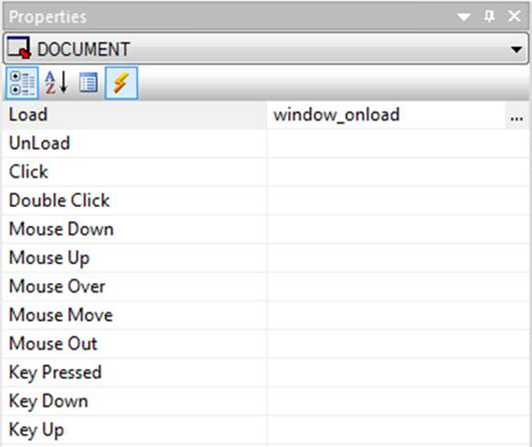
- Click the canvas to select the DOCUMENT object.
- On the Properties panel, click the lightning bolt icon on the toolbar to show the events.
- For the Load event, click the column on the right to display the ellipsis button, as shown in the following image.
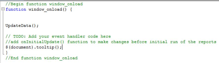
- Select the Embedded JavaScript view tab on the HTML canvas.
- After the comment lines, add a new line, and type the following code, as shown in the following image.
$(document).tooltip();
-
Navigate to the Embedded CSS
tab, as shown in the following image.
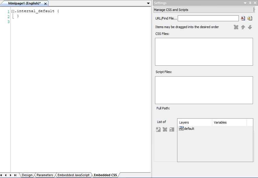
- Enter a new line after the first class definition and type the following as the new class name.
.ui-tooltip
- Add the following CSS Styles, as shown in the following image.
- Color: white;
- Font-size: small;
- Background: black;
- Border-radius: 20px;
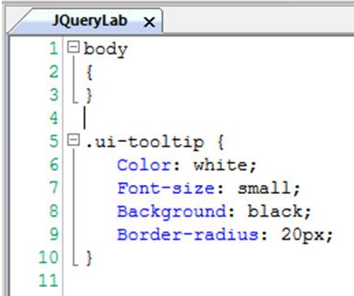
Note: You can add any styling that you want.
- Save and run the HTML page. You can hover the mouse over objects to show the styled tooltips.