Creating Visualizations

How to:

In App Studio, you can create and build visualizations. Visualizations centralize information by providing different views of data that are pertinent to a particular objective (for example, reviewing trends or fluctuations in data over a period of time or within a region).

A visualization provides you with a quick glance of information on a single screen. Visualizations support the use of different types of charts, maps, and grids. For example, you may want to use a bar, pie, and line chart to show different views of the same data. Alternatively, you may want to offset a particular visual by showing other types of related data that employ a different type of visual. You can also add a text cell to your visualization to provide explanatory text or information that other users can reference. Visualizations allow you to monitor changes in data. They also serve to provide information in real-time, based on changes in underlying data or other components. A visualization can be updated, changed, or revised at any time to account for shifts in data needs.

Procedure: How to Create a New Visualization

You can create visualizations from the Workspaces node in the Environments Tree panel or Environments Detail panel.

  1. From the Workspaces node in the Environments Tree panel or Environments Detail panel, right-click a folder, point to New, point to InfoAssist, and click Visualization.
  2. Select a Master File from the list and click Open.

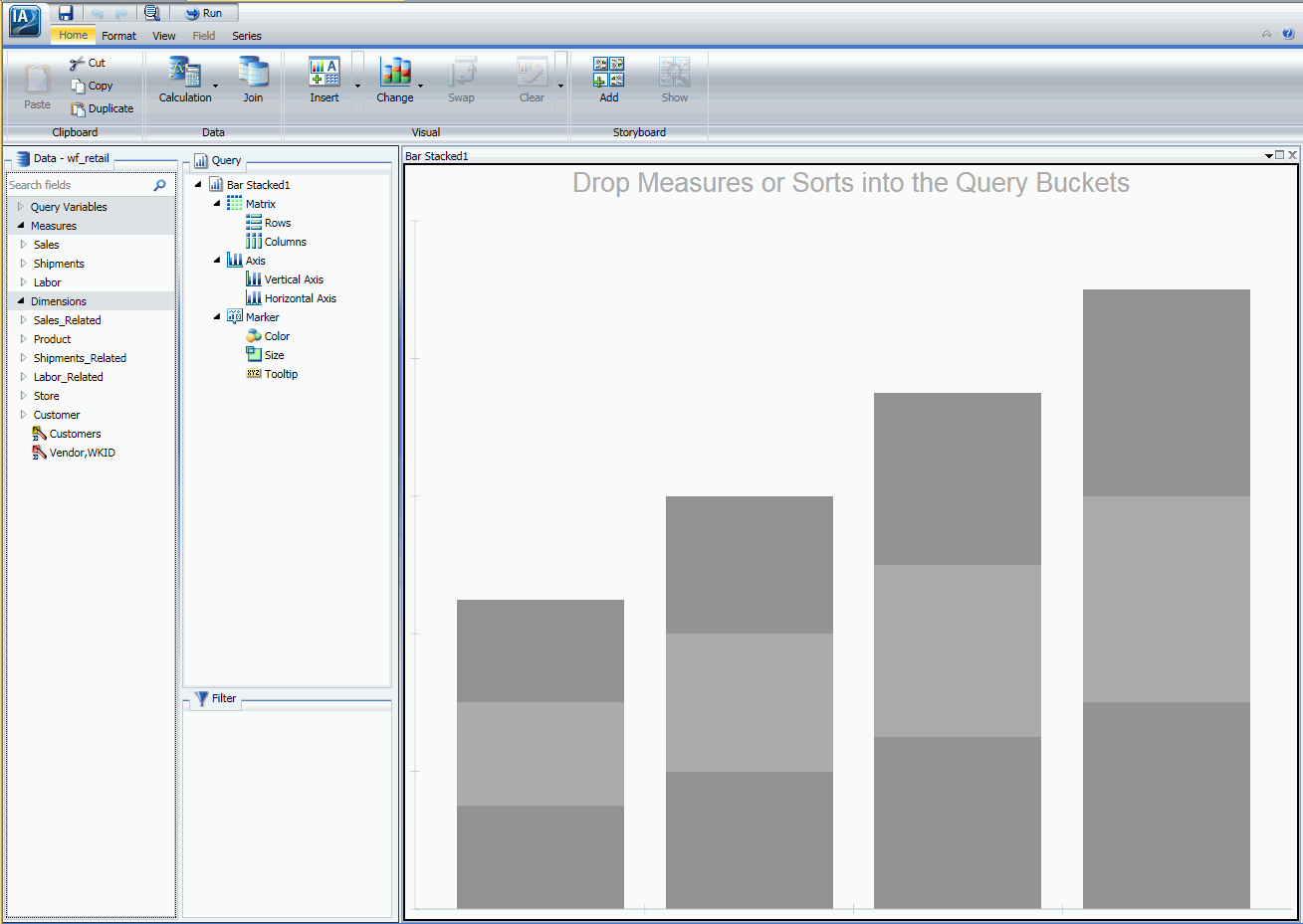
    The WebFOCUS InfoAssist interface opens, as shown in the following image, where you can create charts, maps, and grids to visually represent your data.


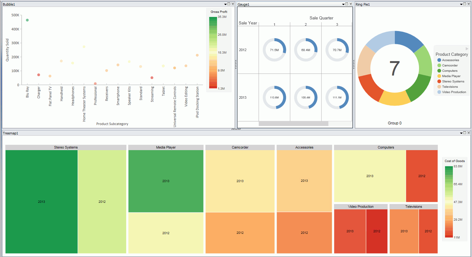
The following image shows a visualization that contains multiple visuals, including a bubble, gauge, ring pie, and treemap.


Note: For more information on creating visualizations, see the TIBCO WebFOCUS® InfoAssist User's Manual, or click the Help icon , located in the upper-right corner of the canvas.