Filling in a Work Item Form
The form that appears when you open a work item is specific to your Openspace. Each company that uses Openspace creates their own forms that relate to their specific business.
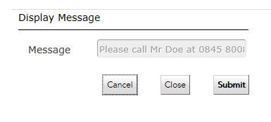
Your company will instruct you in properly filling out the forms that they have designed for Openspace. The following is an example of what a form may look like:
Use the Tab key to move from field to field on the form.
All the elements and components in accessible forms work just the same as they do in ordinary forms. However, there are changes for two of the components.
Note: You can enable accessible forms runtime during the preview by simply copying the form URL in a browser and appending it with
&tibco_a11y=true. The browser then displays the form in accessible mode. A custom client application loading the forms can enable accessible mode by using the following meta definition in the host HTML page:
<meta name='gwt:property' content='tibco_a11y=true'/>.
- Grid panes in Openspace have an additional column at the left of the grid pane. The column shows radio buttons for single-select grid panes, and checkboxes for multi-select grid panes. When the radio button or the checkbox gains the focus, the screen reader reads out the description or the label you have provided in the form designer for the current row. When a cell in a row gains the focus, the screen reader reads out the row label along with the column heading.
- When a Date, Time, or DateTime control gains the focus, the screen reader reads out the control label along with the format for entering the date or time as applicable. If needed, you can override the default formats in the common resource bundle. For further information on how to override formats, see "Advanced Tasks" in TIBCO Forms User's Guide.
For a list of common resource keys and keyboard navigation for regular and accessible forms, see "Reference" in TIBCO Forms User's Guide.
Copyright © Cloud Software Group, Inc. All rights reserved.