Tutorial 5 - Viewing and Comparing the Results of Simulation
In the previous tutorial, we changed the case distribution to the Adjust Loss and Process Claimant Activities from 50:50 to 25:75. This affects the utilization of the Participants involved. TIBCO Business Studio provides a Simulation Report view that will illustrate the effect of this change.
Procedure
-
The comparison report is generated and displayed (you can also save the
Case Cost-Time Analysis and
Participant Utilization
reports to HTML and PDF formats). Remember that the difference between the two simulations was the distribution of cases to the
Claims Handler and
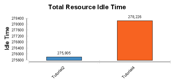
Loss Adjuster participants. The first chart shows that the overall Participant idle time (expressed in total minutes) has increased:
To see why this is so, look at the next two charts, which show Participant Idle time. This is the chart with a 50:50 distribution:

The second chart shows the 75:25 distribution:
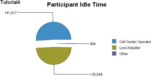
Because fewer cases are sent to the Loss Adjuster, this Participant’s idle time has increased. This is also reflected in lower utilization in the Tutorial 4 results.
Tip: There are several aspects of simulation to note when comparing simulations:- When comparing pie charts such as the previous two, note that the total idle time for each is different, so a similarly-sized segments do not represent the same value.
- A Participant’s utilization drops if they have finished their work but the simulation is still running. For this reason it is best to view the running simulation to get a true picture of a Participant’s utilization while work is being done.
You can save Portable Document Format (PDF) and HTML versions of the comparison report by clicking the appropriate button.
Result
Continue with Tutorial 6 - Using Loops in Simulation to see how to use looping with your simulation.