Rendering of Mobile Forms
A few controls behave in a different way when they are used in mobile forms and rendered on a mobile device.
The differences are as follows:
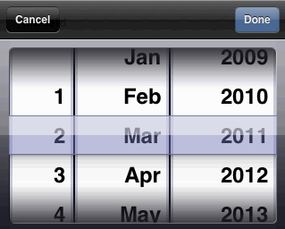
Date Control
The pane that contains the date control displays the formatted date. On selecting the date, a date spinner is shown that allows you to select day, month, and year. The range of years is bounded and is configured in the Properties tab in the Properties view of the control.
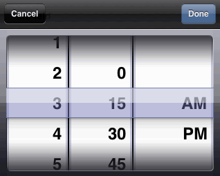
Time Control
The pane that contains the time control displays the formatted time. Selecting the time displays a time spinner that allows you to select hour and minute. The selector uses a 12 hour spinner with AM/PM.
Datetime Control
The pane that contains the datetime control displays the formatted date and time. On selecting datetime, you go to the next screen where the date and time are displayed as two separate links. You can click on the date and time links to set them individually. Clicking the Back button will take you back to the previous screen.
Duration Control
The pane that contains the duration control displays a read-only summary of the information. Clicking on the control displays a detail screen where values can be specified for each of the fields.
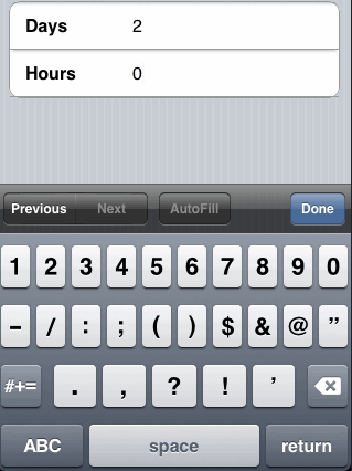
Image Control
The pane containing the image control has a link for the image. Clicking on the link takes you to the next screen that displays the full image.
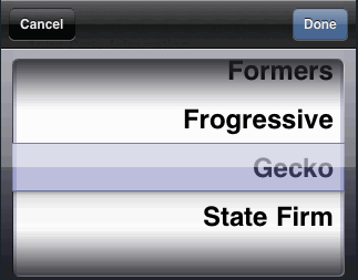
Optionlist Control (Single Value)
The pane that contains an Optionlist control shows the label of the selected option, clicking on which shows a choice spinner from which you can select a choice.
Radiogroup Control
Radiogroup controls are converted to optionlist controls in the mobile version of the form.
Textarea Control
The pane containing the textarea control displays the label. You can select the control to see the text area appear in a full screen. Selecting the Back button returns to the parent pane.
Record Panes
Record panes are used at runtime to handle both grid panes and record panes. The record pane supports all navigation functionality such as go to first, previous, nth, next, and last record. You can navigate to a specific record using the spinner control. The plus and minus icons on the navigation bar are used to add and delete records.
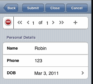
The navigation bar in a record pane displays information on which records in the record pane have validation errors.