Datepicker
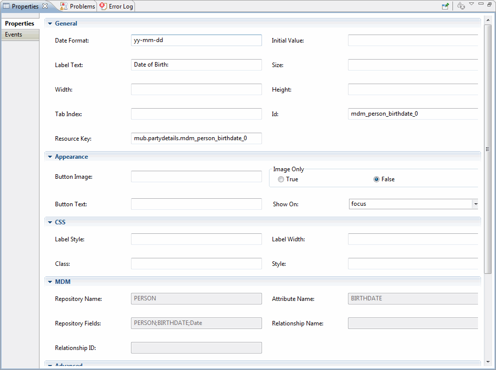
| Properties | Description |
|---|---|
| General | |
| Date Format: | The format for parsed and displayed dates. The default date format is yy-mm-dd. Even though you select "yy’ the year is displayed as "yyyy". |
| Initial Value: | The initial value to be displayed in the field. |
| Label Text: | Specify the display text for the datapicker field. |
| Size: | Specify the size of the datapicker field. |
| Width: | Specify the width of the datepicker field. |
| Height: | Specify the height of the datepicker field. |
| Appearance | |
| Button Image | The URL for the popup button image. If set, the Button Text option becomes the alt value and is not directly displayed. |
| Image Only | Whether the button image should be rendered by itself instead of inside a button element. The default value is false. |
| Button Text: | The text to display on the trigger button. Use in conjunction with the showOn option set to 'button' or 'both'. |
| Show On: | Set to ’focus’, 'button' or 'both'. |
Copyright © Cloud Software Group, Inc. All Rights Reserved.