Button
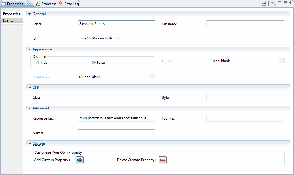
| Properties | Description |
|---|---|
| General | |
| Label: | Specify the display text on the widget. |
| Appearance | |
| Disabled: | Render this component disabled. The default value is false. |
| Left Icon: | CSS class name to display an icon on the left side on the button. The default value is empty. |
| Right Icon: | CSS class name to display an icon on the right side on the button. The default value is empty. |
Copyright © Cloud Software Group, Inc. All Rights Reserved.