Accordion
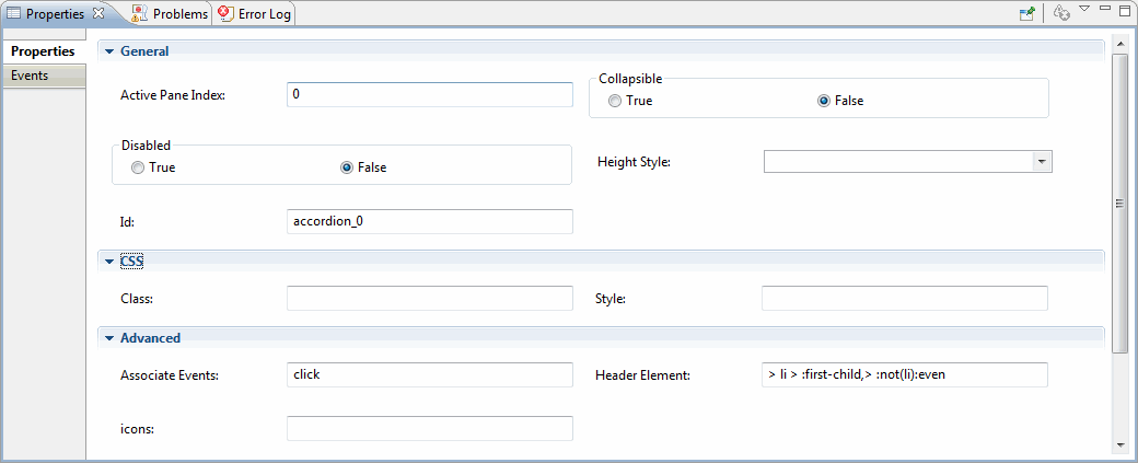
| Properties | Descriptions |
|---|---|
| General | |
| Active Pane Index: | The zero-based index of the panel that is active (open). A negative value selects panels going backward from the last panel. The default value is 0. |
| Collapsible | Whether all the sections can be closed at once. Allows collapsing the active section. |
| Disabled | Disables the accordion if set to true. |
| Height Style: | Controls the height of the accordion and each panel. Possible values: 'auto': All panels will be set to the height of the tallest panel. 'fill': Expand to the available height based on the accordion's parent height. 'content': Each panel will be only as tall as its content. |
| Advanced | |
| Associate Events: | The event that accordion headers will react to in order to activate the associated panel. Multiple events can be specified, separated by a space. For example, Click, mouseover and so on. |
| Header Element: | Selector for the header element, applied via.find() on the main accordion element. Content panels must be the sibling immediately after their associated headers. |
| Header Icon: | Specific the path of the header icon for the widget. |
| Active Header Icon: | Specific the path of the icon for the active header for the widget. |
Copyright © Cloud Software Group, Inc. All Rights Reserved.

