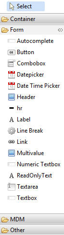
Form
The Form category contains widgets for input and other form related widgets such as button, combobox, date picker, multivalue, textarea, textbox and so on.
| Form | |
| Autocomplete
The Autocomplete widget can be useful to provide suggestions as you type in the text field. |
|
| Button
The Button widget is used to define actions. |
|
| Combobox
The Combobox widget is used to specify the inputs where you can select a value from a list of values. The Source Data property is used to populate the values appearing in the combobox. The values should be specified as comma separated. |
|
| Datepicker
The Date picker widget can be used as input control for the date data types. Date can be selected using the calendar control. |
|
| Fileupload
The file upload widget is used to upload the selected file. The widget is created using html form, hidden iFrame object and jQuery without refreshing page. The Fileupload widget is part of a add record or modify record operation. |
|
| Header
The Header widget is used to define a header for the UI page. |
|
| hr
The Horizontal line widget is used to put a horizontal line in the panel. |
|
| Label
The Label can be used to display read only text. |
|
| Line Break
The LineBreak widget can be used to put vertical space between two widgets or elements. The height property can be used to specify the spacing. |
|
| Link
You can create hyperlink using link widget. Specify the URL property to create the hyperlink. |
|
| Multivalue
The Multivalue widgets allows you to enter multiple values for a data field. These values can be edited or deleted. If the data type of the multivalue field is date or timestamp then the appropriate widget is displayed to help you enter the value. |
|
| Numeric Textbox
It is used for the data fields which are numeric (For example, integers and decimals). It does not allow you to enter invalid string values. It can be configured in four modes in which values can be integer, positive integer, decimal, and positive decimal. It has all the properties of textbox and also additional properties of its own. |
|
| Read Only Text
The Read Only Text widget can be used if the value of the attribute cannot be changed. The label and value can be set similar to textbox. |
|
| Textarea
The Textarea widget is used for strings with large number of characters. It extends textbox control. |
|
| Input
The Input widget is a HTML textbox which can be used for strings. By default, MDM string data fields are mapped to the input widget. |
|
| Timestamp Picker
The Timestamp Picker widget is used for the fields that have timestamp data type. You can select date as well as time using the widget. |
|
| URL
The URL widget is used for the field that have url data type. |
|