Container Widgets
The Container category contains different types of group controls which help in building the UI.
To create a UI, you must select a group control and drop in the tree outliner viewer.
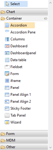
| Container | |
| Accordion
The Accordion can be created using accordion and accordion pane widgets. Accordion is a Container where all the items in it are outlined in a segmented or accordion fashion. |
|
| Accordion Pane
The Accordion can be created using accordion and accordion pane widgets. Accordion Pane is a screen pane which outlines all the items in a segmented or accordion fashion. |
|
| Columns
The Columns widget is used to create vertical column layout. Panel (or panel align 1 or panel align 2) widget is used along with columns to create layout. Each panel represents a column if used under columns widget. |
|
| Dashboard
The Dashboard widget is the outer container that holds dashboardpanel widgets with different columns. |
|
| Dashboardpanel
The Dashboardpanel widget is the container that holds any other widgets. It is displayed as a small container with a blue header on the dashboard. |
|
| Data table
The Data grid control can be used when the data model has relationships associated with parent. If the model has any relationships they appear on the widget palette which can be selected and dropped on the outline viewer to create the data grid. After creating the data grid you can view all the properties in the property pane using which you can set different options for the grid. |
|
| Fieldset
The Field set can be used to group the widgets. |
|
| Form
The Form widget can be used to create a form. |
|
| iframe
The iframe can be used to embed another page within a page. The load URL property is used to load another page. |
|
| Panel
The Panel can be used as a container similar to <div> html element in the web page. |
|
| Panel Align 1
These panels automatically align the textbox and label widgets in the same line. It aligns when you put a label and a input widgets such as textbox. |
|
| Pane Align 2
These panels automatically align the textbox and label widgets. However, the textbox is aligned under the label. It aligns when you put a label and a input widgets such as textbox. |
|
| Sticky Footer
It creates sticky footer for the page which stays at the bottom of the page at all the time. It can be useful to place buttons in the footer. |
|
| Tab Panel
Tabs can be created by selecting the Tab Panel widget. Multiple tabs can be created by putting the Panel widget inside the tab panel widget. |
|
| Wizard
The Wizard widget is for making multi-step workflows that do not require server request. You can drag and drop a data model into the wizard and the data model displays a wizard. |
|