Data Table
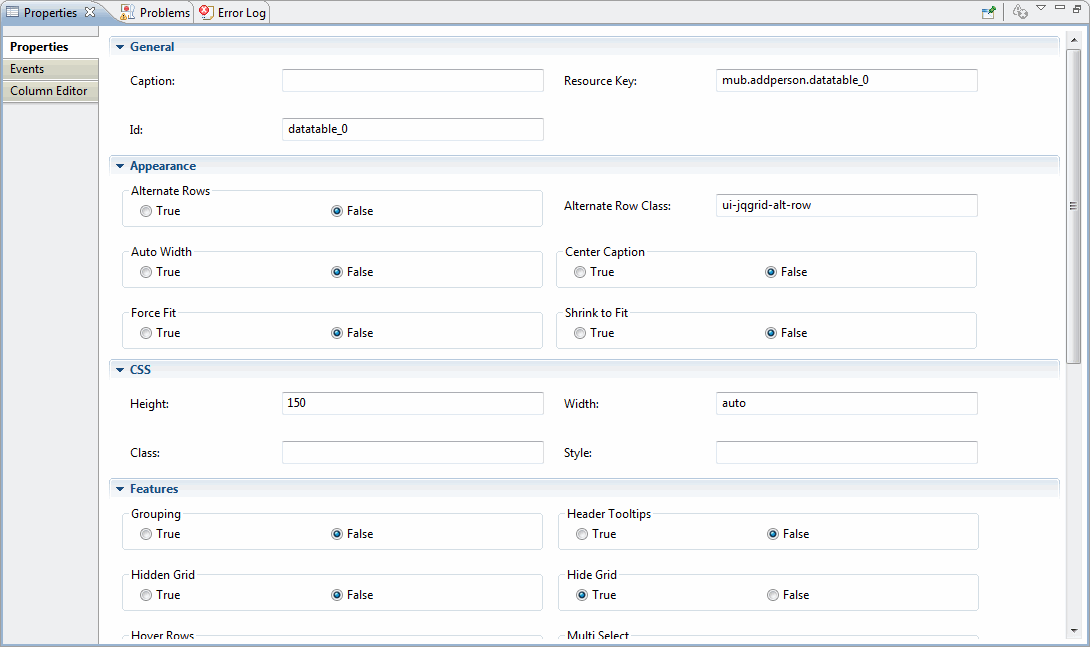
| Properties | Descriptions |
|---|---|
| General | |
| Caption: | Defines the caption for the grid. This caption appears in the caption layer, which is above the header layer. If the string is empty the caption does not appear. |
| Appearance | |
| Alternate Rows | Set row backgrounds to alternate colors. The possible values are true and false. The default value is false. |
| Alternate Row Class | Specifies the alternate row CSS class. Default value is ui-jqgrid-alt-row. |
| Auto Width | When set to true, the grid width is recalculated automatically to the width of the parent element. This is done only initially when the grid is created. Default value is false. |
| Centre Caption | Set to true to display the caption of the table in the center. Default value is false. |
| Force Fit | If set to true, and a column's width is changed, the adjacent column (to the right) will resize so that the overall grid width is maintained (For example, reducing the width of column 2 by 30px will increase the size of column 3 by 30px). In this case there is no horizontal scroll bar. Default value is false. |
| Shrink to Fit | This option, if set, defines how the width of the columns of the grid should be re-calculated, taking into consideration the width of the grid. If this value is true, and the width of the columns is also set, then every column is scaled in proportion to its width. Default value is true. |
| Features | |
| Grouping | Enables grouping in the grid. |
| Header Tooltips | Enables header tooltips in the grid. |
| Hidden Grid | If set to true the grid is initially hidden. |
| Hide Grid | Enables or disables the show/hide grid button, which appears on the right side of the caption layer. Takes effect only if the caption property is not an empty string. |
| Hover Rows | When set to false the effect of mouse hovering over the grid data rows is disabled. |
| Multi Select | If this flag is set to true a multi selection of rows is enabled. A new column on the left hand side containing the checkboxes is added. |
| Column Reorder | When set to true, this option allows reordering columns by dragging and dropping them with the mouse. |
| Sort Columns | The column according to which the data is to be sorted when it is initially loaded. If this value is set and the index (name) matches the name from colModel, then an icon indicating that the grid is sorted according to this column is added to the column header. This icon also indicates the sorting is descending or ascending. |
| Sort Order | The initial sorting order (ascending or descending). The values are asc or desc. |
| View Records | If true, jqgrid displays the beginning and ending record number, out of the total number of records in the query. This information is shown in the pager bar (bottom right by default) in this format: 'View X to Y out of Z'. |
| Advanced | |
| Enable Pager | Set true, if you want to use a pager bar to navigate through the records. |
| Items per Page: | An array to construct a select box element in the pager in which we can change the number of the visible rows. Example: [10,20,30] |
| Default items per page: | Sets how many records you want to view in the grid. |
| Toolbar Position: | This option places a toolbar element at the specified location |
Copyright © Cloud Software Group, Inc. All rights reserved.