Creating a Chart
Charting provides you an intuitive way to analyze your data.
Procedure
What to do next
After creating a chart, you can manage the chart as follows:
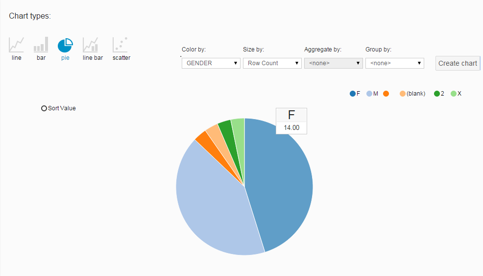
- Click Sort Value to display values from maximum to minimum in the chart.
- Move your mouse pointer over a value to see more details in the tooltip.
- Click a value to view the rows containing the selected value on the project data page.
- Click the corresponding legend to show or hide a group of values.
- Click Export chart to export the chart.
Copyright © Cloud Software Group, Inc. All rights reserved.