Charting Data

Use the charting function to visualize data.

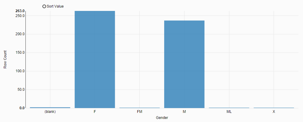
For example, create a bar chart for project 1 in the Sample-customers dataset to present distribution of gender values. To create a bar chart for the Gender column:

Procedure

  1. On the toolbar, click Chart.
  2. In the Chart type area, click bar, and then configure the chart setting:
    1. From the X axis list, select Gender.
    2. From the Y axis list, select Row Count.
    3. Click Create chart.
    The gender distribution is displayed, as shown in the following figure:

  3. View the chart.
    The chart shows that there are 6 different types of gender values: (blank), F, FM, M, ML, and X. You can easily find blank and invalid gender values.