Configuring the add-on
Example configurations
This section describes how to configure the add-on for initial use. The following examples take broad strokes and show a general use case. However, you can build on these principals to take a more methodical approach when configuring the add-on for your specific needs.
See the 'Graph configuration domain' reference section for descriptions of the properties that provide a fine grained control over how your data displays and what data specific users can see and query.
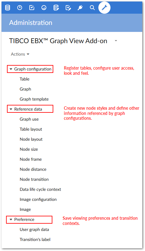
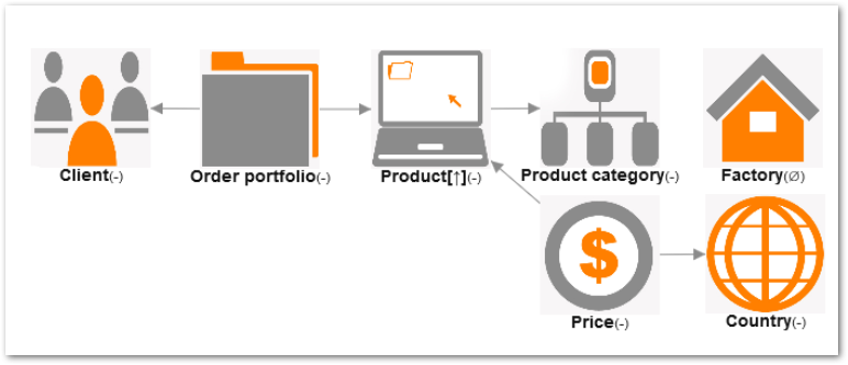
As shown below, all configuration settings for the add-on are located under the 'Administration' tab > 'TIBCO EBX® Graph View Add-on' dataset.
Registering tables with the add-on
By registering a table with the add-on you allow that table to display in the Graph View. The following steps describe how to register a set of tables with the add-on:
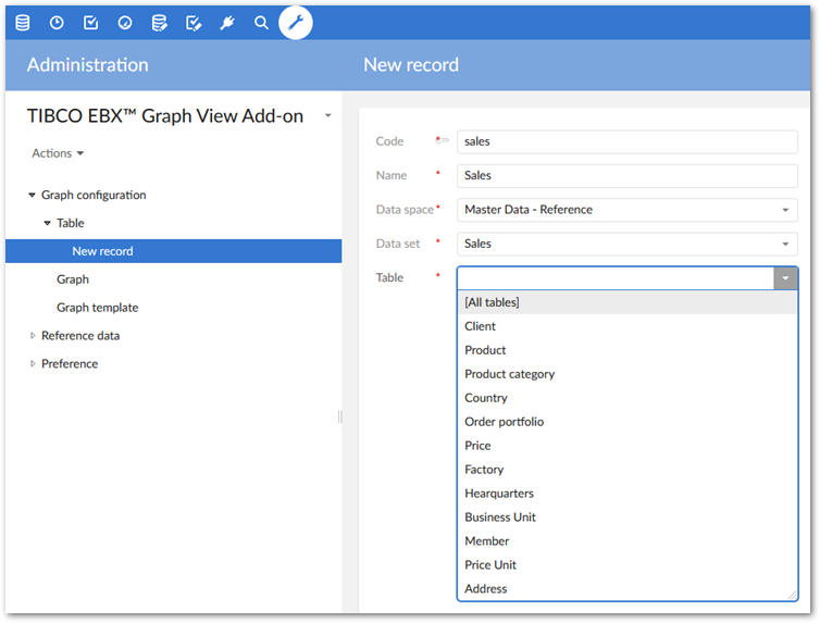
Navigate to: 'Administration' → 'TIBCO EBX® Graph View Add-on' → 'Graph configuration' → 'Table'
Click the '+' icon to create a new record. The screen displays an empty set of fields that you use to define the record.
Enter a unique name in the 'Code' field (without white spaces).
Enter a unique name in the 'Name' field (white spaces are allowed). Keep in mind that this name will be saved and used in other configuration settings. You may want to use a specific naming convention. As shown in the illustration below 'Sales' is used as the name when accessing data related to the sales department.
Using the drop-down lists, specify the desired 'Data space' and 'Data set'.
Select [All tables] from the drop-down list. Alternatively, you can select one table from the specified data set.
Click 'Save' to register this table, or tables, with the add-on. Clicking 'Save and Close' saves your changes and returns you to the previous screen.
You can now display the table(s) you registered in the Graph View.
Managing user access to the Graph View
You may want to limit user access to the Graph View, or allow a set of users limited functionality when it comes to manipulating the Graph View. These settings are available in the 'Graph configuration' domain's 'Graph' table.
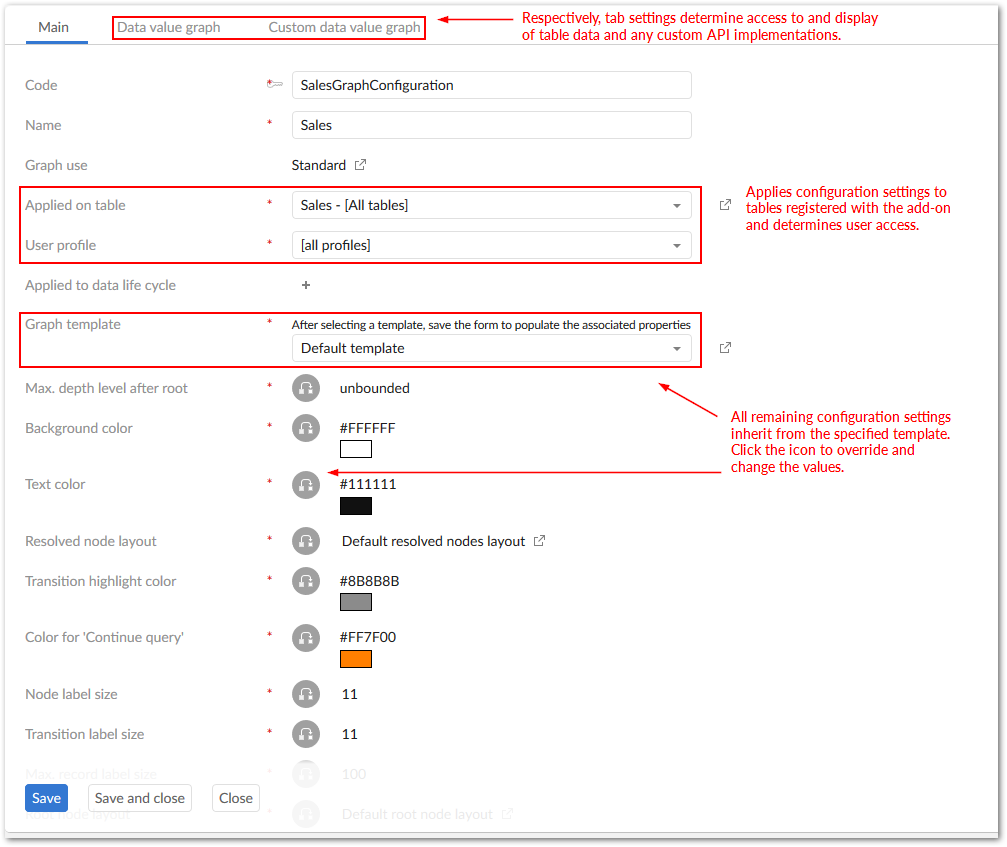
The records here contain many settings that inherit their value from a graph template. These settings deal with both Graph View appearance and user access to tables registered with the add-on. This section only outlines configuration options related to user access. For information pertaining to graph templates that define default look, feel and other behavior, see 'Customizing Graph View display and behavior templates'.
The record properties listed below the 'Graph template' drop-down list inherit their default value from a graph template located in the 'Graph template' table. Each property's inheritance can be overwritten or re-instated by toggling the small icon between a property's name and its value. This provides two places where you can edit property values—at this level and at the 'Graph template' level.
Note: You can prefabricate graph templates that cover the basic scope of your organization's needs. The templates are readily accessible via the 'Graph template' drop-down list, or you can quickly override a property or two-from an existing template-that helps you meet a certain requirement.
The following example makes use of a default graph template included with the add-on:
Navigate to: 'Administration' tab → 'TIBCO EBX® Graph View Add-on' → 'Graph configuration' → 'Graph'
Click the '+' icon to create a new record.
Enter a code and a name in their corresponding fields. Remember, no white spaces can be used in the 'Code' field and it is a good practice to use a meaningful naming convention.
Select a record from the 'Applied on table' drop-down menu. Your choice here determines the table, or tables to which this configuration applies. If you haven't registered any tables, you can select '+ Create' from this drop-down menu to do so. See the above section for more information on registering tables.
This list populates with names of records created in the 'Table' table. Each of these records contains tables registered with the add-on. When the list of tables is extensive, it can be helpful to use the 'Selector' option to display a tabular view of registered tables. You can then use filtering criteria and search options to find and select the desired table.
Select either a specific user profile, or 'all profiles' from the 'User profile' drop-down list. This property specifies to which profile(s) the current configuration applies. Essentially, this determines who can access data using the Graph View.
Select a template from the 'Graph template' property's drop-down list. Each template contains settings that determine graph behavior and display. In the illustration below, the default template is used. Note: After selecting a template, you need to click the 'Save' button at the bottom of the page to populate the remaining properties with values from the selected graph template.
Determine whether or not users with access to this configuration can rearrange nodes and save the layout. The 'Is moveable' property inherits from the associated 'Graph template', but can be overridden here.
The 'Data value graph' tab contains a property called 'Display node by value' which allows you to specify whether or not users can view table records in the Graph View.
Click 'Save and close' at the bottom of the page.
Customizing Graph View display behavior with templates
This section describes how to use a graph template to define a custom look and feel for the Graph View, as well as, set properties that can affect performance. Once a template has been completed and saved, it will be available for selection in the 'Graph template' drop-down list.
The following steps focus on a few properties. For a description of all properties, see the 'Graph template' table section.
If you haven't already done so, select the 'Graph template' table located under the 'Graph configuration' domain.
Click the '+' icon to add a new record to this table where you'll configure your graph display for optimum look and feel. For this example, we'll start a template from scratch.
Add a code and name in the corresponding fields.
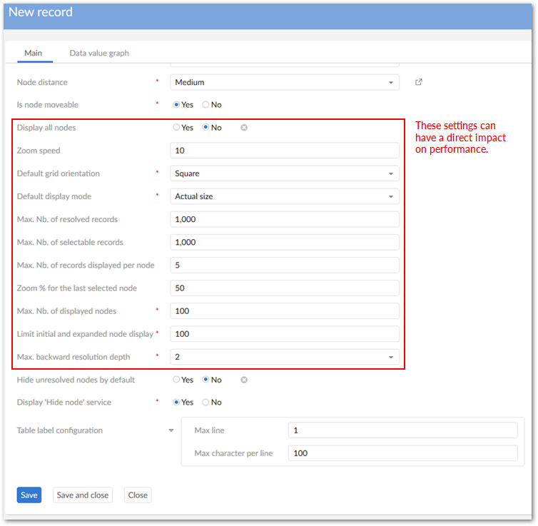
The 'Max depth level after root' property limits the number of nodes that display after the root node. For this example, we'll leave the value unbounded.
The next four properties determine graph color. You can either enter an HTML color code in the field or click in the colored box to choose a color from a color picker. Choose wisely.
Some tables and records may have longer names that would clutter the Graph View. The Max record label size property allows you to specify a table label's maximum length.
The 'Root node layout' and 'Node layout' properties let you select configurations defined in the 'Reference data' domain's 'Node layout' table. These configurations can determine node color, shape and size. See 'Using images to represent graph nodes' for information on displaying nodes as images instead of using standard shapes.
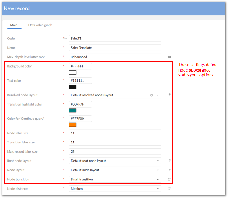
The 'Is node moveable ' property determines whether users can rearrange the nodes in their views.
Set a threshold on the number of records that can be resolved when a query runs using the 'Max. Number of resolved records' property. Depending on your system capabilities, you'll need to increase/decrease this number as this property has a direct effect on performance.
Set a maximum number of records that can be selected when querying a table using the 'Max. number of selectable records' property This property also has an effect performance. The resolution algorithm follows all relationships and if the number of records is extremely high, system performance can be an issue.
Another setting that has an impact on graph performance is the property—'Max. number of displayed nodes'. This property restricts the number of table, or record nodes displayed in a graph. Reducing the number of displayed nodes can improve performance.
When the limit specified is reached a symbol (->) indicates that related nodes exist, but aren't displaying. To view them, use the 'Display graph from current node' service which acts as a paging mechanism and opens a new graph displaying the remaining nodes and relationships. The node from which the service was run becomes the new graph's root node. If the number of nodes still exceeds the specified limit, you will be able to choose which nodes you want to display (up to the specified limit).
Note: if you are using Firefox version 3.6. this value should be set no higher than 50.
The 'Data value graph' tab contains settings pertaining to table records and allows you to enable, or disable user ability to view data values (table records) in the Graph View.
Using images to represent graph nodes
You can further customize the Graph View by using images to represent table and record nodes. Using different configurations you can:
Use the same image to represent all table nodes in a graph view. By default, this image is also used for table records displayed using the 'Display graph data value' service.
Customize the display of each node independently. For example, you can use a different image, or layout to represent each table in a graph and you can use a different image for each record in a table.
Image configuration options are available in the TIBCO EBX® 'Administration' tab → 'TIBCO EBX® Graph View Add-on' domain. However, for image storage, you will need a system folder that EBX® can access. This task may require a system administrator.
The points below are covered in detail in the following sections and outline the basic steps to represent nodes with images:
Create a image storage folder in a location accessible by EBX® (System Administrator task)
Upload images to this folder
Use the same image to represent all nodes in a graph, or use a different image to represent each node
Uploading images
Before uploading an image, a dedicated folder must be in a location accessible by EBX®. A system administrator may need to complete this task. Once the folder is available, complete the following steps to upload images:
Navigate to: 'Administration' tab → 'TIBCO EBX® Graph View Add-on' domain → 'Reference data' → 'Image configuration'.
Click on the '+' icon to create a new record.
Specify the location of the desired folder in the 'Upload folder' field. You can limit the file size and specify a timeout threshold using the 'Max. upload size (KB)' and 'Time out' properties, respectively.
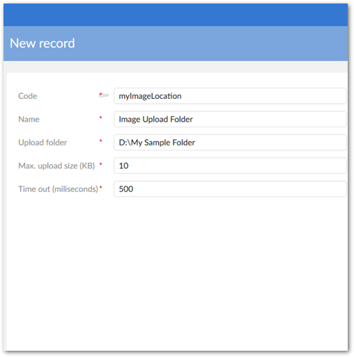
Click 'Save and Close' to save your settings and exit.
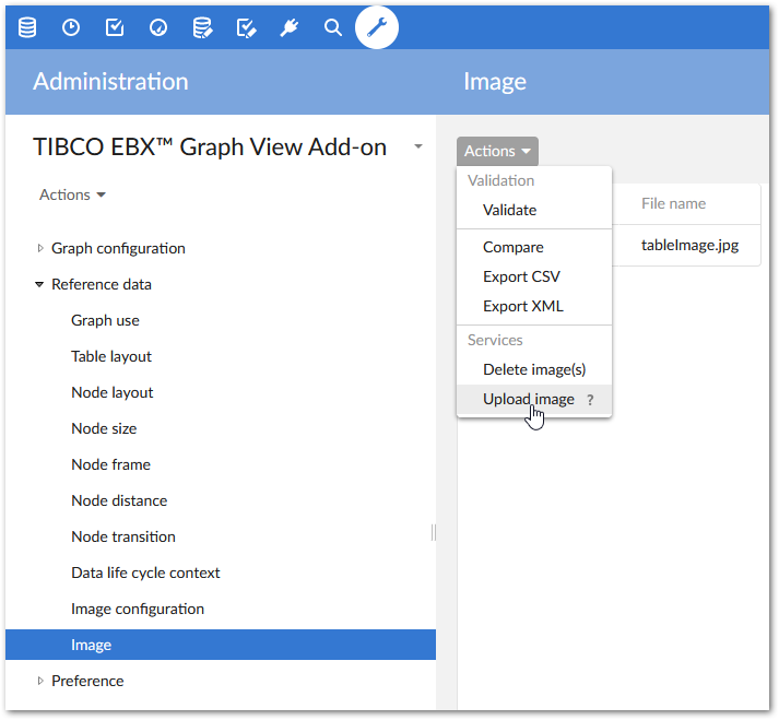
Navigate to the 'Reference data' domain's ' → 'Image' table.
The 'Services' drop-down menu allows you to upload and delete images. Selecting 'Upload image' allows you to specify a name for the image and the file's location. Note: If the 'Upload image' service isn't available, you need to specify an 'Upload folder'. See, step 3 above.
The next section describes how to use an image to represent all nodes in a 'Graph configuration'.
Customizing a 'Graph configuration' to use an image
The 'Reference data' domain's 'Node layout' table stores configuration settings that allow you to customize node display. Using this table, you can specify a node's frame, size, shape and color. Note: In order to complete the steps in this section, images need to be uploaded to a folder accessible by EBX®.
The following steps outline how to use an image to represent all nodes in a graph configuration:
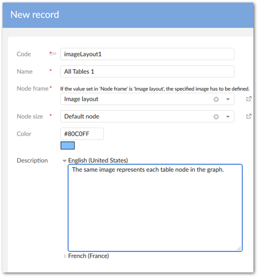
Navigate to 'Reference data' → 'Node layout' and select the '+' icon at the top of the page to create a new record.
Enter a code (unique without white spaces) and a name.
From the 'Node frame' drop-down list, select 'Image layout' and click 'Save' at the bottom of the page to display all related fields.
Specify a display size for your image in the 'Node size' field. You can use one of the existing sizes, or click '+ Create' to open a new page where you can define a custom node size. For this example we defined a custom size called 'Images' with dimensions of 100 pixels high by 100 pixels wide.
Select the image you want to use in the 'Image' drop-down list. This drop-down list displays the images uploaded to the dedicated folder. If you haven't uploaded any images yet, see the previous section. The graphic below gives an idea of what your settings may look like.
Save and close.
Navigate to the 'Graph configuration' domain's → 'Graph' table. Open the graph configuration that you want to apply this image layout to.
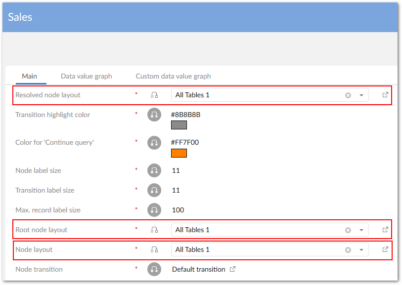
The following properties derive their values from the 'Node layout' table: 'Resolved node layout', 'Root node layout' and 'Node layout'. It is common to use different sizes and colors for each type of node layout. The differences simplify graph viewing by providing a prominent visual indicator of a node's state. For simplicity's sake, we'll use the layout we just defined for all three properties. Click the small gray box to overwrite default inheritance and select the node layout configuration you just created from the drop-down list.
Save and close.
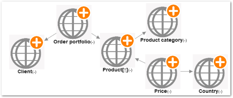
As shown in the image below, when you open tables in the graph view that use this graph configuration, all nodes will display as the specified image. Keep in mind that node layout configuration settings can be changed in 'Graph templates' and any graph configurations using templates inherit the node layout settings.
Customizing individual node display
You can customize the display of each node independently. For example, you can use a specific icon to represent a 'Client' table and use a profile picture to represent each record contained in the 'Client' table.
To display each table record as a different image, the record has to contain a field that specifies an accessible path to an image. Also, the field type must be set to URI. This behavior enables you to use locations other than the folder used to upload images. Keep in mind that the value set in the 'Image configuration' table's 'Max. upload size (KB)' property also applies to the images used to display records. So, if the images referenced for record display exceed this value, they will display as a colored rectangle. Additionally, if it takes longer to load an image than the timeout threshold specified in the 'Image configuration' table, the records display as a colored rectangle.
The following steps outline independent node display:
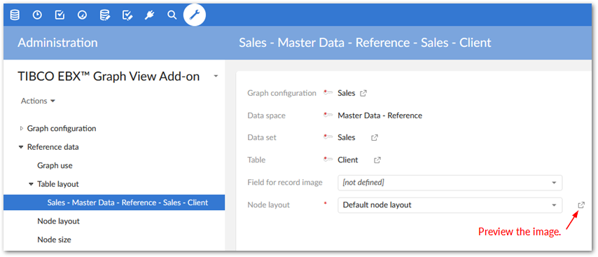
Navigate to the 'Reference data' domain's → 'Table layout' table.
Select '+' to add a record.
Specify the 'Graph configuration', 'Data space', 'Data set' and 'Table' to which you want to apply this configuration.
The 'Field for record image' drop-down list displays any valid URI fields from records contained in the specified table. Select the field that contains the link to the desired image.
The 'Node layout' drop-down list displays configurations specified in the 'Node layout' table. The value you select here determines how the table displays. You can click the 'Preview' icon next to this property to open a preview window.
Save and close. When you open the table in the Graph View it now shows the table as the image you chose and each record displays as its linked image.
View the table's records using the 'Data value graphs' service. All records display as their profile picture setting.
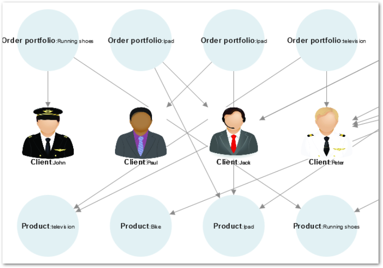
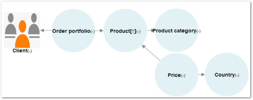
The following image shows an example of how the graph looks when you create a table layout configuration for each table.
The above selections have covered general configuration guidelines. The next section in this document describes how you can query data when in the Graph View.