Overview
What are data value graphs?
A data value graph is a visual representation of how data values relate to each other. A graph can display relationships between data in the same table, different tables, and even tables from multiple data models. By default, you can view a graph of selected data values. Additionally, you can choose a data value graph configuration created by an administrator to display a customized graph of selected data values. See the sections below for more details on each graph type.
Default graphs
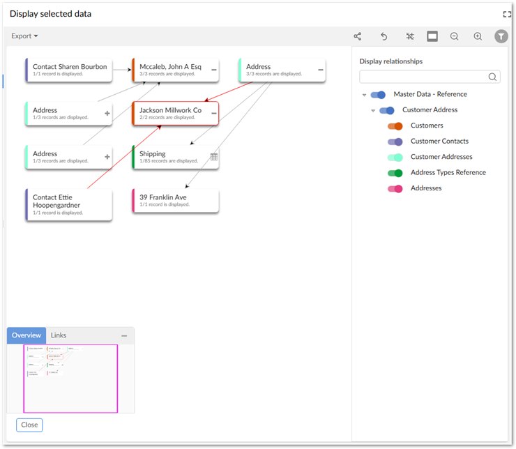
A default data value graph requires no advance configuration. Default graphs display data values in color-coded nodes and use arrows to represent the relationships between the data values. The following image provides an example of a default data value graph:
Configured graphs
Administrators can create configurations to determine which values and relationships can display. They also configure how the add-on renders these relationships by assigning a display type to each one. The table below provides examples of the available display types. To display a graph, users select one or more values in a table and run the table's Display data using configuration service. Note that this service is available only from tables included in a configuration.
The following table outlines the available relationship display types:
Type | Example and description |
|---|---|
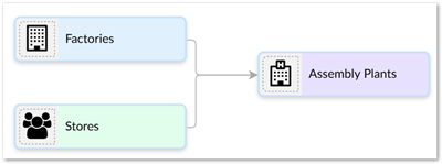
As Lines | As shown in the following image when you set the display to lines, values display in rectangular nodes and lines between nodes represent relationships.
|
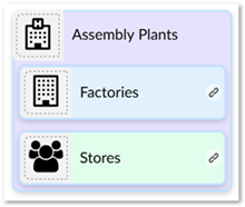
As Containers | As shown in the following image containers show a parent/child relationship as nodes within nodes. Outer nodes are the parents of the smaller, inner nodes.
|
The sample tutorial provides detailed configuration instructions. You can follow the tutorial step-by-step, or feel free to use the generalized instructions in the Configuring graphs chapter to create your own configuration.