Using configured data value graphs
Overview
If you have the necessary permissions enabled for your role or profile, you can create data value graph configurations and generate graphs based on configurations created by others.
There are two primary types of data value graphs: Standard and Org chart. The Standard graph can display values from multiple tables and represent relationships using both lines and containers. In contrast, an Org chart displays values from a single table in a conventional tree-like hierarchy. Org charts have two available view modes that rely solely on the line relationship type.
The following sections provide additional details on data value graphs:
Using standard data value graphs
When viewing graphs, you can:
Export a PDF, PNG, or SVG of the graph.
Expand the graph to full screen and zoom to change the magnification level.
Choose the orientation of the graph's nodes that use line relationships. The options for node orientation tell the add-on to put the source nodes in the selected position. Then it renders related nodes in the selected direction. For example, the Top-down option adds source nodes to the top of the graph and renders related nodes below.
Click and drag to change the orientation.
Expand/collapse nodes and view node and relationship details. You can access this option by right clicking on nodes. Depending on the available relationships and configuration, you can expand one node at-a-time, or expand all related nodes.
Use the Overview mini-map and Tables tab to re-orient the graph and see how styles are applied to tables, respectively. Additionally, you can move the box to a different corner of the graph by selecting its title bar and dragging.
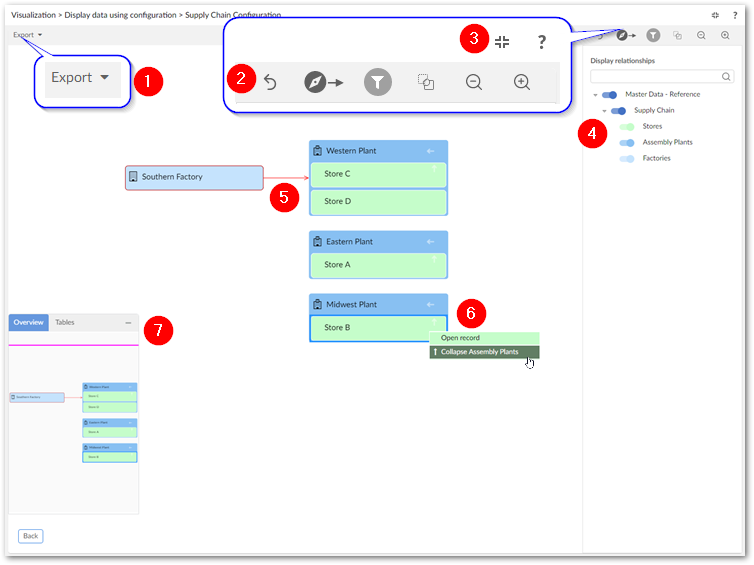
The following image and table highlight the available features when viewing a data value graph:
Note
It is not shown in the image above, but a double arrow displays to indicate nodes are linked multiple times using the same link.
1) | Export a PDF, PNG, or SVG of the current graph. |
2) | Undo your last action, change graph orientation, toggle the filter pane (shown), edit graph configuration options, and zoom. |
3) | Enter and exit full screen mode and select the '?' to view the documentation related to data value graphs. |
4) | In the filter pane, the search field allows you to search for data values in the graph. As you enter text in the field the list of nodes narrows to only those that include the entered text. Once you find the element you are looking for, select the node to center the graph on it. The filter pane also allows you to toggle display of nodes in the graph. |
5) | Selected nodes and relationships are highlighted in red. Click a node's |
6) | Drag the mini-map in the Overview tab to re-orient the graph. You can also drag the box to any of the graph's four corners. The tables tab contains a legend to help you identify the tables containing the values displayed in the graph. |
 icon, or right-click a relationship to open their context menus.
Context menus
Opening a node or relationship context menu allows you to:
Expand any related nodes configured to display in this graph. When a node holds a relationship type to multiple nodes, you can expand them recursively in a given direction. For example, you might see the option to expand all of a node's targets. Nodes can expand recursively up to five levels deep.
Open the selected record, or show the link details.
If expanding related nodes would display more nodes than the configured threshold, selecting the expand option displays a pop-up where you can choose the nodes that you want to expand. This behavior is shown below:
Note
The number of nodes you can select is determined by an administrative configuration option. By default, this value is 2000.
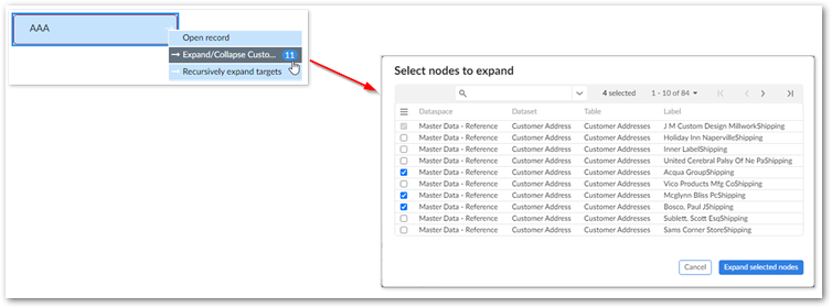
As shown above, the Select nodes to expand pop-up includes a search field and navigation options. By default, the quick search option displays. You can access advanced search functionality by selecting the downward-facing arrow to the right of the search field. Advanced search allows you to filter the nodes displayed by specifying different criteria. Each criterion you add is applied to one of the following fields: Dataspace, Dataset, Table, Label. Note that the button to apply filters and search is disabled until valid criteria are added.
Using Org chart graphs
An Org chart displays a tree-like hierarchy and has the following view modes:
Standard: You can expand and collapse nodes on multiple levels.
Step by step: This mode provides a more focused view, displaying just one parent node and its immediate children.
The following image and table highlight the available features Org charts displayed in Standard mode:
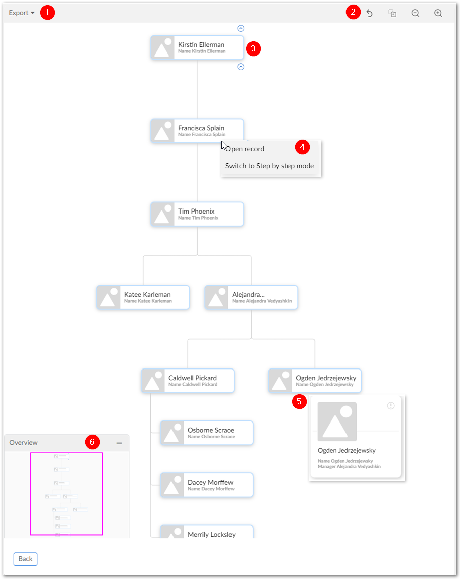
1) | Export a PDF, PNG, or SVG of the current graph. |
2) | Search (not shown in above image), undo your last action, edit graph configuration options, and zoom. |
3) | Hover your mouse over a node. Use the small arrows that display above and below the node display the nodes parents and children, respectively. |
4) | Right-click nodes to expand their context menus and select:
|
5) | Hover your mouse over a node to display a pop-up with additional details. |
6) | Drag the mini-map in the Overview tab to re-orient the graph. You can also drag the box to any of the graph's four corners. |
When viewing an Org chart in step mode, many of the options described above are available. The following image and table describe features unique to graphs configured to use Step by step mode:
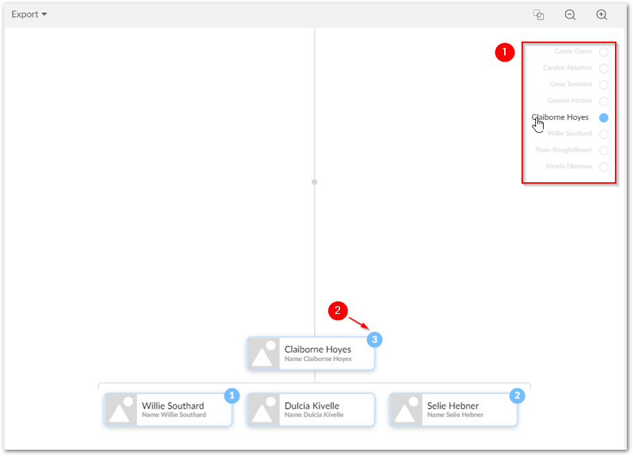
1) | The breadcrumb tracks your progress as you navigate through the chart. Select an item in the breadcrumb to jump to that node. |
2) | The number of a node's immediate children displays above each node. |
3) | Not shown in the image above are the Show more and Show less buttons. When a node has many children, the add-on automatically caps the number of nodes displayed initially. These buttons allow you to increase or decrease the number of nodes displayed. |