Using data value graphs
When you generate a data value graph using default functionality—a graph not tied to a custom configuration—the add-on displays the selected values as nodes. From the graph, you can:
Export a PDF, PNG, or SVG of the graph.
Change the node shape.
Expand the graph to fullscreen, zoom to change the magnification level.
Click and drag a node to change its position or graph background to change its orientation.
Expand/collapse nodes and view node details. To view node details, double-click a node.
Filter the graph content to display only the data and relationships you want.
Use the Overview mini-map to re-orient the graph. Additionally, you can move the box to a different corner of the graph by selecting its title bar and dragging.
The following image highlights the available features when viewing a data value graph:
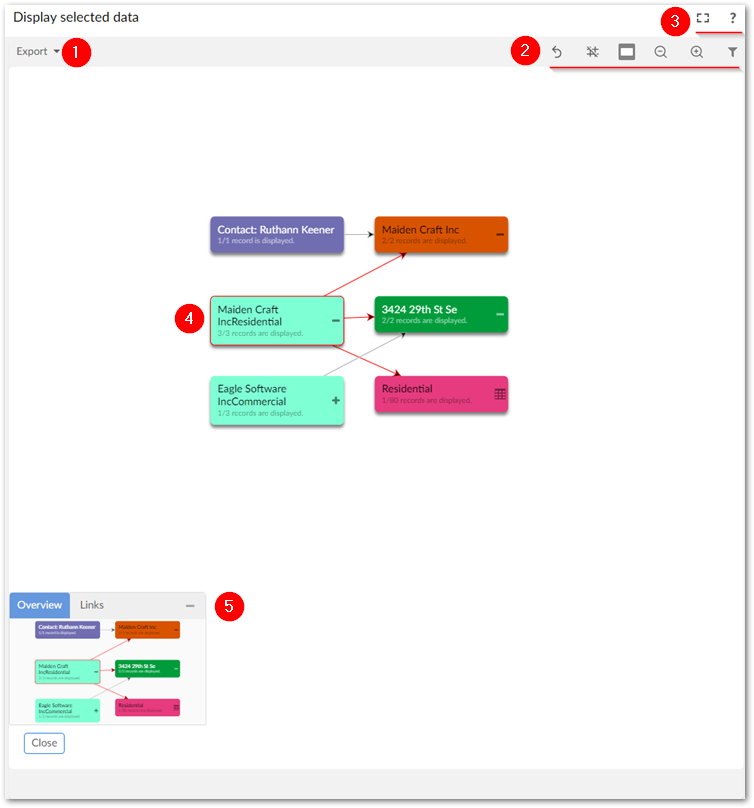
1) | Export a PDF, PNG, or SVG of the current graph. |
2) | From left to right, these icons allow you to:
|
3) | Enter and exit fullscreen mode and select the '?' to view the documentation related to data value graphs. |
4) | Expand and collapse relationships by selecting the + or - icons. Double-click a node to open the record detail view. Selected nodes and relationships are highlighted in red. Each node displays the number of additional nodes that will display after selecting the + icon. |
5) | Drag the mini-map in the Overview box to re-orient the graph. You can also drag the box to any of the graph's four corners. |
When expanding a node would result in display of 10 or more nodes, the add-on allows you to select the nodes you want to expand. Selecting the  icon displays the following pop-up dialog where you can choose the nodes to open and select Expand selected nodes:
Note
The number of nodes you can select is determined by an administrative configuration option. By default, this value is 2000.
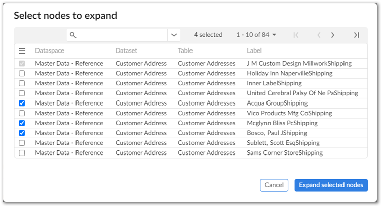
As shown above, the Select nodes to expand pop-up includes a search field and navigation options. By default, the quick search option displays. You can access advanced search functionality by selecting the downward-facing arrow to the right of the search field. Advanced search allows you to filter the nodes displayed by specifying different criteria. Each criterion you add is applied to one of the following fields: Dataspace, Dataset, Table, Label. Note that the button to apply filters and search is disabled until valid criteria are added.