Custom forms
This chapter details how custom forms are defined and managed by TIBCO EBX®.
Related concepts
- Access
- Forms and components
- The editor
- Blocks
- Arithmetic operator
- Array
- Array item
- Boolean operator
- Check box
- Check box group
- Children
- Choose
- Close button
- Color picker
- Combo box
- Comparator
- Comparison
- Concatenate arrays
- Constant
- Content title
- Creating record?
- Custom action bar
- Date time input
- Declare
- Default action bar
- Default toolbar
- Duplicating record?
- Expand/Collapse
- Flow
- For each
- Form
- Form definition
- Form group
- Form row
- Form parameter
- From...get
- Function
- Function call
- Function call argument
- Function parameter
- Grid
- Grid element
- If
- Input parameter
- In role?
- Label
- Localized
- Message
- Next button
- Node
- Nomenclature item
- Not
- Object
- Otherwise
- Paragraph title
- Password
- Previous button
- Property
- Radio button
- Radio button group
- Revert button
- Save button
- Save and close button
- Tab
- Tab container
- Text input
- Toolbar named
- Variable
- When
- Widget
- With
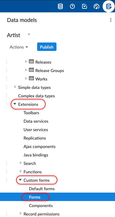
Access
To access it, go to: Data Models > Extensions > Custom forms > Forms
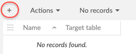
Click on the [+] button to create a form.
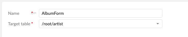
Name your new form and indicate the table on which it will be available.
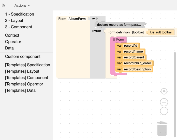
Pressing the "Save" button will redirect you to the layout designer.
Forms and components
Both forms and components can be created in the 'Custom forms' data model extension.
A form describes the layout of a record. It can access contextual information such as the record or the input parameters. When creating a form, the user is asked to provide its target table. Once created, it can be declared as the default form of the table either in the 'Default form' table of the extension, or in the 'Extensions' tab of the target table. Forms that are not the default for their table will not be used.
A component is a reusable fragment that can be shared between forms and other components. Unlike forms, components don't have access to contextual information. If such information is needed, it must be provided explicitly by its caller.
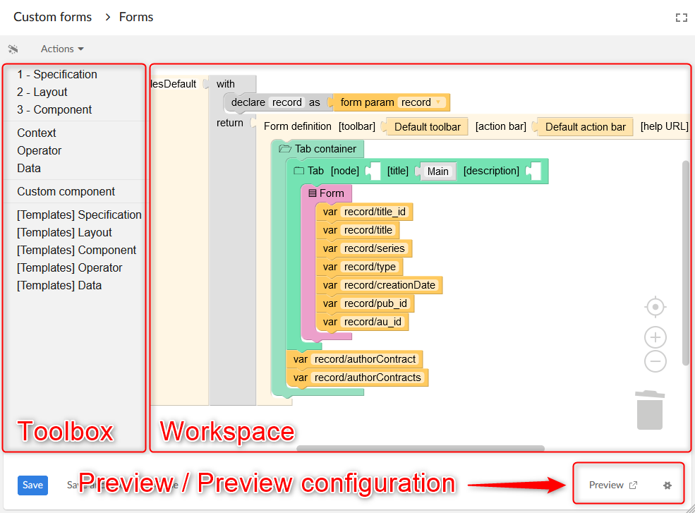
The editor
A form or component is just an imbrication of blocks. Blocks can represent a concrete graphical element or some piece of logic, allowing to have different layouts based on conditions like permissions, language, etc.
The workspace contains the description of the form, inside a predefined root block. Any block that is not connected to this root is grayed out, to mark it as inactive. To move a block, it must be dragged and dropped. Dragging a block also drags the blocks connected below it. If only one block has to be moved, hold the control key before clicking on it. Right-clicking on a block in the workspace also shows a list of options such as expand/collapse, comment, help, etc.
The toolbox on the left displays a list of categories. By clicking on a category, the blocks it contains are displayed. Some categories have a related 'Template' section. This section provides some combinations of the blocks of the section and can be considered as useful shortcuts or samples.
On the bottom right of the screen are the 'Preview' and 'Configure preview' buttons. These can be used to see what the form will look like.
Blocks
Here is the list of all the blocks that appear in the toolbox.
Arithmetic operator
Operations on two integers.
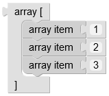
Array
A list of items.
See also
Array item
Adapter to make expression blocks into arrays.
See also
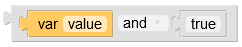
Boolean operator
Operations on two booleans.
Check box
Displays the checkbox widget.
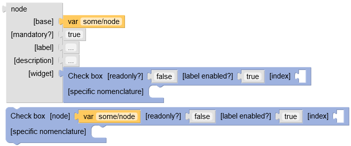
Parameters
Input | Description |
|---|---|
| The node for which to display the widget. |
| Indicates if the widget should be in readonly mode. |
| If set, indicates if the item label is to be added next to the widget. |
| The index for this enumeration item. |
| If set, overrides the model-driven nomenclature. |
Check box group
Displays the checkbox group widget.
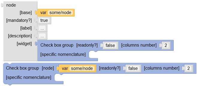
Parameters
Input | Description |
|---|---|
| The node for which to display the widget. |
| Indicates if the widget should be in readonly mode. |
| If set, defines the number of columns to use for the layout of the checkboxes. |
| If set, overrides the model-driven nomenclature. |
Children
Returns the list of the children of the given node.
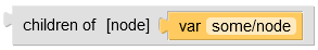
Parameters
Input | Description |
|---|---|
| The complex node from which to extract children. |
Choose
A block returning the content of one of its inner 'when'/'otherwise' blocks.
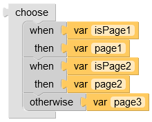
Parameters
Input | Description |
|---|---|
| A list of 'when' blocks and optionally a final 'otherwise' block. |
Close button
Standard 'Close' button.
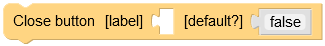
Parameters
Input | Description |
|---|---|
| If set, overrides the default label. |
| Indicates if this is the action to trigger when pressing 'Enter'. Only one button should be the default one. |
Color picker
Displays the color picker widget.
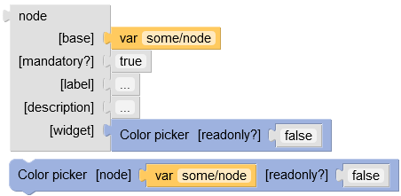
Parameters
Input | Description |
|---|---|
| The node for which to display the widget. |
| Indicates if the widget should be in readonly mode. |
Combo box
Displays the combo box widget.
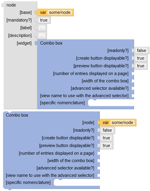
Parameters
Input | Description |
|---|---|
| The node for which to display the widget. |
| Indicates if the widget should be in readonly mode. |
| If set, defines if the create button should be displayed when the underlying node is a foreign key. |
| If set, defines if the preview button should be displayed when the underlying node is a foreign key. |
| If set, defines the number of entries on each page of the drop-down list. |
| If set, defines the width of the combo box. |
| If set, defines if the advanced selector should be displayed when the underlying node is a foreign key. |
| If set, defines the name of the published view that will be used in the combo-box selection of the associated foreign key field. |
| If set, overrides the model-driven nomenclature. |
Comparator
Compares two integers.
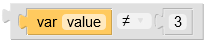
Comparison
Compares strings, numbers or booleans.
Concatenate arrays
Returns the concatenation of the given arrays.
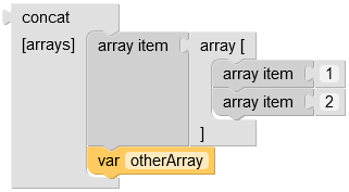
Parameters
Input | Description |
|---|---|
| A list of arrays. |
Constant
A constant value. Depending on the context, this value may be interpreted as text, boolean or number.
Parameters
Input | Description |
|---|---|
| Text, boolean or number. |
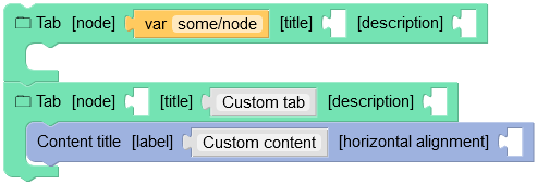
Content title
Display the workspace content title.

Parameters
Input | Description |
|---|---|
| The text to display. |
| The horizontal alignment of the element. If set, accepted values are: 'start', 'end', 'center'. |
Creating record?
Returns a boolean indicating if the form is displayed in the context of a record creation or duplication.
Custom action bar
A custom action bar.
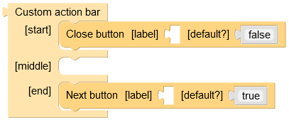
Parameters
Input | Description |
|---|---|
| A list of 'Button's to display on the left of the action bar. |
| A list of 'Button's to display on the center of the action bar. |
| A list of 'Button's to display on the right of the action bar. |
Date time input
Displays the date/time input.
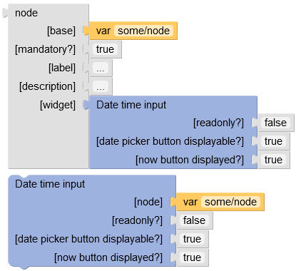
Parameters
Input | Description |
|---|---|
| The node for which to display the widget. |
| Indicates if the widget should be in readonly mode. |
| Indicates if the button opening the date picker is displayed (read/write mode only). |
| Indicates if the button setting the date to the current time is displayed (read/write mode only). |
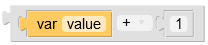
Declare
The declaration of a variable, in a 'with' block.
Parameters
Input | Description |
|---|---|
| The name of the variable. Must be unique for a given 'with' block. |
| The value of the variable, which will be returned by 'var' blocks referencing this. |
See also
Default action bar
The default action bar.
Default toolbar
The model-driven toolbar.
Duplicating record?
Returns a boolean indicating if the form is displayed in the context of a record duplication.
Expand/Collapse
Displays its content inside an expand/collapse block.
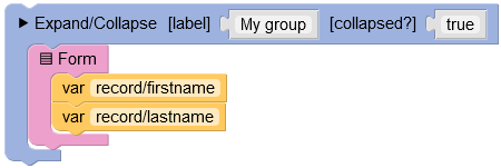
Parameters
Input | Description |
|---|---|
| Label displayed next to the arrow. |
| Indicates if the group is initially collapsed or not. |
| A list of components to be collapsible. |
Flow
Displays its content in a fluid manner. If the elements don't fit in one row or column, they will wrap to start a new one.
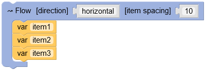
Parameters
Input | Description |
|---|---|
| 'horizontal' or 'vertical', indicates in which direction to queue its content. |
| The space between elements, in pixels. |
| A list of elements to display either horizontally or vertically. |
For each
Returns an array that is made of the result of the 'body' function, applied on each item of the 'of' array.
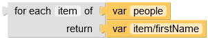
Parameters
Input | Description |
|---|---|
| The name of the variable containing the current item. |
| The array containing the items to transform. |
| What to return for the current item. |
Form
Standard table-like layout with labels on the left side and values on the right side.
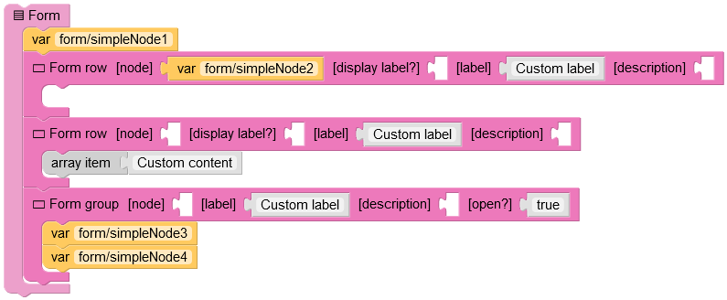
Parameters
Input | Description |
|---|---|
| A list of 'Form row', 'Form group' or nodes. Nodes will result in model driven display, 'Form row' and 'Form group' allow to display custom content. |
See also
Form definition
Actual definition of a form.
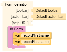
Parameters
Input | Description |
|---|---|
| Definition of the toolbar displayed on top of the form. |
| Definition of the action bar displayed below the form. |
| URL of the help page. |
| The content of the layout. |
Form group
Inside a 'Form', displays a collapsible group of items.
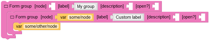
Parameters
Input | Description |
|---|---|
| If set, the group label, description and content will be model driven. |
| The label of the group. May override the model driven label if a node and a label are set. |
| The description of the group. May override the model driven description if a node and a description are set. |
| Indicates if the group is initially open. |
| A list of 'Form row', 'Form group' or nodes. Nodes will result in model driven display, 'Form row' and 'Form group' allow to display custom content. |
Form row
Inside a 'Form' or a 'Form group', displays a row, that is basically a label and a value.
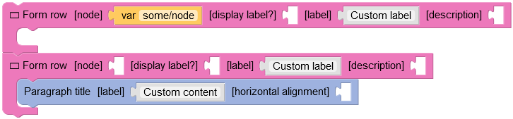
Parameters
Input | Description |
|---|---|
| If set, the label, description and content will be model driven. |
| Indicates if the label should be displayed. If set to false in a 'Form' the content will span over both the label and content area. |
| The label of the row. May override the model driven label if a node and a label are set. |
| The description of the row. May override the model driven label if a node and a label are set. |
| The content to be displayed next to the label. |
See also
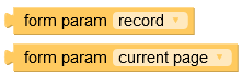
Form parameter
The 'record' is the node representing the displayed record. 'current page' is a number (1 by default) representing the displayed page. This value can be changed by the 'Previous' and 'Next' buttons.
From...get
Extract a value from an object or a node.
<from "node" get "path/to/value"> is equivalent to <var "node/path/to/value">
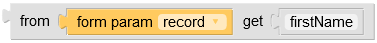
Parameters
Input | Description |
|---|---|
| Base object or node, from which to extract data. |
| Path of the data to extract, inside the object in 'from'. |
Function
The definition of an anonymous function. A function makes use of its parameters in its body to return a result.
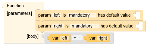
Parameters
Input | Description |
|---|---|
| List of 'param' blocks, defining the parameters accepted by this function. |
| Body describing the result of the function, using its parameters. |
See also
Function call
Calls a function by setting actual values to its parameters.
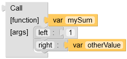
Parameters
Input | Description |
|---|---|
| The function to call. |
| The arguments to pass to the function. |
See also
Function call argument
Actual value to pass to the parameter of the called function.
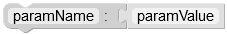
Parameters
Input | Description |
|---|---|
| The name of the parameter. |
| The actual value to pass the the parameter. |
See also
Function parameter
This is the declaration of a parameter of a function.
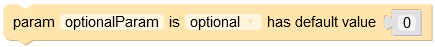
Parameters
Input | Description |
|---|---|
| The name of the parameter. |
| Indicates if this parameter must be provided by the caller. |
| If set, this is the default value taken by this parameter if the caller does not provide one. |
See also
Grid
A layout allowing to place components in a grid with coordinates.
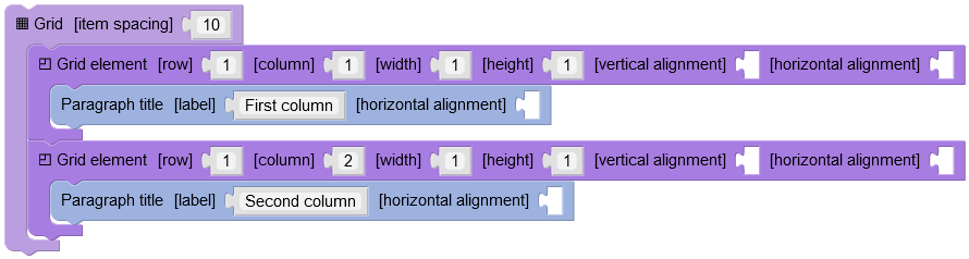
Parameters
Input | Description |
|---|---|
| Space between elements, in pixels. |
| A list of 'Grid element's, which specify where to display their content. |
See also
Grid element
Inside a 'Grid', specifies the location of its content.
Parameters
Input | Description |
|---|---|
| The row where the element starts. Minimum value is 1. |
| The column where the element starts. Minimum value is 1. |
| The width of the element, in grid cells. Minimum value is 1. |
| The height of the element, in grid cells. Minimum value is 1. |
| The vertical alignment of the element. If set, accepted values are: 'start', 'end', 'center'. |
| The horizontal alignment of the element. If set, accepted values are: 'start', 'end', 'center'. |
| The content inside the cell. |
See also
If
A block returning either the content of 'then', or the content 'else', based on the result of the test.
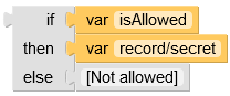
Parameters
Input | Description |
|---|---|
| A test determining which value to return. This must be a boolean value. |
| The value returned if the test is true. |
| The value returned if the test is false. |
Input parameter
Returns the raw value of an input parameter.
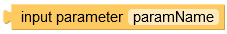
Parameters
Input | Description |
|---|---|
| The parameter name. |
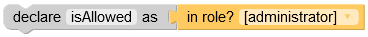
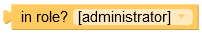
In role?
Returns a boolean indicating if the current user has the requested role.
Label
Displays the label of the given node.
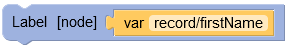
Parameters
Input | Description |
|---|---|
| The node for which to display the label. |
Localized
Block which result depends on the user locale.

Parameters
Input | Description |
|---|---|
| Each parameter relates to a locale. The result of the block will be the one corresponding to the locale of the current user. |
Message
Formats the given text by replacing java-like {0}, {1}, etc. placeholders by the argument at the given index.
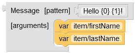
Parameters
Input | Description |
|---|---|
| Text with placeholders ({0}, {1}, etc.) which will be replaced by the given arguments. |
| The list of values which will replace the placeholders in the pattern. |
Next button
A button which will increment the 'current page' value by one.
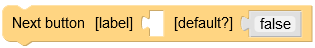
Parameters
Input | Description |
|---|---|
| If set, overrides the default label. |
| Indicates if this is the action to trigger when pressing 'Enter'. Only one button should be the default one. |
Node
Overrides the definition of an existing node.
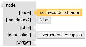
Parameters
Input | Description |
|---|---|
| The node to override. |
| If set, overrides the mandatory indicator of the base node. |
| If set, overrides the label of the node. |
| If set, overrides the label of the node. |
| If set, overrides the default widget of the node. |
Nomenclature item
A nomenclature item is a (key, label) pair.
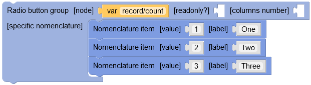
Parameters
Input | Description |
|---|---|
| The value of the item. |
| The label of the item. |
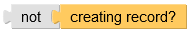
Not
Returns the inverse of the given boolean.
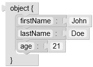
Object
An object composed of a list of (key, value) pairs.
Parameters
Input | Description |
|---|---|
| A list of 'property' blocks. |
See also
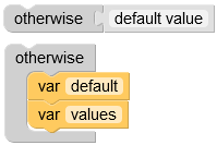
Otherwise
Final choice in a 'choose' block. Will be returned if no 'when' case matched.
Parameters
Input | Description |
|---|---|
| The value to return if no 'when' case matched. |
See also
Paragraph title
Display a paragraph title.

Parameters
Input | Description |
|---|---|
| The text to display. |
| The horizontal alignment of the element. If set, accepted values are: 'start', 'end', 'center'. |
Password
Displays the input password widget.
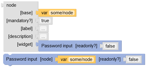
Parameters
Input | Description |
|---|---|
| The node for which to display the widget. |
| Indicates if the widget should be in readonly mode. |
Previous button
A button which will decrement the 'current page' value by one.
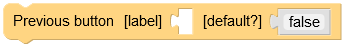
Parameters
Input | Description |
|---|---|
| If set, overrides the default label. |
| Indicates if this is the action to trigger when pressing 'Enter'. Only one button should be the default one. |
Property
A property of an object.
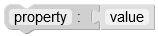
Parameters
Input | Description |
|---|---|
| Name of the property. Must be unique for a given object. |
| Value of the property. |
Radio button
Displays a radio button widget.
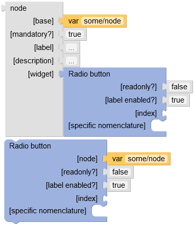
Parameters
Input | Description |
|---|---|
| The node for which to display the widget. |
| Indicates if the widget should be in readonly mode. |
| If set, indicates if the item label is to be added next to the widget. |
| The index for this enumeration item. |
| If set, overrides the model-driven nomenclature. |
Radio button group
Displays the radio button group widget.
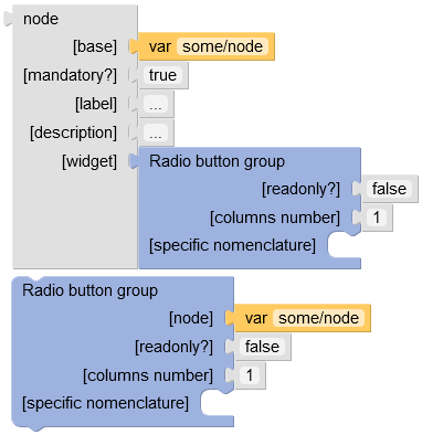
Parameters
Input | Description |
|---|---|
| The node for which to display the widget. |
| Indicates if the widget should be in readonly mode. |
| If set, defines the number of columns to use for the layout of the radio buttons. |
| If set, overrides the model-driven nomenclature. |
Revert button
Standard 'Revert' button.
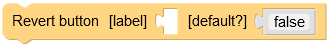
Parameters
Input | Description |
|---|---|
| If set, overrides the default label. |
| Indicates if this is the action to trigger when pressing 'Enter'. Only one button should be the default one. |
Save button
Standard 'Save' button.
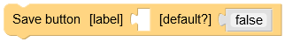
Parameters
Input | Description |
|---|---|
| If set, overrides the default label. |
| Indicates if this is the action to trigger when pressing 'Enter'. Only one button should be the default one. |
Save and close button
Standard 'Save and close' button.
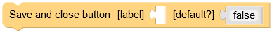
Parameters
Input | Description |
|---|---|
| If set, overrides the default label. |
| Indicates if this is the action to trigger when pressing 'Enter'. Only one button should be the default one. |
Tab
A tab, inside a 'Tab container'.
Parameters
Input | Description |
|---|---|
| If present, the tab title, description and content will be model driven. |
| The title of the tab. May override the model driven title if a node and a title are set. |
| The description of the tab. May override the model driven description if a node and a description are set. |
| The content of the tab. May override the model driven content if a node and a content are set. |
See also
Tab container
A container of tabs, which displays a list of tab names and one active tab.
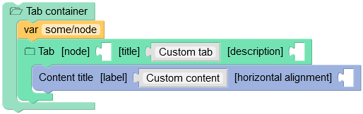
Parameters
Input | Description |
|---|---|
| A list of 'Tab's. |
See also
Text input
Displays the text input widget.
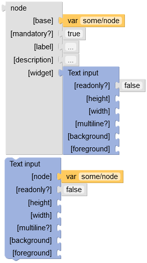
Parameters
Input | Description |
|---|---|
| The node for which to display the widget. |
| Indicates if the widget should be in readonly mode. |
| If set, defines the height of the widget, in pixels. |
| If set, defines the width of the widget, in pixels. |
| If set, defines if the widget spans over multiple lines. |
| If set, defines the background color, in hexadecimal format. |
| If set, defines the foreground color, in hexadecimal format. |
Toolbar named
The toolbar having the specified name.
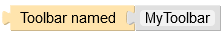
Parameters
Input | Description |
|---|---|
| The name of the toolbar to display. |
Variable
A reference to a variable declared by a 'with...declare' block. A path is also accepted if the variable is an object or a node.
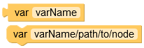
Parameters
Input | Description |
|---|---|
| A reference to a variable declared by a 'with...declare' block. A path is also accepted if the variable is an object or a node. |
When
A choice in a 'choose' block. If the test is true, the 'then' content will be returned, otherwise the next block will be tested.
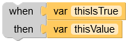
Parameters
Input | Description |
|---|---|
| A boolean test indicating if this case should be resolved. |
| If the test is true, this value will be returned. |
See also
Widget
Displays the default widget.
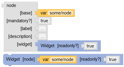
Parameters
Input | Description |
|---|---|
| The node for which to display the widget. |
| Indicates if the widget should be in readonly mode. |
With
Declares variables that can be used in its 'return' statement.
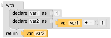
Parameters
Input | Description |
|---|---|
| A list of 'declare' blocks. |
| The value to return. The variables declared in the 'variables' statement can be used here, with 'var' blocks. |