Viewing data
TIBCO EBX® offers different ways to list records. This chapter presents how to sort, search, and display records in varying ways, and according to different user profiles, through to the concept of 'Views'.
'View' menu
The 'View' drop-down menu allows accessing all available views and management features.
Views are managed directly in the 'View' menu toolbar, available on each listed view: 'View' menu toolbar.
Views can also be grouped. An administrator has to beforehand define groups in 'Views configuration' under the 'Groups of views' table. The end-user can then set a view as belonging to a group, through the field 'View group' upon creation or modification of the view. See 'View description' for more information.
Sorting data
Sort criteria control the order in which records are presented.
Use the 'Select and Sort' button at the top left of the table to define specific sorting criteria.
There are two types of sorting:
sorting by relevance, used in the quick search,
sorting by column.
Sorting by column
The 'Sorting criteria' dialog box offers:
on the left, the list of sorted columns,
on the right, the list of unsorted columns.
Use the ← → arrow buttons to toggle columns from one list to another.
Use the ↑ ↓ arrow buttons to change the priority order of the column.
To change the sort order of a column, use the 'ASC' (ascending) or 'DESC' (descending) button that appears on the mouse-over.
Quick Search
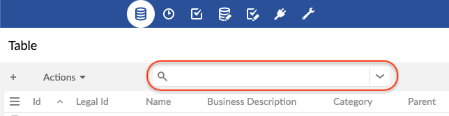
The quick search is used to easily find a result in a tabular, a hierarchical, or a tile view.
It does not differentiate between upper and lower case. It allows you to search for several terms at once (separated by spaces). By default, the records found are sorted by relevance. This search includes all searchable columns, even those that are not visible. When the quick search is not possible for a column, it is indicated by an icon when hovering over the column header.
See also
Special characters
The quick search offers special characters to refine your search on strings. Please note that columns that are not string-based do not support this syntax, and certain search strategies such as 'Code' does not support it either.
| Makes it required that the word be present in the result. Prevents the search engine from excluding this word from the search. Note Works with Example: +flute +bach ↳ Finds results with required flute and required bach. Results with only flute or only bach will be ignored. |
| Excludes the word from the result. Note Works with Example: bach -flute ↳ Find results with bach, but without flute. |
... | Specifies that the search can change 2 characters of the word to find it. To allow for a single character to change, use Note Works with Example: handel~ ↳ Find results with a word that is handel, with 1 or 2 letters differing. |
| Replaces an unknown character. Example: ?uttle ↳ Finds results with a word starting with any character, and ending with uttle. |
| Replaces several unknown characters. Example: rachmanino* ↳ Find results with a word beginning with rachmanino. |
| Find the exact match of the phrase. Note Can be surrounded by Example: "Johann Sebastian Bach" ↳ Find results containing exactly Johann Sebastian Bach. |
| Allows grouping words to apply a special character NoteYou can make groups of groups. Example: bach +(flute piano) ↳ Find the results with possibly bach, and necessarily flute or piano. |
Note
These special characters can also be used in the documentation search engine.
Quick search result highlighting
Quick search results are highlighted to improve the user experience by visually identifying the parts of the data that match the search query, making it easier to locate relevant records in the result. Highlighting is enabled only in the tabular view and does not apply to hidden columns.
Known limitations
When the search matches a foreign key displayed using computed label, the highlight may not appear as expected. Instead, the displayed label may be replaced by the raw field value that matched the query, since the highlighting mechanism operates on raw values rather on labels.
Known limitations
The highlight does not appear for fields using custom widgets.
Searching and filtering data
The search pane is hidden by default and accessible via the  icon located to the right of the quick search in the toolbar of the tabular, the hierarchical or the tile view.
The quick search and the criteria lines combine to narrow the search (restricting the result to fewer and fewer records).
It is possible to deactivate a criteria line by unchecking it. The deactivated criteria are not kept during a save.
The trashcan button  at the end of the line of each criterion permanently deletes the criterion.
To save the filter applied to a search, use the 'Save' button. Saving takes into account the quick search and all active criteria.
To recall a saved filter, use the 'Load' button. Loading replaces the quick search and the whole criteria panel. Click on the 'Apply' button to start the new search.
When a view is applied, it ensures that it is displayed according to its configuration. All existing criteria in the search panel are therefore removed. The view can contain a set of search criteria, which are applied together with the at the same time as the view.
Some operators (such as 'text-search') allow to use Lucene regular expressions. See technical specifications of Lucene's regex pattern for more information.
Search on a field
All searchable fields are available, except those of type osd:locale which are not defined as enumerations, and those of type osd:resource.
Validation filter
In field selection, the validation criteria display the records as of the last validation performed.
Note
This filtering only applies to records of the table that have been validated at least once by selecting Actions > Validate at the table level from the workspace, or at the dataset level from the navigation pane.
To filter on the validation severity level (independent from validation Message), use the 'Severity' validation criterion. Available levels are: 'Errors', 'Warnings' and 'Information'.
To filter on the validation message (independent from validation Severity level), use the 'Message' validation criterion.
Create complex filters
Use multiple criteria grouped by logical operator to create complex filters. The groups display in a tree view that utilizes a variety of features to streamline the construction of even the most complex filters.
For example, take a record where Bob and Smith are values passed to the filter in the Name and Surname fields, respectively. If the contains condition is used for both fields, the logical operators impact record filtering as follows:
AND: restricts the search, as a record must meet all of the criteria in this group to display. Only a record that has Bob Smith displays in the results.
OR: broadens the search, as a record only needs to meet one of the criteria in this group to display. Any record displays where the Name field includes Bob, or the Surname field includes Smith. For example, results might include Jon Smith and Bob Jones.
NOT: inverts a group or criterion so that the opposite conditions from those specified must be met to display the record.
NOT AND: All records that are not Bob Smith are returned.
NOT OR: Only records that do not have Bob or Smith are returned. For example, Peter Jones and Mary Stewart.
NOT applied to a single criterion: Reverses the condition for that criterion only. For example, if the group's condition is AND, and NOT was applied to the Surname field, the Bob Smith record would be excluded from results as only records that do not contain Smith in the Surname field are returned.
The following table describes actions available when working with groups:
Select an operator | Toggle between the AND and OR operators. |
Mouse hover: | On operators allows you to select the following:
On individual criterion hover to select NOT and invert the condition applied to that criterion. |
Drag and drop | Drag lines connected to criteria:
|
Group criteria button | Use this button to enable group edit. Select the checkboxes next to criteria you want to group. Note that action moves the selected criteria to the new group. |
 to duplicate the group.
 to ungroup the criteria.
Custom table searches
For backward compatibility, the feature for custom searching and filtering records is still operational and accessible via the icon  in the workspace. The icon and feature are only available when at least one custom filter exists.
Additional custom filters can be specified for each table in the data model.
See also
Technical limitation
Optimized text search filters cannot be combined using the OR operator with non-optimized filters, or filters that involve a different table.
Typical examples of this situation could be a text search with an OR filter on:
An inherited field.
A computed value without a local dependency.
A field from a different table (e.g. a linked field).
This technical limitation displays as "The request cannot be resolved since a "text search" operator is inside an "OR" group" (technical limitation).
Views
It is possible to customize the display of tables in EBX® according to the target user. There are three types of views: tabular, hierarchical and tiles.
A view can be created by selecting View > Create a new view in the workspace. To apply a view, select it in View > name of the view.
Three types of views can be created:
'Simple tabular view': A table view to sort and filter the displayed records.
'Hierarchical view': A tree view that links data in different tables based on their relationships.
'Tile view': A view which displays the records in the form of cards that are positioned in rows and columns. This view allows to show information in an eye catching form, sort, and filter the records displayed.
View description
When creating or updating a view, the first page allows specifying general information related to the view.
Documentation | Localized label and description associated with the view. |
Owner | Name of the owner of the view. This user can manage and modify it. (Only available for administrators and dataset owners) |
Share with | Other profiles allowed to use this view from the 'View' menu. NoteRequires a permission, see Views permissions. |
View mode | Simple tabular view, hierarchical view or tile view. |
View group | Group to which this view belongs (if any). |
Simple tabular views
Simple tabular views offer the possibility to define criteria to filter records and also to select the columns that will be displayed in the table.
Displayed columns | Specifies the columns that will be displayed in the table. |
Sorted columns | Specifies the sort order of records in the table. See Sorting data. |
Filter | Defines filters for the records to be displayed in this table view. See Criteria editor. |
Initial request | When set to manual, users of this view will have to apply a filter or a sort criteria before they can view data. |
Pagination limit | Forces a limit to the number of visible records. |
Grid edit | If enabled, users of this view can switch to grid edit, so that they can edit records directly from the tabular view. |
Disable create and duplicate | If yes, users of this view cannot create nor duplicate records from the grid edit. |
Toolbar on top of table | Defines the toolbar to use on top of this table view. |
Toolbar on table row | Defines the toolbar to use on each row of this table view. |
Hierarchical views
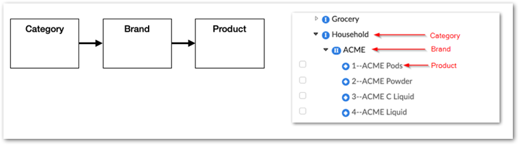
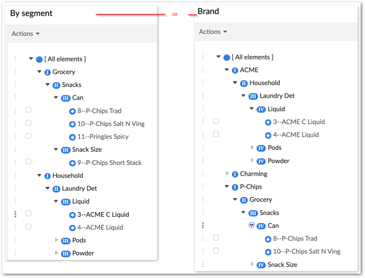
A hierarchy view displays your data in a tree-like representation. Use hierarchy views to visualize different relationships between data, or to group common values. To create a hierarchy view, you define a dimension that determines what data will be included and how it displays. Consider the following example and image where the dimension is Category --> Brand --> Product and displays Products by Brand by Category.
Hierarchy dimensions and members
Each hierarchy is defined by its dimension. The dimension is subdivided into dimension levels. Members are hierarchy nodes and represent a record, or a field value. A member can be a parent of other members, or a leaf node with no children. The table from which you create the hierarchy view is called the target table. Members of the target table are lowest-level leaves, except in the case of a recursive hierarchy.
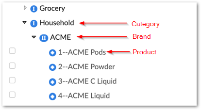
In the following image:
Grocery and Household are members of the Category dimension level. This is the top dimension level.
ACME is a member of the Brand dimension level and is at an intermediate level. A dimension can have many intermediate levels.
The individual products listed at the Product dimension level are leaf members from the target table. This is the bottom dimension level.
Creating a hierarchy view
This topic provides high-level instructions for creating a hierarchy view. See the following topics for additional details about creating views of specific hierarchy types:
To create a hierarchy view:
From the target table's Actions menu, select Create a new view.
After specifying the following information, click Next:
Add any view-related documentation such as a label and description.
Set access permissions.
For the View mode property, select Hierarchical view.
Use the Dimension box to define the hierarchy by working backwards through the dimension levels:
Bottom level: The members of this level are pre-determined based on the target table.
Intermediate levels: Start with the attribute that corresponds to the next highest dimension level and continue to expand until you navigate to the highest level.
Top level: Select the attribute corresponding to the top dimension level.
Review the required options and after making desired changes, click Next.
Specify labels, filters, and sort options for the members of each dimension level:
Navigate between dimension levels by selecting them in the breadcrumb at the top of the screen.
Make adjustments to labels, filters, and sort strategies as desired.
Click Save and quit to display the hierarchy view.
Ragged hierarchies
A ragged hierarchy includes members where their parent skips one level. An example of this type of hierarchy is shown by using the Country, State, and City dimension. Some countries do not have states, but they all have cities. In the case of the latter, the city members directly roll up to the Country dimension level.
Attention
A ragged hierarchy only supports skipping one level.
To display ragged hierarchies in EBX®:
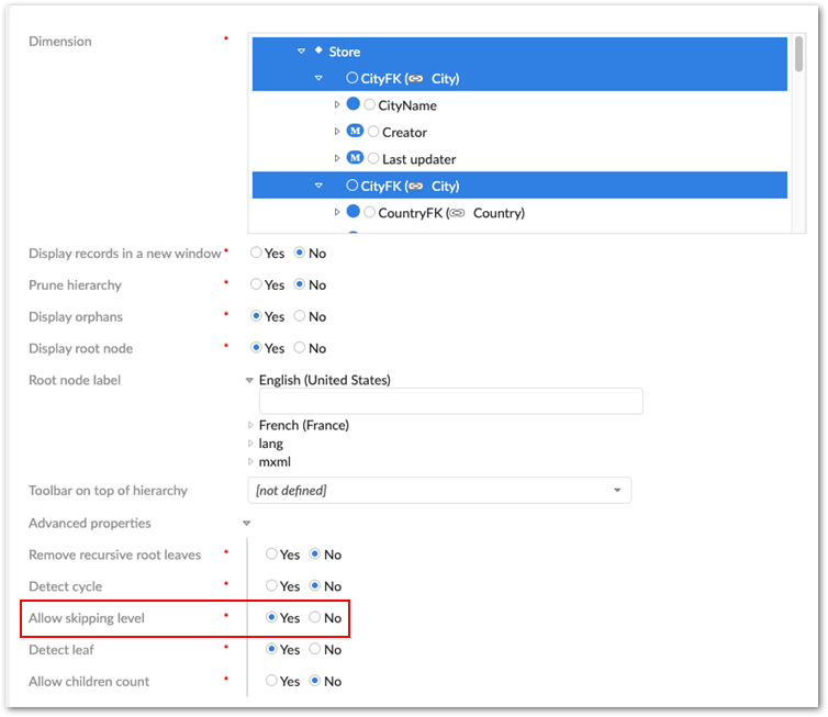
In the data model, you must define all foreign key relationships from the target table. Using the example above, the City table must hold a foreign key to the State and Country tables. Of course, for cities with no state, this field is left undefined.
When configuring your hierarchy view, enable the Allow skipping level option under Advanced properties. This property is highlighted in the image below:
Group by hierarchies
The dimension in a Group By hierarchy is defined using columns located in the same table. Allowed column data types are foreign keys or the following enumerable types: String, Integer, Enumeration, and Boolean. This provides a powerful tool for defining hierarchy views that group common values together. A group by hierarchy also provides flexibility when setting the order for dimension levels. For example, a Product table might include the following columns: Brand, Segment, Type, and Packaging. Use these columns in any order to show products by: Segment --> Type --> Packaging, or Brand --> Segment --> Type --> Packaging.
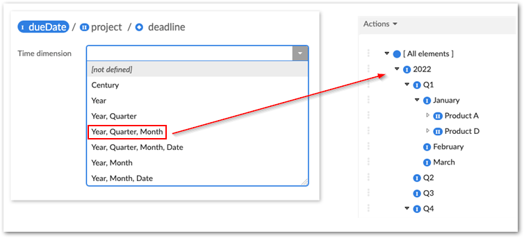
Time-based hierarchy dimensions
Use fields with a Date data type to define a time-based hierarchy dimension. When configuring the view, choose from several predefined display options. Some options subdivide the time into smaller units. For example, you can specify that a project's Due Date field is used to display all project deadlines by month in Q1 of 2022.
To use a time-based dimension in a hierarchy view:
Create a new hierarchy view configuration:
When viewing a table, open the View menu and select Create a new view.
Provide a name and optionally specify share options.
For the View mode, select Hierarchical view and click Next.
Ensure the field used for the hierarchy's root dimension is of the Date data type and click Next.
Click on the Date field at the top of the screen in the hierarchy structure breadcrumb and use the Time dimension menu to specify how you want the dimension to display.
Save and view the hierarchy.
Hierarchical view configuration options
This form allows configuring the hierarchical view options.
Display records in a new window | If 'Yes', a new window will be opened with the record. Otherwise, it will be displayed in a new page of the same window. |
Prune hierarchy | If 'Yes', hierarchy nodes that have no children and do not belong to the target table will not be displayed. |
Display orphans | If 'Yes', hierarchy nodes without a parent will be displayed. |
Display root node | If 'No', the root node of the hierarchy will not be displayed in the view. |
Root node label | Localized label of the hierarchy root node. |
Toolbar on top of hierarchy | Allows setting the toolbar on top of the hierarchy. |
Detect cycle | Allow cycle detection and display in a recursive case, the oldest node record will be chosen as the cycle root. Limitation: does not work in search or pruned mode. |
Detect leaf | Allows detecting whether the member is a leaf or not. The leaf detection is very costly for large volumes of data. Thus, it is recommended to disable this option when the query response is delayed to display the hierarchy view. This property is always disabled for orphans' parent members. |
Labels
For each dimension level that references another table, it is possible to define localized labels for the corresponding nodes in the hierarchy. The fields from which to derive labels can be selected using the built-in wizard.
Filter
The criteria editor allows creating a record filter for the view.
See also
Sort strategy
For each dimension level, it is possible to choose one of the following sort strategies:
Default | Nodes are sorted by label in alphabetical order |
Sort by columns | Nodes are sorted by selected column(s). The direction (ascending/descending) can be chosen for each column. |
Sort by ordering field | Nodes are sorted by a hidden numeric field, which allows users to dynamically change the order of sibling nodes in the hierarchy view. This strategy is available only if there is at least one 'Hidden' numeric field in the table. In order to enable this option, you must designate an eligible ordering field defined in the table on which the hierarchical view is applied. An ordering field must have the 'Integer' data type and have a 'Hidden' default view mode in its advanced properties in the data model definition. Except when the ordering field is in 'read-only' mode or when the hierarchy is filtered, any field can be repositioned. AttentionDo not designate a field that is meant to contain data as an ordering node, as the data will be overwritten by the hierarchical view. |
Actions on hierarchy nodes
Each node in a hierarchical view has a menu  containing contextual actions.
Leaf nodes can be dissociated from their parent record, using 'Detach from parent'. The record then becomes an orphan node in the tree, organized under a container "unset" node.
Leaf nodes can also change parent nodes, using 'Attach to another parent'. If, according to the data model, a node can have relationships to multiple parents, the node will be both under the current parent and added under the other parent node. Otherwise, the leaf node will be moved under the other parent node.
Quick search on hierarchy nodes
Quick search on hierarchy nodes is similar to the tabular view, except that it only applies to the records of the target table's nodes and on the fields defined for the node's label.
Below the Quick search tool there is a Quick search on all columns checkbox, which is unchecked by default. If you want it to default to checked, go to Advanced properties and enable the corresponding option. Please note that this option is disabled by default for performance reasons.
Tile views
This view displays records as tiles arranged in a grid. Each tile and can include the following information: Title (required), Subtitle, Image, and description. For the titles and description you can: select fields to automatically populate the values, manually specify the text that displays, or use a combination of both methods. Additionally, you can define sort and filter criteria that applies to the view. Toolbars can also be added. The following table lists and defines the properties available when creating a tile view:
Title | Defines the tile title displayed on first line. |
Subtitle | Defines the subtitle displayed on second line. |
Image | Defines the tile image. |
Image > Default image URL | Defines the fallback image URL. |
Image > URL | Defines the image URL. |
Image > Height (px) | Sets the height of the image slot in pixels (between 10 and 250). The slot width will always be 180 pixels. If the dimensions of the image exceed the size of the intended slot, it will be adjusted according to the cropping rules defined by the view. |
Image > Cropping | Defines the cropping of the image. If "Cover", the image will be scaled up or down so that occupy all the available space. In this case, the image might be truncated. If "Scale down", the image will be scaled down only if it overflows the available space. Whatever the value, the image will always be centered. |
Tile description | Defines the tile text. |
Tile description > Number of displayed lines | Defines the number of lines (between 3 and 6). |
Tile description > Line wrap | If "Yes", each row is displayed entirely (with line wrap) up to the defined limit of the number of lines. The excess is then truncated. If "No", each line is truncated. |
Tile description > Content | Defines the tile text content. |
Sort criteria | Specifies the sort order of records in the view. See Sorting data. |
Filter | Defines filters for the records to be displayed in this tile view. See Criteria editor. |
Toolbar on top of table | Defines the toolbar to use on top of this table view. |
Tile toolbar | Defines the toolbar to use on each item of this tile view. |
View sharing
Users having the 'Share views' permission on a view are able to define which users can display this view from their 'View' menu.
To do so, simply add profiles to the 'Share with' field of the view's configuration screen.
View publication
Users having the 'Publish views' permission can publish views present in their 'View' menu.
A published view is then available to all users via Web components, workflow user tasks, data services and perspectives. To publish a view, go to the 'View menu', click on the Edit button displayed on the mouseover of a listed view and add a 'Publication name' to the view.
Views management
Manage recommended views
When a user logs in with no view specified, their recommended view (if any) is applied. Otherwise, the default view is applied. The 'Manage recommended views' action allows defining assignment rules of recommended views depending on users and roles.
Available actions on recommended views are: change order of assignment rules, add a rule, edit existing rule, delete existing rule.
Thus, for a given user, the recommended views are evaluated according to the user's profile: the applied rule will be the first that matches the user's profile.
Note
The 'Manage recommended view' feature is only available to dataset owners.
'View' menu toolbar
The 'View' menu toolbar offers the following actions:
Edit | Click on the 'Edit' button of the targeted view's toolbar to access the editable form. |
Duplicate | Click on the 'Duplicate' button of the targeted view's toolbar to duplicate the view. The new view creation form pre-populates the field values from the view being duplicated. |
Delete | Click on the 'Delete' button of the targeted view's toolbar to delete the view. |
Define this view as my favorite | Click on the 'Define this view as my favorite' button of the targeted view's toolbar. The favorite view will automatically be applied when accessing the table. Click a second time on the button to remove the view as the user's favorite view. |
Grid edit
The grid edit feature allows modifying data in a table view. This feature can be accessed by clicking on the  button.
Accessing the grid edit from a table view requires that the feature be previously activated in the view configuration.
See also
Copy/paste
The copy/paste of one or more cells into another one in the same table can be done through the Edit menu. It is also possible to use the associated keyboard shortcuts Ctrl+C and Ctrl+V.
This system does not use the operating system clipboard, but an internal mechanism. As a consequence, copying and pasting a cell in an external file will not work. Conversely, pasting a value into a table cell won't work either.
All simple type fields using built-in widgets are supported.
History
The history feature allows tracking changes on master data.
The history feature must have been previously enabled at the data model level. See Advanced properties for tables for more information.
To view the history of a dataset, select Actions > History in the navigation pane.
To view the history of a table or of a selection of records, select Actions > View history in the workspace.
Several history modes exist, which allow viewing the history according to different perspectives:
History in current dataspace | The table history view displays operations on the current branch. This is the default mode. |
History in current dataspace and ancestors | The table history view displays operations on the current branch and on all its ancestors. |
History in current dataspace and merged children | The table history view displays operations on the current branch and on all its merged children. |
History in all dataspaces | The table history view displays operations on the whole branch hierarchy. |
In the history view, use the VIEW menu in order to switch to another history mode.
See also
 User guide table of contents