|
| Copyright © Cloud Software Group, Inc. All Rights Reserved |
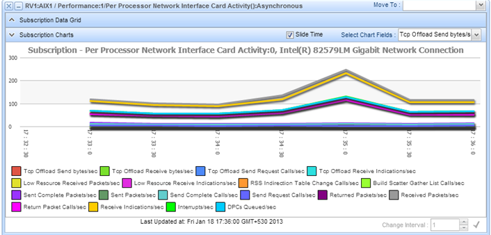
You can view the results of a method subscription in a data grid or as a chart. These viewing modes are useful for identifying patterns over time.To view a results of a subscription, we will continue working on the same example used to subscribe to a microagent method.
1. The Subscription Results window (Figure 19) has two viewing options:
− Subscription Data Grid: Displays the subscription results in tabular form.
− Subscription Charts: Displays the subscription results in form of charts.
If the Subscription Results windows contains more than one row, each row usually describes one instance in a set — one storage device, one process, one application.
2. Click the Subscription Data Grid window title bar to view the tabular results of the subscription. The subscription results appear at regular intervals (if the method you called was synchronous) or as information becomes available (if the method you called was asynchronous).When new results are retrieved, they replace the previous results in the dialog. Over time, the values will fluctuate in all fields except Instance.
3. Select the Update same line checkbox to view the subscription results updates in the same line. This feature can be used for microagents that return subscription results in a single row (as composite data). If the Update same line is not checked, the subscription results are displayed in multiple rows.
4. Click the Subscription Charts window title bar to view the subscription results as a chart.
5. The Subscription Charts window title bar has the Select Chart Fields drop-down list. Select the rows to chart on the Select Chart Fields drop-down list by selecting the row checkbox. Subscribed data begins to appear in the charts.Data points are added dynamically, as they are returned by the method. The chart automatically assigns a range to the Y axis based on the values collected; the X axis always represents time.Since the field to chart is a numeric result field, both Chart View and Tabular View tabs are active. If the result contained only text, you would see a table.
7. Select the Slide Time checkbox to see the graphs in a sliding window with the facet representing time sliding. If the Slide Time checkbox is cleared, you can see a consolidated average result over all time periods in the window.
8. To change the data interval use the Change Interval text box. You can either type a new value or change the value using the spinner.
9. Click theicon to apply the changes.
|
| Copyright © Cloud Software Group, Inc. All Rights Reserved |