Note that you can display either buttons with text on them, or icons, in the Mode Selection section by clicking on the arrow between the
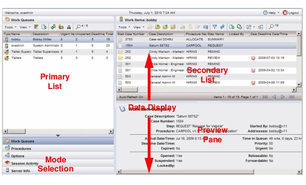
Primary List and
Mode Selection sections:
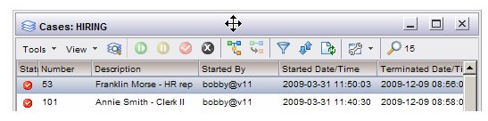
This section always contains either the work queue list or procedure list, depending on the selection made in the Mode Selection section. If one of the other mode selections are made (Options, Session Activity, or Server Info), this section will still display either the procedure or work queue list, whichever was most recently selected.
If you select a mode other than Work Queues or
Procedures, this list is overlaid with the options, session activity, or server info, depending on which you select.
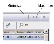
The work item and case lists provide a Preview icon that can be used to turn off the
Preview Pane, which causes the
Secondary List to encompass the entire right side of the screen.
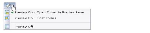
Both of these cause the Preview drop-down menu to be displayed:
Preview menu from the work item list:
When you open (double-click) a work item or case, the work item form or case details are also displayed in the Preview Pane. (Note - You may not be able to open a work item form in the Preview Pane, depending on the type of work item form your application uses — for more information, see
Work Item Form Location.)
If you are choosing to display the work item form in a separate floating window, the separate floating window may be either a dialog or a new browser window, depending on the setting of a user option for the logged-in user — for more information, see
Floating Work Item Form Window. (Note - You may not be able to open a work item form in a separate dialog (it may have to be a separate browser window), depending on the type of work item form your application uses — for more information, see
Work Item Form Location.)
Selections you make on the Preview menu are
not persistent; the next time you log in, the
Preview menu setting defaults to the setting in user options. For more information, see
Work Item Preview Default and
Case Preview Default.
From the work item or case list, you can display a separate floating window containing whatever information is currently displayed in the Data Display section. This allows you to create multiple views of the same list, or to view details about multiple work items or cases from the same list simultaneously.
A separate floating window is displayed containing the same information currently in the Data Display section. This floating window is always opened as a separate dialog within the application (rather than as a new browser window).
To close a floating window, click in the x in the upper right corner of the floating window.

 icon on the work item or case list, or
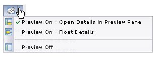
 icon.
icon.