This widget is used to show the distribution of the total count of a selected column over its distinct values.
| Field
|
Description
|
| Query
|
Enter a search query. Enter USE to start an EQL statement and SELECT to start an SQL statement. You can search based on filter and time Bloks as well.
|
| Time
|
You can enter absolute and relative time ranges. Click
 to open a window that allows you to define a time range. to open a window that allows you to define a time range.
For example, enter -5h to display results that occur in the last 5 hours.
|
| X-axis
|
Define the column name. If the column names are already defined in the search query, the X-axis column is auto-populated. Otherwise, as you start typing in the field, the available matching column names are displayed. Choose the column name to define the X-axis of the line chart.
|
| X-axis label
|
Define the label name for the X-axis that is displayed on the chart.
|
| Y-axis
|
Define the column name. If the column names are already defined in the search query, the Y-axis column is auto-populated. Otherwise, as you start typing in the field, the available matching column names are displayed. Choose the column name to define the Y-axis of the line chart.
|
| Y-axis label
|
Define the label name for the Y-axis that is displayed on the chart.
|
| Categorize by
|
Define the column name by which the Y-axis data is combined into a series.
|
| Show Average
|
Select the check box if you want to show the average in the line format.
|
| Show Total
|
Select the check box if you want to show the total in the pie format.
|
| Auto refresh
|
Click the slider to ON to refresh the widget. By default, it is set to OFF.
|
| Refresh widget
|
Enter a time interval to refresh the widget. Refresh action starts after the data is completely retrieved and displayed.
|
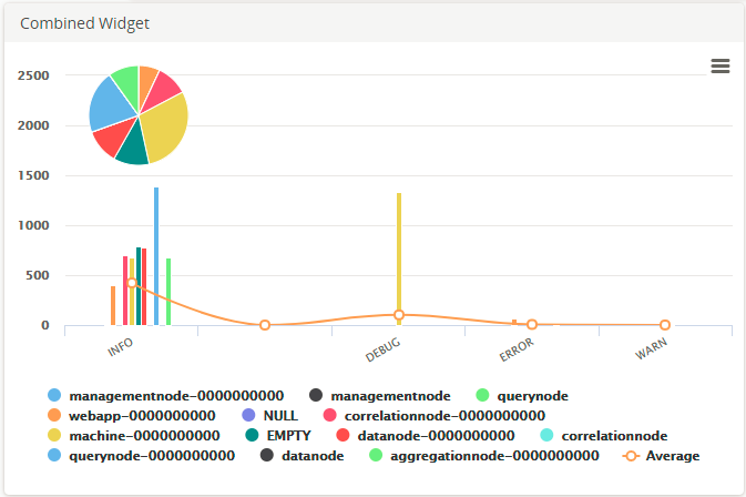
For the search query:
USE LogLogic_Logu GROUP BY ll_node | COLUMNS ll_node, count(*)
the X-axis is ll_node, the Y-axis is count (*), and Categorize by is ll_node.
The Combined Widget displays the pie, bar graph, and line graph for the results of the query. The pie and bar graphs display the values by the selected X-axis. The line graph joins the average values in each category. To calculate the average values, the sum of the Y-axis values is divided by the total number of items on the category.
The following figure is an example of a Combined widget: