Heat Map Widget
This widget is used to visualize various thresholds in the form of a colored heat map.
Use the following information to configure the widget:
| Field | Description |
|---|---|
| Fetch data from source | |
| Query | Enter a search query.
You can search based on filter and time Bloks as well. After you enter the search query, the columns from the query are used as field options in the For more information about EQL search syntax, see Event Query Language Reference. |
| Date & Time | You can enter absolute and relative time ranges.
For example, enter -5h as a relative time range to display results for events that occurred in the past 5 hours. For more information and examples, see Time Range Expressions. |
| X-axis data | Select the column name to define the X-axis. |
| Y-axis data | Select the two columns to define the Y-axis of the widget. |
| Tile Value | Select the column name by which the treemap tile is to be represented. The value of this column is used for the size of the tile.
If the column names are already defined in the search query, the Tile Value column is automatically filled. Otherwise, as you start typing in the field, the available matching column names are displayed. |
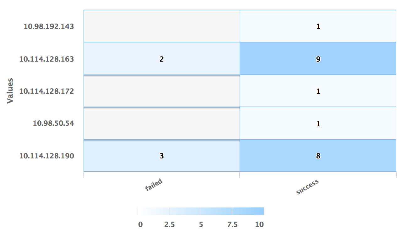
| Use Color Axis | In the
Min Color and
Max Color fields, specify the range of minimum and maximum values of the color to be represented on the axis.
To get the right color spread for the tile values, you must adjust the color axis. |
| Use Color Threshold | Define the threshold range for the colors on the heat map.
|
| Use Color Value | Define the column name by selecting the column. The color represented by the Use Color Value field is used to color the tiles on the chart.
To return specific color values, you can use Enrichment List or EQL Conditional functions such as IIF in the query. If this field is specified, the Use Color Axis field is ignored. |
| Widget description | Enter a short description for the widget. The description is displayed on the Advanced Dashboard when you hover over the widget. |
| Auto load | Turn on the toggle to automatically load widget data on the Advanced Dashboard as soon as you save the widget or when you navigate to the dashboard. Disabling the Auto load option also disables the Auto refresh option. However, you can manually refresh the widget on the Advanced Dashboard to load its data. Default:
|
| Auto refresh | Turn on the toggle to refresh the widget every few seconds. This setting is enabled only if the Auto Load option is enabled. Default: OFF |
| Refresh widget every | If Auto refresh is set to ON, then enter a time interval in seconds to refresh the widget. Refresh action starts after the data is completely retrieved and displayed. |
Examples
For the search query:
use LogLogic_Appliance | GROUP BY ll_eventStatus, ll_sourceIP | COLUMNS ll_eventStatus, ll_sourceIP, count(*) as count | ll_eventStatus is NOT NULL | (ll_eventStatus != '')
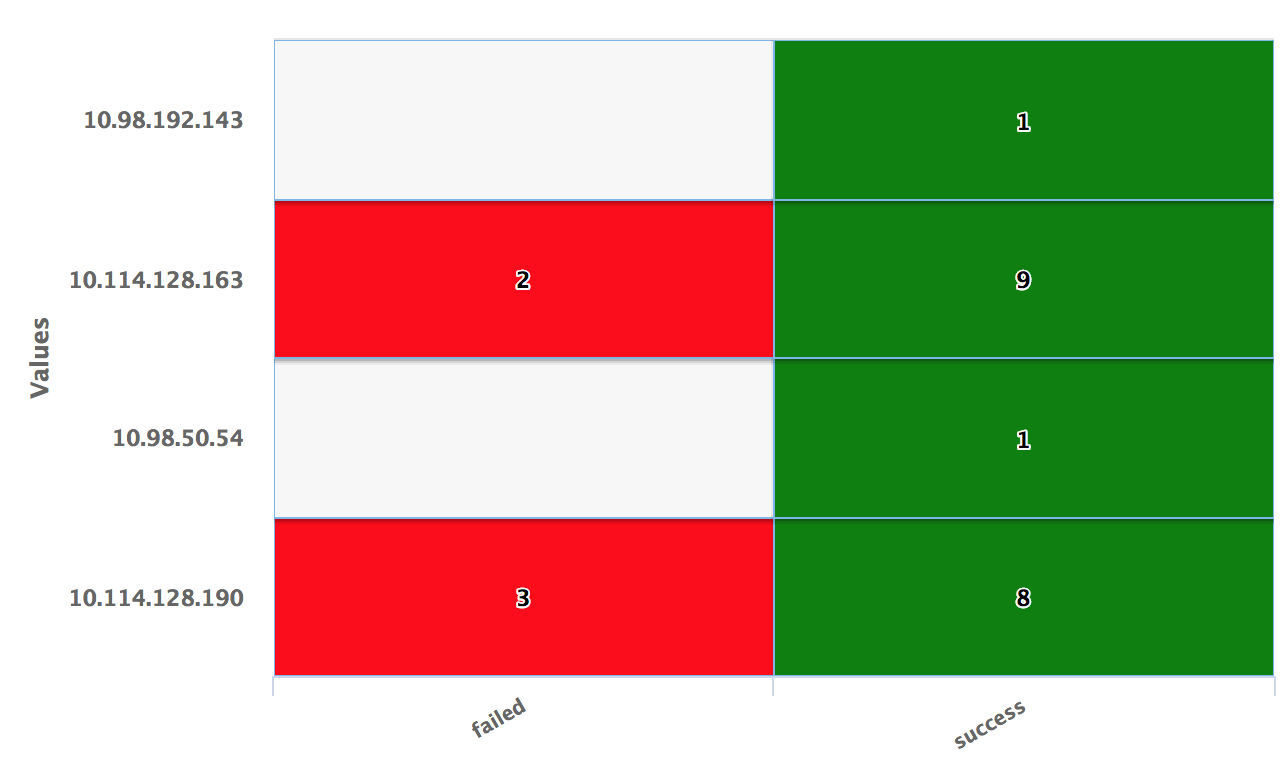
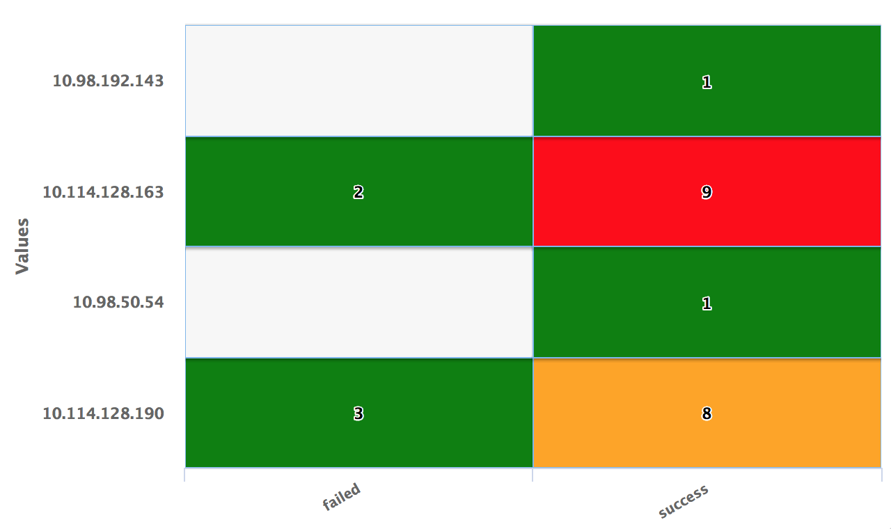
the X-axis is ll_eventStatus and the Y-axis is ll_sourceIP
The following are examples of a Heat widget:
- Using default values of color axis
- Using threshold values 4 and 8


For the search query:
use LogLogic_Appliance | GROUP BY ll_eventStatus, ll_sourceIP | COLUMNS ll_eventStatus, ll_sourceIP, count(*), IIF(ll_eventStatus ='failed', 'red', 'green') AS color | ll_eventStatus is NOT NULL | (ll_eventStatus != '')