| Query
|
Enter a search query. Enter USE to start an EQL statement and SELECT to start an SQL statement. You can search based on filter and time Bloks as well.
|
| Time
|
You can enter absolute and relative time ranges. Click
 to open a window that allows you to define a time range. For example, enter -5h to display results that occur in the last 5 hours. to open a window that allows you to define a time range. For example, enter -5h to display results that occur in the last 5 hours.
|
| X-axis
|
Define the column name. If the column names are already defined in the search query, the X-axis column is auto-populated. Otherwise, as you start typing in the field, the available matching column names are displayed. Choose the column name to define the X-axis of the line chart.
|
| Y-axis
|
Define the column name. If the column names are already defined in the search query, the Y-axis column is auto-populated. Otherwise, as you start typing in the field, the available matching column names are displayed. Choose the column name to define the Y-axis of the line chart.
|
| Tile Value
|
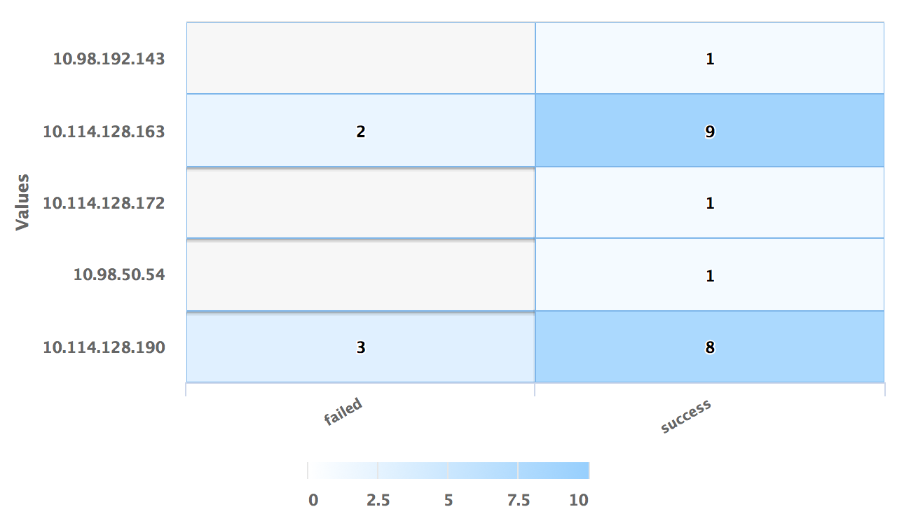
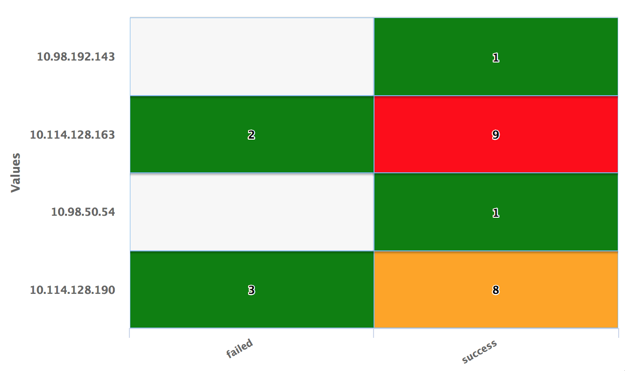
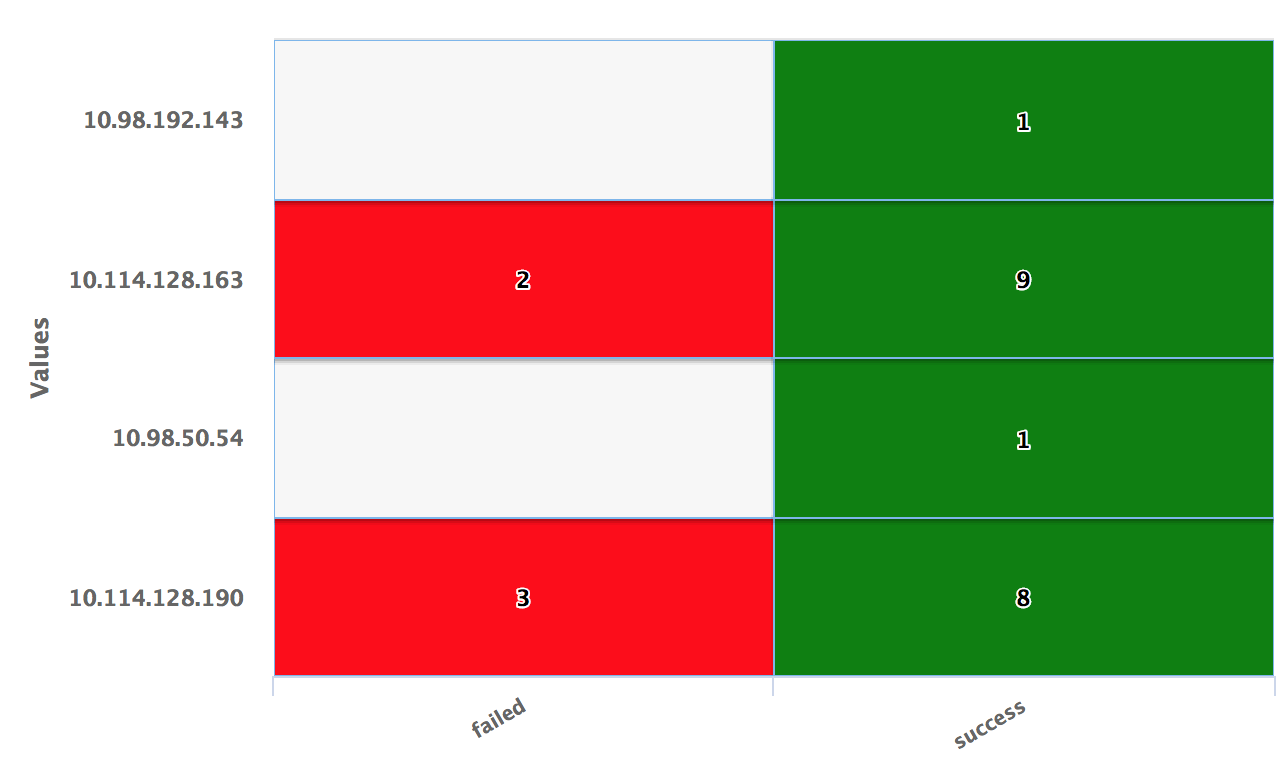
Define the column name by which the heat map tile will be represented. The value of this column is displayed as a tile.
|
| Use Color Axis
|
In the
Min Color and
Max Color fields, specify the range of minimum and maximum values of the color to be represented on the axis.
The color axis needs to be adjusted to get the right color spread for the tile values.
|
| Use Color Threshold
|
Define the threshold range for the colors on the heat map. When the Tile Value is below the threshold range, the tile color will be green and when the Tile Value is above the threshold range, the tile color will be red. If the Tile Value is in between the threshold range, the tile color will be orange.
|
| Use Color Value
|
Define the column name by selecting the column. The color represented by the Use Color Value field will be used to color the tiles on the chart.
You can use Enrichment List or EQL Conditional functions such as IIF in the query to return specific color values.
If this field is specified, the Use Color Axis field is ignored.
|
| Auto refresh
|
Click the slider to ON to refresh the widget. By default, it is set to OFF.
|
| Refresh widget
|
Enter a time interval to refresh the widget. Refresh action starts after the data is completely retrieved and displayed.
|