| Query
|
Enter a search query. Enter USE to start an EQL statement or SELECT to start an SQL statement. You can search based on filter and time Bloks as well.
|
| Date & Time
|
You can enter absolute and relative time ranges.
For example, enter -5h as a relative time range to display results that occur in the last 5 hours.
|
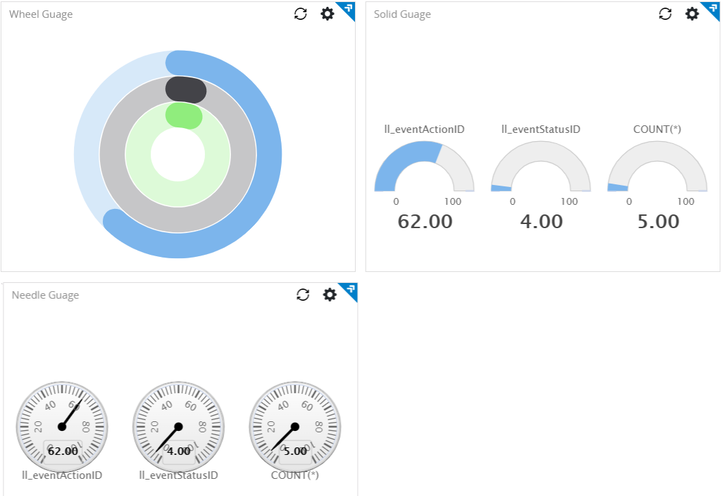
| Gauge type
|
Select the type of gauge:
The default is Needle.
|
| Show value of
|
Choose the columns to be displayed. You can select up to three columns, of numeric type.
For Needle and Solid types, if you select more than one column, multiple charts are displayed, one per selected column.
For the Wheel type, one chart is displayed, and the selected columns are displayed as concentric circles.
|
| Unit label
|
Type the desired unit.
|
| Range
|
Specify the range values to define the size of the gauge chart and the range of each threshold slider.
|
| Threshold
|
If the Threshold check box is selected, then you can define the threshold value. The color on the chart depends on the threshold values.
- When the number is less than or equal to the minimum threshold value, the color changes to green.
- When the number is greater than the minimum threshold value but less than or equal the maximum threshold value, the color changes to yellow.
- When the number is higher than the maximum threshold value, the color changes to red.
|
| Auto refresh
|
Click the slider to ON to refresh the widget. By default, it is set to OFF.
|
| Refresh widget every
|
If Auto refresh is set to ON, enter a time interval in seconds to refresh the widget. Refresh action starts after the data is completely retrieved and displayed.
|