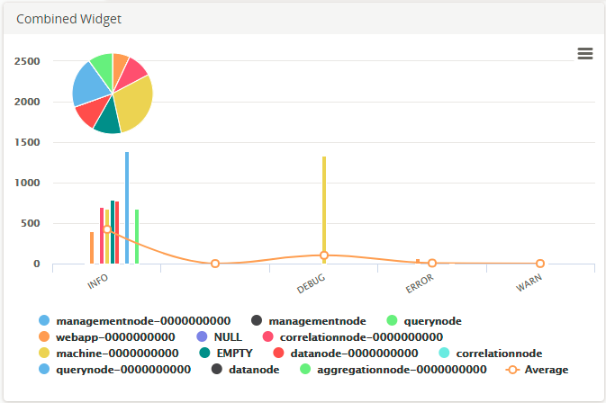
This widget is used to show the distribution of the total count of a selected column over its distinct values.
| Field
|
Description
|
| Query
|
Enter a search query. Enter USE to start an EQL statement or SELECT to start an SQL statement. You can search based on filter and time Bloks as well.
|
| Date & Time
|
You can enter absolute and relative time ranges.
For example, enter -5h as a relative time range to display results for events that occur in the last 5 hours.
|
| X-axis data
|
Choose the column name to define the X-axis.
|
| X-axis label
|
Define the label name for the X-axis that is displayed on the widget.
|
| Y-axis data
|
Choose the column name to define the Y-axis.
|
| Y-axis label
|
Define the label name for the Y-axis that is displayed on the widget.
|
| Categorize by
|
Define the column name by which the Y-axis data is combined into a series.
|
| Show Average
|
Select the check box if you want to show the average in the line format.
|
| Show Total
|
Select the check box if you want to show the total in the pie format.
|
| Widget description
|
A short description for the widget. On the Advanced Dashboard, the description is displayed when you hover over the widget.
|
| Auto load
|
Click the slider to ON to automatically load widget data on the Advanced Dashboard.
- By default, it is disabled for newly created widgets, but enabled for the widgets created in
LogLogic LMI 6.3.0 and earlier.
- Disabling the
Auto load option disables the
Auto refresh option. However, you can manually refresh the widget on the Advanced Dashboard to load its data.
|
| Auto refresh
|
Click the slider to ON to refresh the widget. By default, it is set to OFF.
|
| Refresh widget every
|
If Auto refresh is set to ON, enter a time interval in seconds to refresh the widget. Refresh action starts after the data is completely retrieved and displayed.
|
The Combined Widget displays the pie, bar graph, and line graph for the results of the query. The pie and bar graphs display the values by the selected X-axis. The line graph joins the average values in each category. To calculate the average values, the sum of the Y-axis values is divided by the total number of items on the category.
Hover your mouse over the widget to view the value at that point. Clicking the value opens the search results of that value on an Advanced Search tab. However, if you click on the average line in the widget, the Advanced Search tab displays search results for the entire query.
To view the line and bar graphs properly, you can drag the pie to any area of the widget.

