Bubble Widget
This widget displays data as a bubble chart or scatter plot. In a bubble chart, three dimensions of data are displayed - data from two columns is displayed on the x- and y-axes, and data from the third column is displayed through a bubble. In a scatter plot, two dimensions of data are displayed, and a third dimension can be displayed by coloring the points with different colors.
Use the following information to configure the widget:
| Field | Description |
|---|---|
| Fetch data from source | |
| Query |
Enter a search query.
You can search based on filter and time Bloks as well. After you enter the search query, the columns from the query are used as field options in the For more information about EQL search syntax, see Event Query Language Reference. |
| Date & Time | You can enter absolute and relative time ranges.
For example, enter -5h as a relative time range to display results for events that occurred in the past 5 hours. For more information and examples, see Time Range Expressions. |
| Bubble type |
|
| X-axis data | Select the column name to define the X-axis. |
| X-axis label | Define the label name for the X-axis that is displayed on the widget. |
| Y-axis data | Select the two columns to define the Y-axis of the widget. |
| Y-axis label | Define the label name for the Y-axis that is displayed on the widget. |
| Bubble weight |
Select the column to be displayed as bubbles. The size of the bubble is proportionate to the column value. |
| Buffer size | Enter the number of rows to be displayed in the widget after refreshing the widget. For example, if the buffer size is 100 and the query returns 150 results, the latest 100 results are displayed.
Default: 1000 rows |
| Use bubble color | Select the color of the bubbles or scatter points on the widget. Click the color value to change the color. |
| Use color threshold | Define the threshold range for the colors on the widget. |
| Use color value |
Define the column name by selecting the column. You can use an Enrichment List or EQL conditional functions such as
|
| Widget description | Enter a short description for the widget. The description is displayed on the Advanced Dashboard when you hover over the widget. |
| Auto load |
Turn on the toggle to automatically load widget data on the Advanced Dashboard as soon as you save the widget or when you navigate to the dashboard. Disabling the Auto load option also disables the Auto refresh option. However, you can manually refresh the widget on the Advanced Dashboard to load its data. Default:
|
| Auto refresh |
Turn on the toggle to refresh the widget every few seconds. This setting is enabled only if the Auto Load option is enabled. Default: OFF |
| Refresh widget every | If Auto refresh is set to ON, then enter a time interval in seconds to refresh the widget. Refresh action starts after the data is completely retrieved and displayed. |
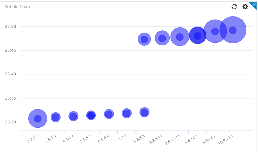
Example of bubble chart
For the search query:
USE General_Syslog | GROUP BY sys_collectIP , sys_eventTimethe X-axis is
sys_collectIP, Y-axis is
sys_eventTime, and Bubble value is
count(*).
Example of scatter plot
For the search query:
USE General_Syslog | GROUP BY sys_collectIP, sys_deviceTypethe X-axis is
sys_collectIP and Y-axis is
count(*).
