Combined Widget
This widget is used to show the distribution of the total count of a selected column over its distinct values.
Use the following information to configure the widget:
| Field | Description |
|---|---|
| Fetch data from source | |
| Query |
Enter a search query.
You can search based on filter and time Bloks as well. After you enter the search query, the columns from the query are used as field options in the For more information about EQL search syntax, see Event Query Language Reference. |
| Date & Time | You can enter absolute and relative time ranges.
For example, enter -5h as a relative time range to display results for events that occurred in the past 5 hours. For more information and examples, see Time Range Expressions. |
| X-axis data | Select the column name to define the X-axis. |
| X-axis label | Define the label name for the X-axis that is displayed on the widget. |
| Y-axis data | Select the two columns to define the Y-axis of the widget. |
| Y-axis label | Define the label name for the Y-axis that is displayed on the widget. |
| Show Average | Select the check box to show the average in the line format. |
| Show Total | Select the check box to show the total in the pie format. |
| Categorize by | Define the column name by which the Y-axis data is combined into a series. |
| Widget description | Enter a short description for the widget. The description is displayed on the Advanced Dashboard when you hover over the widget. |
| Auto load |
Turn on the toggle to automatically load widget data on the Advanced Dashboard as soon as you save the widget or when you navigate to the dashboard. Disabling the Auto load option also disables the Auto refresh option. However, you can manually refresh the widget on the Advanced Dashboard to load its data. Default:
|
| Auto refresh |
Turn on the toggle to refresh the widget every few seconds. This setting is enabled only if the Auto Load option is enabled. Default: OFF |
| Refresh widget every | If Auto refresh is set to ON, then enter a time interval in seconds to refresh the widget. Refresh action starts after the data is completely retrieved and displayed. |
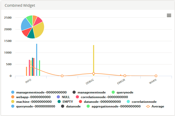
The Combined Widget displays the pie, bar graph, and line graph for the results of the query. The pie and bar graphs display the values by the selected X-axis. The line graph joins the average values in each category. To calculate the average values, the sum of the Y-axis values is divided by the total number of items on the category.
Hover your mouse over the widget to view the value at that point. Clicking the value opens the search results of that value on an Advanced Search tab. However, if you click on the average line in the widget, the Advanced Search tab displays search results for the entire query.
To view the line and bar graphs properly, you can drag the pie to any area of the widget.
Example
For the search query:
USE LogLogic_Logu GROUP BY ll_node | COLUMNS ll_node, count(*)the X-axis is
ll_node, the Y-axis is
count (*), and Categorize by is
ll_node.