Alerts Heat Map
The heat map is a graphical representation of alerts and notifications in the entire monitoring ecosystem (across agents and domains).
TIBCO OI Hawk RedTail UI Alerts heat map
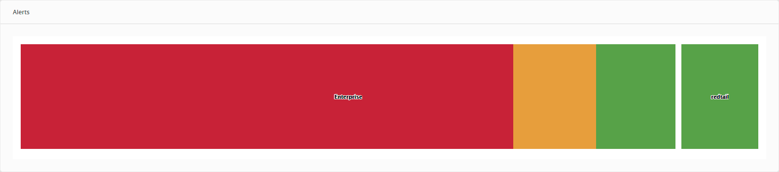
The color of the individual segment in the map represents different alert levels. The size of the individual segment is directly proportional to the number of alerts/notifications of that type. The color scheme of the alerts indicate the following type of alerts:
| • | [Red] High |
| • | [Orange] Medium |
| • | [Yellow] Low |
| • | [Green] Notification |
Heat Map Hierarchy
Heat map implementation in TIBCO OI Hawk RedTail UI is a treemap representation. The treemap charts display hierarchical data in a set of nested rectangles. You can click any rectangle to drill down to its nested levels. A rectangle’s size is directly proportional to the specified dimension of the data.
The levels of hierarchy (from higher to lower level) in TIBCO OI Hawk RedTail UI are:
| • | Hawk domain |
| • | Hawk agent |
| • | Alert level |
Drill Down Capability
The top-level heat map shows all alerts for all the agents in the domain. You can drill down to any level of the hierarchy (dimension) to see the details. You can further drill down to an agent in the domain to see all alerts in expanded view. You can drill down to the last level in the hierarchy, which is the segment for Alert category for an agent. Clicking the segment opens the Agent Alerts Details page filtered with the Alert Category.
Heat Map Autoupdates
The heat maps are autoupdated after every 20 seconds. If the agent previously had less number of high alerts, the size of high alerts segment for the agent was small as compared with other segments. However, if the agent starts generating a large number of high alerts, then the size of high alerts segment for the agent starts growing dynamically and all other segments in the entire heat map are automatically adjusted.