Integration Topology
The Integration Topology view gives you quick insight into your entire integration landscape. This provides you with a quick helicopterview of your entire information architecture. From the various entities in this view, you get quick access to more detailed information linked to these entities, like Documentation, APIs, Deployments, and more.
The integration topology is built on top of Backstage's catalog graph plug-in. It customizes the node and edge labels to help visualize the relationships between entities, such as ownership, grouping, or API connections. Additionally, it provides detailed information about entities including type, name, description, documentation, source code, deployment status, and more. This makes catalog exploration productive and efficient directly within the topology view.
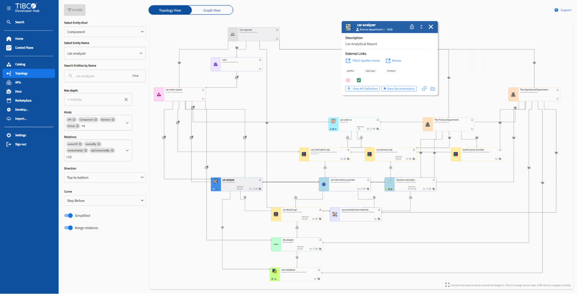
Topology Page showing a complex system can be used to explore entity information and relationships.
You can access and explore the topology view in two ways:
Topology Page
A standalone page that can be accessed via the side panel link. It provides a visualizer for your entities and their relationships. The viewer allows navigation through the catalog by selecting entity types or kinds, searching by entity name, or filtering for specific relationships. It also provides a switcher to switch between detailed topology view and classic graph view.
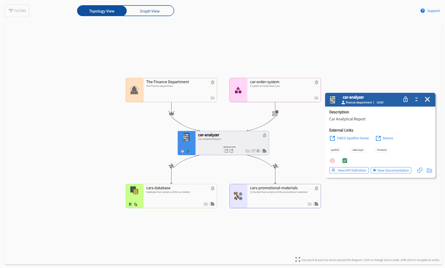
Topology view showing entity details and relationships
Topology Page showing a component with various filters to explore entity information and relationships

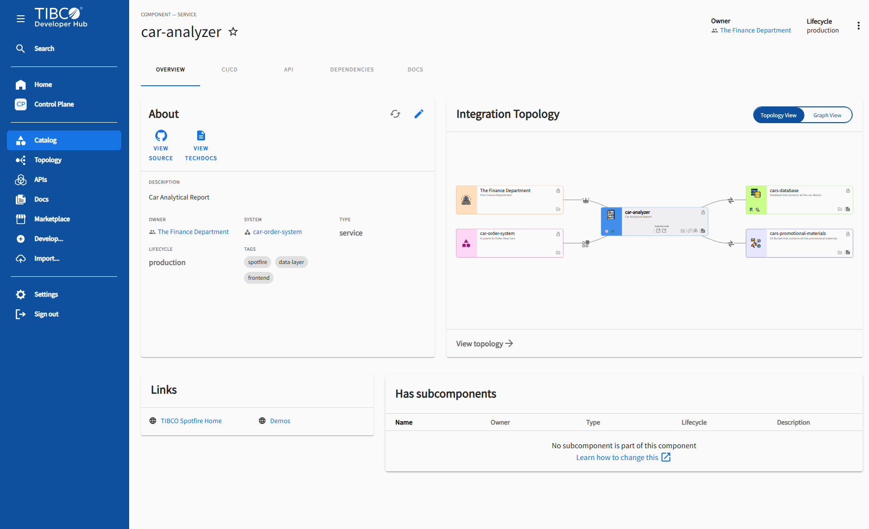
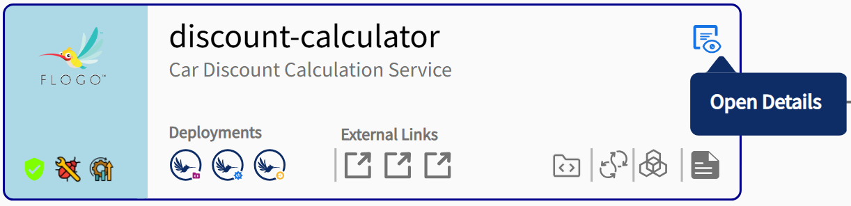
Entity Details Page
The entity details page has a card that displays the topology view of the current entity and its directly related entities. It also includes a view switcher to toggle between topology view and graph view and a link called View topology that navigates to the Topology page where users can explore the entity relationships in detail.
Integration topology card embedded in the entity details page
A zoomed-in entity node displays detailed information about its components and the links available for the user to explore further.
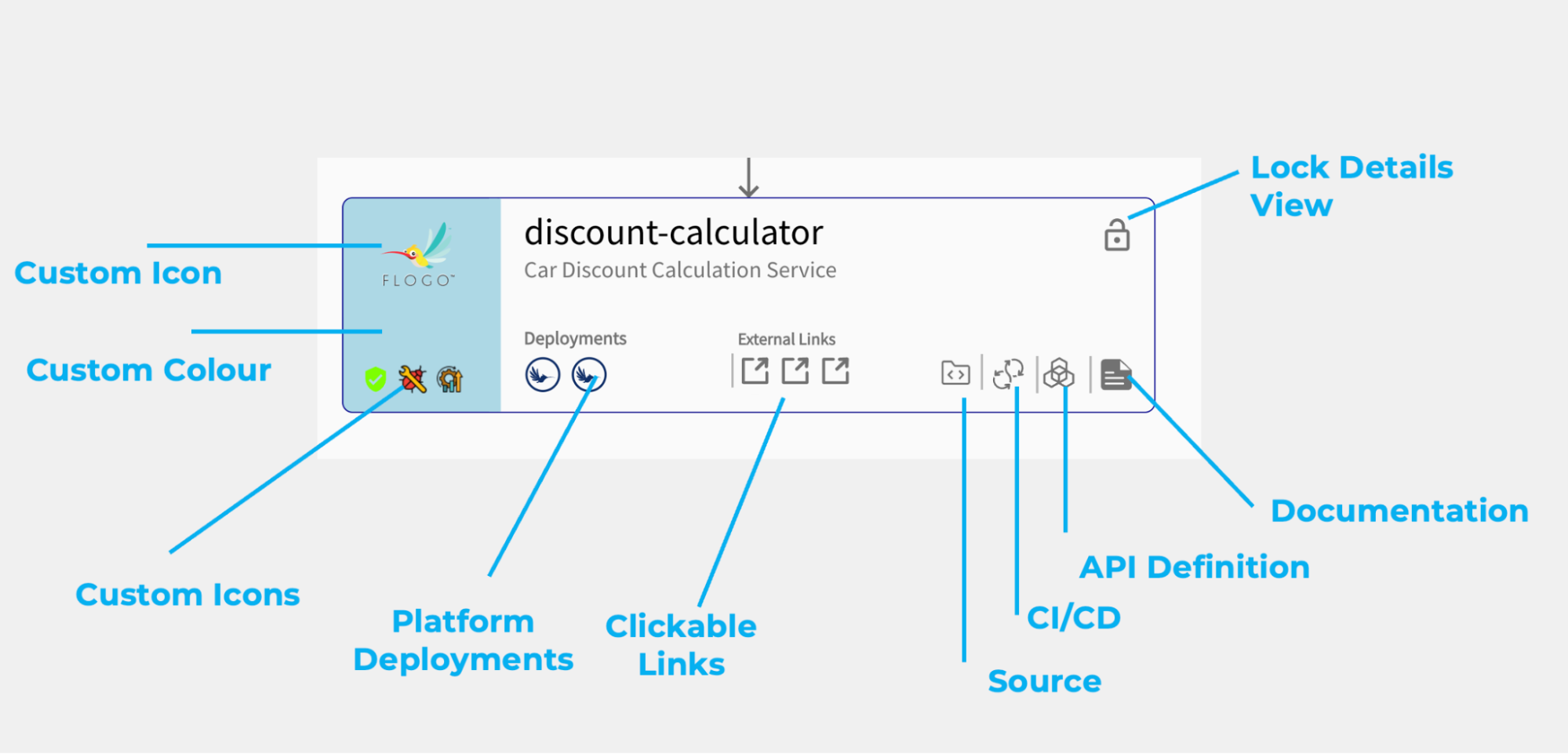
When the lock detailed view is clicked, the detail view does not change on hovering, also when the details view is closed it can be retrieved again from this place.
Theme Customization
The Topology Entity Node UI offers theme customization, entity icon customization, and status icon customization. All three customizations are optional and can be provided individually or together.
To customize, update the catalog YAML for the entity as follows:
apiVersion: backstage.io/v1alpha1
kind: Component
metadata:
  name: 'component-name'
  description: 'A description'
  tibco.developer.hub/topology: # Optional
    theme: # Optional - Provide either name or colors. If both are provided, colors will override the chosen theme.
      name: 'purple' # Optional | Choose from the theme colors below or add custom colors using the `colors` property.
      colors: # Optional - Can provide either one or both.
        background: 'hsla(203, 100%, 78%, 1)' # Optional - Can use CSS color codes or named colors (https://developer.mozilla.org/en-US/docs/Web/CSS/named-color).
        iconColor: 'hsla(233, 100%, 33%, 1)' # Optional
    entityIcon: # Optional
      icon: 'cloud' OR 'path/to/link1/icon.svg' # Material v4 icon name OR custom image (requires URL - can be of type SVG, PNG, or JPEG).
      iconTooltip: 'Entity Icon' # Optional
    statusIcon: # Optional - List of icons.
      - icon: 'VerifiedUser' # Material v4 icon name OR custom image (requires URL - can be of type SVG, PNG, or JPEG).
        iconColor: 'hsla(101, 78%, 41%, 1)' # Optional
        iconTooltip: 'Security Scan Passed' # Optional
      - icon: 'path/to/status/icon.svg' # Material v4 icon name OR custom image (requires URL - can be of type SVG, PNG, or JPEG).
        iconColor: 'darkorange' # Optional
        iconTooltip: 'Status Icon' # Optional
  spec:
    type: service
    lifecycle: experimental
    owner: owner-name
Provided Theme Colors
The following theme colors are available:
-
pink
-
orange
-
yellow
-
green
-
pastelGreen
-
purple
-
navy
-
blue