![]() |
Copyright © TIBCO Software Inc. All Rights Reserved |
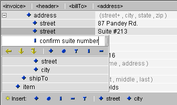
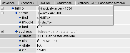
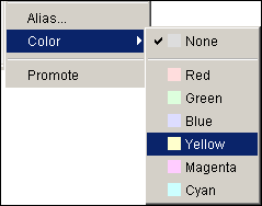
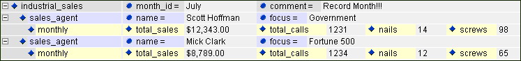
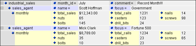
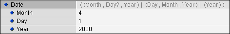
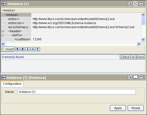
When an Instance resource is selected within your project, a series of new panels, toolbar buttons, and menus options are provided to facilitate the schema-driven creation, editing, and navigation of the resource. The editing environment for instance resources, shown in Figure 75 is described in this chapter.Figure 75 XML Instance Editing Environment
Table 37 Configuration Tab Field This is the name of the file when persisted. The *.xml suffix will be automatically added.For a description of the buttons that appear on the toolbar when editing Instance resources, see Toolbar Buttons.
The content panel provides the primary editing area and loads by default when an Instance resource is selected in the project panel. The content panel consists of a left-hand listing of the elements and attributes (tag area) and a right-hand area for inserting values for the elements and attributes (edit area). The content panel also has a navigator bar for navigating throughout the document and a factory bar for adding new elements, attributes, processing instructions, comments, and text. The content panel is shown in Figure 76.Figure 76 Content Panel
Table 38 Tag Area Components Within the tag area, double click an element to generate a drop down box. This box will always contain an empty box with a series of icons below which, when selected, determine the type (element, attribute, and so on) and location (child, sibling, parent) of the node to be entered. (The insertion default is an element sibling.) If the document is based on a schema, any elements and attributes available based on the schema's content models will also be appear in the insert box, and can be added with single mouse click. Note in Figure 77 that the elements appearing the drop down box are marked by various indentions which represent their relationship to the selected element. In this case, street and city are siblings to the selected element, street, and hence, appear along the same vertical line. The elements shipTo and item appear to the left of the selected item, indicating parent and grand-parent relationships, respectively.Figure 77 Insert BoxIn Figure 77, a name (suiteNumber) for a new sibling element for street has been entered into the text box. With a single click on the appropriate icon, this new entry can be changed from an element into an attribute, text, comment, or processing instruction. When you are finished entering and defining your new tags, either hit tab or enter to complete the entry.
The factory bar at the bottom of the content panel, provides another option for entering new items to the tag area. The factory bar is shown in Figure 78.Figure 78 Factory BarThe factory bar also facilitates the insertion of new elements and attributes, as well as new comments, processing instructions, and text. Click the blue icon representative of the item you would like to add to launch the Insert box described above. Figure 79 illustrates the insert box which appears after clicking on the comment icon on the factory bar.Figure 79 Inserting a CommentA right button menu, shown in Figure 80, provides the basic cut, copy, paste, clear and rename functions to enable you to make changes to the elements and attributes within the tag area. (For an explanation of the other options on this menu, see Creating a Customized View of the Tag Area.)Figure 80 Right Button MenuYou can also use your mouse to quickly change the positioning of elements and attributes appearing in the tag area. This “drag and drop” editing can be used to change the structure of your document or simply to change the view of your document. (For more information, see Promoting elements and attributes). To move an element or attribute, left click on the blue icon which appears to the left of the tag. Holding down the left mouse button, drag the item to its new position and release the mouse button. If your document is dependent on a schema, be sure to use the Errors button on the toolbar to determine if the move is permitted by the schema.When creating an XML document based on a schema, the tag area facilitates data entry into the edit area by providing a guide to the type of data that is required by the schema. When you mouse over the element and attribute tags appearing in the tag area, a tool tip is created which describes the type of data that should be entered in the edit area. For example, in Figure 81, the tool tip indicates that the content for the quantity element should be entered as an int (integer) to conform to the schema.Figure 81 Content Hint as Tool TipThe navigator bar appears along the top of the content panel (below) tracks your movements throughout the tag area, displaying your selected element or attribute along with each of its element antecedents, all the way up to the document root. Notice in Figure 82 that the entire ancestry of the element selected in the tag area--street--is illustrated on the navigator bar.Figure 82 Navigator BarClicking on an element in the navigator bar will also open a drop down window displaying the selected element and each of its siblings. Figure 83 shows the siblings for the billTo element.Figure 83 Siblings Displayed on Navigator Bar
Customization is performed using the right button menus associated with each tag. The initial menu that appears is used to customize tags on an individual item basis. That is, if the document uses several address elements, the menu choice will only affect the address element that is selected. The final option of this menu provides access to a type level sub-menu. The options within this menu affect all instances of a given element within your document. Both the item and type level menus are shown in Figure 84.Figure 84 Item and Type Level (Right-Button) Menus
To allow for a cleaner view of your document at a particular level of its hierarchy, you can expand or collapse sections of the tag structure by clicking the small + or - icons preceding element tags. All elements of a particular type (e.g. all address elements) can be collapsed at once by right-clicking on an instance of element in the tag area and selecting the “Element Type” option from the drop down menu. A second menu will appear with the expand and collapse options.To show elements that have been hidden, select the parent of the hidden element and use the “Show” or “Show All” functions accessible through the item and type-level drop down menus. The Show command is used to select an individual element or element to be shown, as shown in Figure 85, while “Show All” displays all elements or elements previously hidden within the selected element.Figure 85 Selecting a Hidden Element to ShowAn alias can only be applied at the type level (meaning all instances of the selected element or attribute name will be displayed with the alias name), using the Alias option of the type level submenu of the right button menu. A dialog box will appear where you can set the alias. In Figure 86, the attribute dur is given the alias of duration.Figure 86 Specifying an AliasColor highlighting can be applied to make the instance document more intuitive and to showcase important areas. Color can only be applied at the type level (meaning all instances of the selected element or attribute name will be highlighted with the selected color), using the Color option of the type level submenu of the right button menu. Six colors are available, as shown in Figure 87.Figure 87 Color Options
Figure 88 illustrates the tabular format created through promotion. In this example, the attributes name and focus have been placed on the same row as their element, sale_agent and the elements total_sales, total_calls, nails, and screws have been placed on the same row of their parent, monthly.Figure 88 Promoted Elements and AttributesIf you want to promote a large number of child elements, you can resize an element row to allow for multiple lines of promotion per element. To resize an element row vertically, click on the bottom of the row in the area just to the left of the split bar separating the Tag and Edit Areas and then drag to the desired size. An element row can be re-sized to allow for a maximum of 7 lines per row. In Figure 89, the row for the element monthly has been resized to allow for three lines of promotion.
• If your document is based on a schema, content hints facilitate valid data entry by providing information about the schema's content model. The hints appear as grayed-out text strings in the edit area next to each structural element. Figure 90 illustrates the different types of content hints.Figure 90 Content HintsContent hints in parentheses represent the sequence and occurrence of any data elements contained by the particular structural element. The content models are described using occurrence and sequence indicators. Table 39 describes the Occurrence indicators. Table 40 describes the Sequence indicators.
Table 39 Occurrence Indicators
Table 40 Sequence Indicators
Element and attribute content can be displayed in either a row format or in markup format. When a element's content is displayed in row format the element, along with each of its child elements, appear in the tag area along with a corresponding data entry field in the edit area. Figure 91 shows a date element in row format.Figure 91 Row Format (The Default View)When an element's content is displayed as markup, all of the element's content (that is character data, child elements, child element character data, and so on) is displayed as XML in the edit area. Figure 92 shows the date element in markup format.Figure 92 Markup FormatA row holding content shown as markup can be collapsed or expanded by way of the blue icon appearing at the end of the data entry field. In Figure 93, the field has been expanded to show all of the markup content associated with the element Date.
![]() |
Copyright © TIBCO Software Inc. All Rights Reserved |