The Configuration tab has the following fields.
The Target Namespace tab has the following fields.
The Schema Attributes tab is used to specify schema-level properties (specifically, attributes of the
schema element that control how the schema’s components can be used within the schema or within XML instance documents.) Because these attributes serve very specific purposes, the fields within the
Attributes tab typically do not need to be edited.
|
|
|
|
|
By default, the elementFormDefault attribute of the schema element takes the value qualified. Thus, you must declare top-level elements to be associated with a namespace in the instance document.
|
|
|
By default, the attributeFormDefault attribute of the schema element takes the value unqualified. Thus, unless you specify otherwise, only globally declared attributes can be associated with a namespace in the instance document.
|
|
|
Use the blockDefault attribute of the schema element to control whether types can be replaced by their derived types in instance documents.
The blockDefault attribute takes one of the values in the drop-down menu. The value you select will prevent type replacement in the instance if derivation is of that value. Select # all to prevent any type replacement by derived types
|
|
|
The finalDefault attribute of the schema element allows you to specify that new types may not be derived from any simple or complex type. Click the arrow to display the drop-down menu choices.
|
|
|
The id attribute on the schema element can be used to apply an identifier value to your schema. The value you give for id must be of type ID, which requires an NCName.
|
|
|
The version attribute on the schema element can be used to apply a version value to your schema.
|
The Schema Statistics tab is not editable. The tab displays the number of times a schema component type is used. The tab has the following fields.
|
|
|
|
|
|
|
|
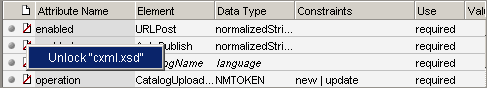
Warning: Any changes made to unlocked declarations of an included schema will be reflected in the included schema as well.
|
|
|
|
|
|
This column is labelled as either Element or Complex Type depending on the type of declaration indicated in the Declaration Type column for the selected row. A new element or complex type can be created by clicking on a blank row under the Element/Complex Type column, and then entering a name. To edit an element or complex type name, click on an existing name in the Element/Complex Type name column.
Note: Element and complex type names must begin with a letter and may contain other letters, numbers, underscores, dashes, and periods.
|
|
|
|
|
|
|
•
|
Any — The content model contains any combination of elements and/or character data (text).
|
|
•
|
Empty — When an element has no content at all, its content model is empty. Essentially, a model is defined that allows only elements in its content but does not actually declare any elements, so the type's content model is empty.
|
|
•
|
Mixed — In a mixed content model, an element contains other elements interleaved with character content. Character data can appear alongside child elements and is not confined to the deepest child elements.
|
|
•
|
Elements — The content model contains elements only.
|
|
•
|
Typed — The content is either a simple type (such as xs:string, xs:integer, or xs:float) or a named complex type.
|
|
|
|
The Content Model/Data Type column displays the content model of the elements and provides a set of tools for creating and editing content models and data types. (The name of this column is either Content Model or Data Type, depending on the content type set in the Content column.) Users who are comfortable with occurrence and sequence indicator syntax can enter element content models directly by typing them in the Content Model column. For users not yet comfortable with occurrence and sequence indicators, a series of buttons are provided to help the user create and edit content models. See
Building Content Models: Occurrence and Sequence Indicators for more information.
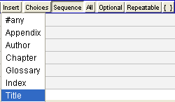
The Insert button provides a drop-down menu that differs depending on whether the content model may include elements or data. The Insert menu provides a quick way to add content that's been previously defined, such as a built-in data type, a user-defined simple type, an element, or a complex type. The selected material is inserted at the current location of the cursor. See
Example: Building a Content Model for more information.
|
|
|
The Attributes column allows the user to specify which attributes may be used for a particular elements. If an attribute name is entered which does not yet exist, it is automatically created with a default data type of xs:string and with no constraints (The declaration can be further refined in the attributes panel at any time. See
Attributes Panel for more information.)
When the user tabs to an Attributes field, an Insert Attribute button appears. Click the button to access a menu listing previously defined attributes. Selecting an attribute name adds it to the element or complex type being defined
|
This declaration requires the MEMO element to contain, in sequence, one or more
To elements, one or more
From elements, zero or more
CC elements, a single
Subject element, a single
Body element, and zero or one
Typist elements.
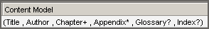
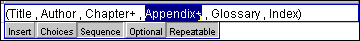
The Intro element could appear once (and only once) at the start of the chapter, and then Section or Sidebar elements could follow in any order. (This model is read as “an Intro element followed by zero or more Section or Sidebar elements”.)
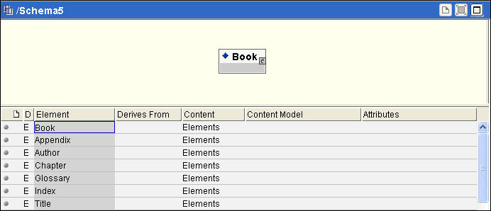
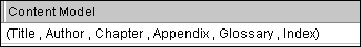
You will build the content model for an element based on the structure of a book. The content model would likely include several elements, including a Title, an
Author, multiple
Chapters, maybe an
Appendix (or several), perhaps a
Glossary, and possibly an
Index. Assuming these elements are already declared (as shown in the next diagram), the steps to build the content model for
Book appear below:
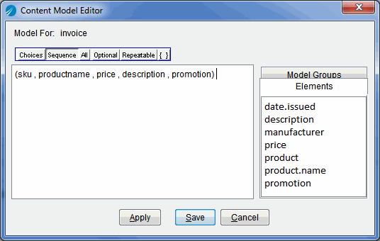
If the space provided by the Content Model column is too small to see all of an element content model, select Expand from the
Schema > View menu or press the Ctrl Shift E keys to bring up the
Content Model Editor dialog box. The
Content Model Editor provides more room for editing, making it easier to work with larger content models, and gives easy access to the elements and reusables. To add an element or reusable model group to a content model, click on its name. Occurrence and Sequence indicator buttons are also available in the editor. The Apply button adds the edited content model to the list, but leaves the editor open. The Cancel button closes the editor without making any changes to the content model in the list, while the Save button closes the editor and makes the changes. Figure 6 illustrates the Content Model Editor.
See
Content Model Diagram for more information about the content model diagram.
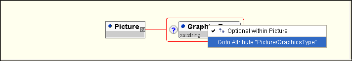
When you select the Schema > View > Attributes menu, or when you click the
Attributes button on the toolbar, the attributes panel becomes the primary panel for editing. The attributes panel is used to view, create, and edit attribute type declarations. While you can also create an element’s attribute in the element/type list, you must use the
Attributes panel to specify an attribute’s data type. Constraints, facets and enumeration of attributes are set from the properties panel when the attribute is selected.
Figure 24 illustrates the attributes panel.
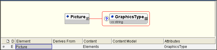
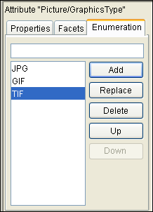
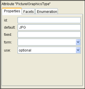
An attribute type declaration, by default, sets the data type for an attribute to xs:string. In this example,
GraphicsType will be enumerated (that is, it will only ever have the value of
JPG,
TIF, or
GIF). Because the values for this enumeration are best defined as strings, the
xs:string data type is appropriate. An attribute type declaration, by default, sets the data type for an attribute to
xs:string. In this example,
GraphicsType will be enumerated (that is, it will only ever have the value of
JPG,
TIF, or
GIF). Because the values for this enumeration are best defined as strings, the
xs:string data type is appropriate. For example:
Figure 27 illustrates the overview panel, with a right button menu activated.
|
|
|
|
|
|
|
|
|
|
|
Use the block property to control whether types can be replaced by their derived types in instance documents. The block property takes one of the following values:
|
•
|
restriction - prevents type replacement in the instance if derivation is by restriction
|
|
•
|
extension - prevents type replacement in the instance if derivations is by extension
|
|
•
|
substitution - prevents replacement by substitution groups in the instance document
|
|
•
|
restriction extension - prevents type replacement in the instance document if derivation is byrestriction or extension
|
|
•
|
restriction substitution - prevents replacement in instance documents by substitution groups and prevents type replacement if derivation is by restriction
|
|
•
|
extension substitution - prevents replacement in instance documents by substitution groups and prevents type replacement if derivation is by extension
|
|
•
|
#all - to prevent any type replacement in the instance document by derived types or by substitution groups
|
|
|
|
The final property allows you to prevent new types from being derived from the selected simple or complex type. The final property takes one of the following values:
|
•
|
restriction - to prevent derivation by restriction in the schema document
|
|
•
|
extension - to prevent derivation by extension in the schema document
|
|
•
|
#all - to prevent any derivations at all in the schema document
|
|
|
|
|
|
|
|
|
|
|
|
|
|
|
|
Use this field to specify whether the selected element or attribute should be either qualified or unqualified in the instance document. If qualified, the element or attribute must be associated with the target namespace in the instance document. If unqualified, a locally declared element or attribute must not be associated with the target namespace in the instance document.
(By default, elements and attributes are defined as unqualified. The default setting can be changed in the Attributes tab of the configuration panel).
|
When you choose the Schema > View > Advanced menu, the advanced panel becomes the primary panel for editing. The advanced panel allows you to define or edit parts of XML schemas that move beyond the description of document structures. The advanced panel consists of three tabs.
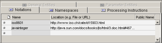
The Namespaces tab provides an inventory of the external namespaces being used by your schema. The
XML Schema namespace (unless designated as the default namespace) and any namespaces added by way of the
Import button of the overview panel will appear in the
Namespaces tab.
The Namespaces tab permits only limited editing of the namespace declaration:
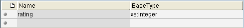
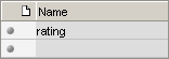
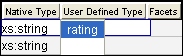
In this example a new simple type, called rating is derived. The new type can be any integer from 1 to 10.
The rating type is now declared and will become a choice on the
User Defined Type menu available in the elements/types panel, the attributes panel, and the simple types panel.
When selected by way of the Schema > View > Validation menu, the validation panel appears between the active editing panel and the configuration panel. The validation panel displays errors or warnings found when a new schema is loaded, as well as errors or warnings detected throughout the editing process.
When selected by way of the Schema > View > Source menu or upon clicking the
Source button on the toolbar, the source panel becomes the primary panel for editing. The source panel allows you to edit the source code of your Schema directly. If you are comfortable with Schema syntax, editing your declarations directly may occasionally be useful or even convenient. Even if you don't want to edit your Schemas directly, the source panel provides another way to examine your declarations.

List
Overview Panel


