 (when the
analysis is in Editing mode). If more than one data table is available
in the analysis, you can select which data table to investigate from the
drop-down list at the top of the flyout.
(when the
analysis is in Editing mode). If more than one data table is available
in the analysis, you can select which data table to investigate from the
drop-down list at the top of the flyout.The Data in analysis flyout shows a structured list of all data columns in a data table, that is, it gives you an overview of your data. It can be the starting point for configuring visualizations, because from the flyout, you can drag columns to drop targets in the middle of the visualizations and to the visualization axes. In addition, filters are associated with the columns, so you can filter the data from the flyout. You can also get recommendations about suitable visualizations and suggested other operations from the expanded flyout.
The Data in analysis flyout is automatically shown when
you add new data. On the authoring bar, you can also click Data
in analysis (when the
analysis is in Editing mode). If more than one data table is available
in the analysis, you can select which data table to investigate from the
drop-down list at the top of the flyout.
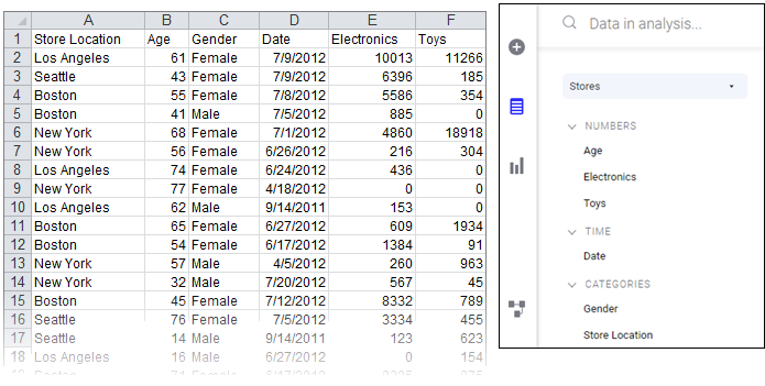
The columns are by default organized into categories to make them easy to locate. For example, loading the Microsoft Excel file below results in the Data in analysis flyout to the right. Columns that contain numerical data suitable to aggregate are gathered in the Numbers section, columns related to time are in the Time section, and columns useful for splitting the data is in the Categories section.
The category of a column affects what happens when you drag the column to a column selector or to a drop target in a visualization. If the suggested category for a column is not the desired category, you can change the categorization.
Selecting columns on an axis
You can drag a column from the data in analysis flyout to a visualization, and drop it on any of the column selectors indicated with a blue color or on a drop target. The visualization will immediately reflect the new setting.
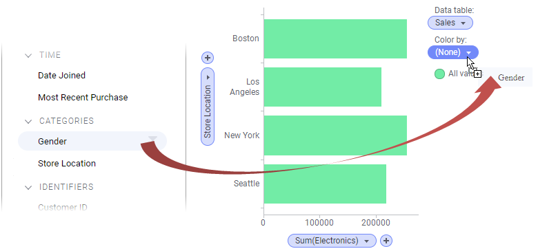
Note: More than one column can be selected on an axis. You can drag another column from the flyout and drop it next to the first selected column on the axis.
If a hierarchy filter has been created, it is possible to drag the entire hierarchy or any of its sub-levels to an axis.
Filtering data in columns
Depending on whether you are working with in-memory or in-database data, you get access to the filters in the flyout in slightly different ways.
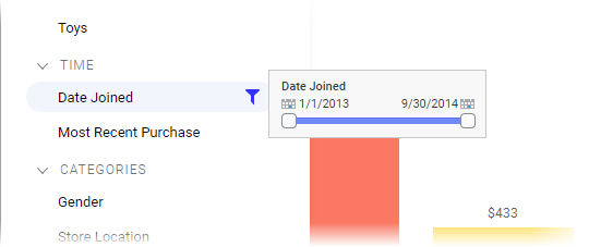
For in-memory data, filters
are created automatically. Hover with the cursor over a column in
the flyout, and click the Show filter button  that appears. Use the opened filter to limit the data directly.
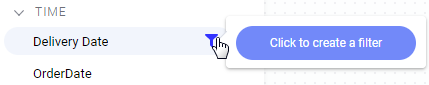
For in-database data, the
filters must first be created. Hover with the cursor over a column,
click the Show filter button
that appears, and click to create a filter. Use the created filter
to limit the data.
Note: Depending on the
database you are using, this may take some time.
Details about which columns have been filtered, and to which values, are displayed at the bottom of the flyout. If you want to modify what has been filtered in a filter, you can open the filter from here by simply clicking it.
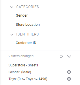
Above, the expanded filter details view is shown. To collapse
the filter details, click the  button.
Filtering can be reset. Click the  button to reset separate filters, and the
  button to
reset all filters.
button to
reset all filters.
Filtering can also be handled using the filters panel, which offers more filtering options.
Data from external sources
The sections in the data in analysis flyout differ slightly depending on the data source and the data content. Some examples of differences are described below.
In-Database Relational Data from Joined Tables
If data tables from in-db databases have been joined with relations in the Views in Connection dialog, they can be treated as a single, virtual data table within Spotfire. In this case, there will be an additional field showing the source structure in the flyout. If no relations have been defined, each data table in the external data connection will be a separate data table within Spotfire as shown above.
Cube Data
When you are working with cube data from Microsoft SQL Server Analysis Services, Oracle Essbase or SAP BW you will see the underlying structure of the cube in the flyout.
If the data is shown with a hierarchical structure, the underlying structure of the data source is shown in the flyout. Top levels can be expanded to reveal, for example, the different levels in a hierarchy. See Icon Descriptions for an explanation of the icons in the hierarchical view.
It is recommended to use the hierarchical view when working with cube data, to avoid mixing unrelated columns in one visualization.
See the section Cubes in Spotfire under Connectors or the separate document Working with Cubes (available under Spotfire Analyst on the TIBCO Product Documentation web portal) for more information about different systems.
Note: When working with in-db cube data it is not possible to create filters for measures or sets, only for dimension columns. This is because the cube calculates the measures in the context of the selected dimensions.