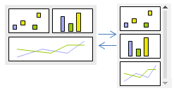
The analysis layout is responsive. If the screen width is below a certain breakpoint, there is an automatic switch to a layout, where the visualizations on the page are placed on top of each other, supplemented with a scroll bar. You can change this breakpoint.

To ensure the information in the visualizations on an analysis page is readable no matter which screen size is used, you can specify a minimum acceptable width and height of the area used for the actual visualizations. When the window is resized for any reason, so that the width or height falls below its specified acceptable value, horizontal and vertical scroll bars will be added automatically to keep the size of the content.

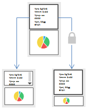
Sometimes you might want to avoid scroll bars in text areas, or make sure important content is not hidden. Then you can claim space for these text areas and visualizations by locking their sizes to the edges of the visualization area. Other visualizations will re-scale to fit the remaining space.

Note: It is possible to lock areas containing more than one visualization.