|
Option |
Description |
|
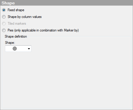
Fixed shape |
Select this option to use the same, fixed shape on all markers. Select which shape to use from the Shape drop-down list under Shape definition. |
|
Shape |
Defines which shape to use for all markers. |
|
Shape by column values |
Select this option to use different shapes for the categories in a specified column or hierarchy. Which column or hierarchy to use, as well as which shape should represent which category, is specified under Shape definition. Note: A default set of shapes is used when automatically assigning shapes to categories. When there are more categories than available shapes in the default set, shapes will be recycled. |
|
Columns |
Specifies the column or hierarchy containing the categories you wish to present using different shapes. |
|
Settings... |
Opens the Advanced Settings dialog where you can change the category mode to determine which combinations to show. |
|
Shape scheme |
Lists the categories in the selected column or hierarchy, and the shapes that have been assigned to each of these categories. Note: The set of shapes that is used by default in the scheme does not include all the available shapes. You can, however, always change to the shapes of your choice manually. Click on a shape in the scheme to display all the available shapes and make your selection. |
|
Tiled markers |
[Only available when the coordinate reference system is set to None, e.g., when markers are displayed on an image background.] Select this option to display the markers as tiles. The markers will be rectangular, have the same size, and be displayed in a grid-like layout. Note: When you use tiled markers the settings in the Size page will be disabled since the markers have the same size. Note: Tile positions are allocated in the grid layout for any possible tile markers to display along an axis (positions are allocated also if no markers should be located there). So if the range between the lowest value and the highest value is wide, the large number of positions might cause the tile sizes to be too small to be visible. |
|
Pies |
Select this option to use pies instead of markers. |
|
Sector size by |
Determines the numeric column that should provide the sizes of the pie sectors. Note: Remember to specify an aggregation method (for example, sum) for this column if you want each category selected under Colors to be summarized. |
|
Show in labels |
Specifies what information to show in the labels for the pie sectors. |
|
Sector value |
Displays the value of the sector. For example, sum of sales for apples, if the sector size is defined by sum of sales and the color is defined by fruit or vegetable type. |
|
Sector category |
Displays the category defining the sector. For example, "apples", if the sector color is defined by fruit or vegetable type. |
|
Sector percentage |
Displays labels showing the percentage of the total that each sector represents. |
|
Threshold |
Excludes the labels for the sectors whose percentage falls below the specified threshold value. |
|
Decimals |
Specifies the number of decimals to display for the percentage value. The number specified here will also affect the number of decimals shown for pie sectors in the tooltip. |
|
Label position |
Specifies whether the labels will be located Inside or Outside the pie sectors. |
|
Sort sectors by size |
Sorts the pie sectors by size. |