|
Option |
Description |
|
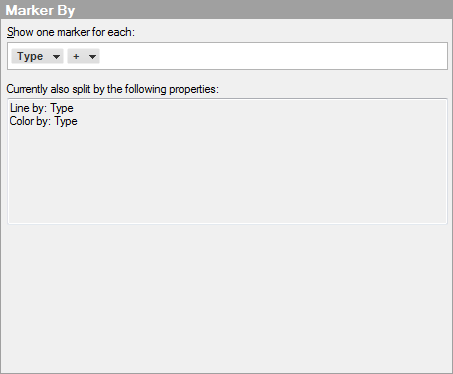
Show one marker for each |
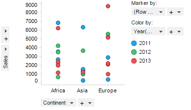
If you select (Row Number) here, then each row in the data table will be displayed as a separate marker in the visualization, even if several markers have identical values for the X-axis and Y-axis, and therefore are located at the exact same coordinates. These markers will be drawn on top of each other. You can, however, select to combine markers (known as aggregation) so that each marker shows for example the sum of all rows that have something in common. For example, if you have Continent on the X-axis and Sales on the Y-axis, then each individual sales number for each continent would be displayed as a marker (below).
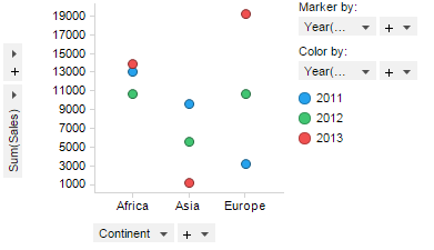
However, if you set Marker by = Year, then the sum of sales for each year will be displayed as a marker for each continent.
|
|
Currently also split by the following properties |
Displays information about what other properties currently contribute to a splitting of the markers. |