Spotfire tries to find a symbolic representation of the selection you make when marking data, whenever this is possible. That means that if you mark an item in an aggregated visualization, the marking will be based on the selected categories, rather than on saved indexes of the underlying rows.
However, symbolic representation is not possible to use with some visualizations or configurations. For example, if you mark rows in an unaggregated visualization or layer (e.g., in a table visualization, or in a scatter plot with row number on one of the axes), or, if you use complex configurations (e.g., categorical axes using OVER expressions in a hierarchy, or, use of Limit by Expression in a visualization), then there will not be any symbolic categories available. Data of the data types Binary or Currency will also always use index based marking for in-memory data.
In these cases, you will lose the marking upon reload, unless you have specified key columns that can identify the separate data rows.
If you create analyses that should keep a marking after data has been reloaded, for example, if you want to add a bookmark which marks some items in an analysis, then, you must make sure that either the interesting category, or the particular rows, are possible to identify even after the reload.
What is important? The category or the distinct values?
For example, imagine that you want to include a bookmark where a specific category is marked. If the category is marked from a simple, aggregated visualization, like a bar chart based on categorical values from a column, and the data is reloaded to include more values within that same category, then all of the new values will be marked, because the symbolic marking is used. This way, you can easily configure a bookmark with a marking which always lets you see the data that currently is included in a particular category, and not the data that was included in that category when you first applied the marking.
Category
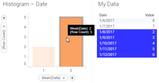
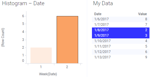
If it is the category that is of interest, you should mark the category in an aggregated visualization:
All rows belonging to that category will be marked, as shown in the table visualization using the same marking.
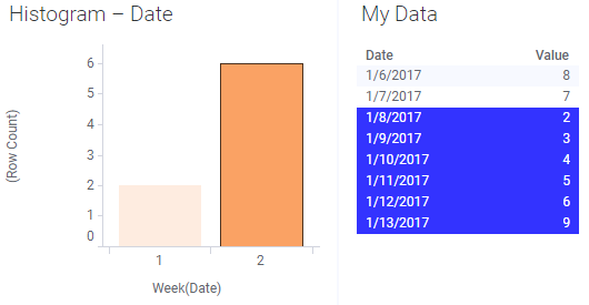
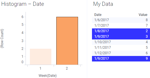
If the data table gets an additional row for week 2 and data is reloaded, then the new row is automatically included in the marked selection:
Rows
If it is the particular rows that are important, you make the selection in the table instead:
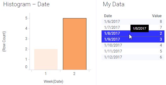
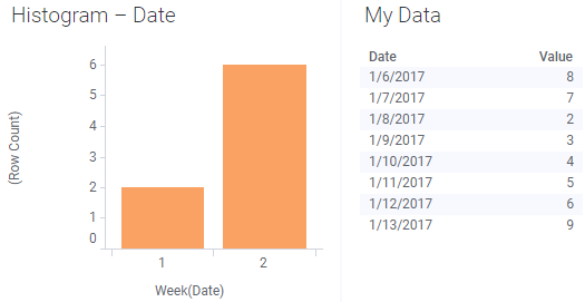
If no key columns were specified, a reload will make the marking disappear, because the rows could not be identified:
If key columns were specified and any changes to the data upon reload do not affect the key columns, then the marking will be kept, just as intended:
In this case, the Date column was used as the key column.
And finally, if the reload causes the key columns to break, so that they no longer uniquely identify all rows, you may end up in situations where more values are marked than expected:
In this example, another row with the same date was added to the linked data, and the previously unique key column was no longer unique. You may also end up in a situation where all markings are lost when the key columns are broken.
External data
When you are working with external data (in-db), you will always use symbolic marking. However, if a primary key has been defined in the external data source or if a primary key has been specified in the Views in Connection dialog when setting up the data connection, it may still be possible to mark rows in a table visualization. See Working with In-Database Data for more information about external data.