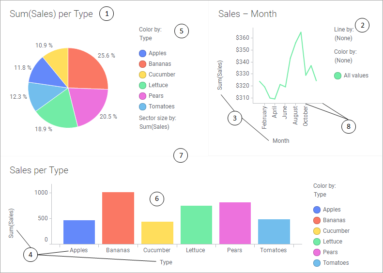
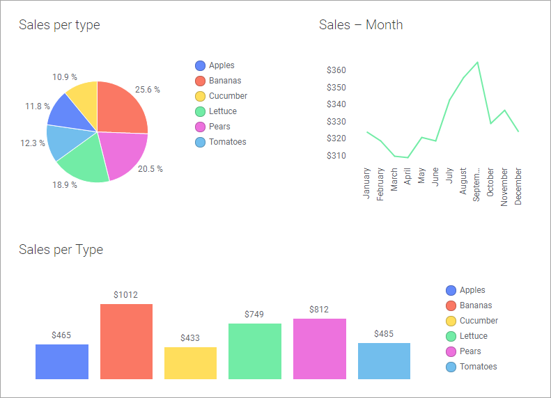
A cleaner visual appearance of the analysis below can be achieved using menu options reached from the visualization titles bars, settings made in the visualization Properties dialogs, and a customized visual theme. The attributes to modify to get the cleaner look in the bottom image are indicated by numbers, and the actions made are described.
Attributes to modify from the visualization title bar
1. Change titles
Double-click the visualization titles, and then enter new titles.
2. Remove legend
Move the cursor over the line chart
title, and then click Legend,  .
.
3. Remove selectors in the line chart
Move the cursor over the line chart title bar, and click
 to open the menu. Then click X
Axis Selector and Y Axis Selector
to remove these selectors. You remove one axis at a time.
to open the menu. Then click X
Axis Selector and Y Axis Selector
to remove these selectors. You remove one axis at a time.
4. Remove selectors and scale labels in the bar chart
Move the cursor over the bar chart title bar, and click
to open the menu. Then click, one at a time, Category Axis Selector, Value
Axis Selector, and Scale
Labels to remove them.
Attributes to modify from the Properties dialogs
5. Keep only color information in the legend
In the pie chart Properties dialog, the Legend page, select the Color by check box only and clear the other check boxes beneath Display the following legend items.
Then click Color by to activate Settings at the bottom of the Legend page. Clear the Show title and Show axis selector check boxes.
Perform the same action for the bar chart.
6. Add labels to the bars in the bar chart
In the bar chart Properties dialog, the Labels page, set Show labels for to All, and below Types of labels, clear the Bar segments check box.
Attributes to modify from the Edit Custom Theme dialog
7. Get a background without borders and background color
In the Details tab, select Visualizations general, and set Borders to None.
In the Canvas tab, set Distance between visualizations to 0.
8. Remove lines and tick marks on scales
In the Details tab, select Visualizations scales, and set Lines as well as Tick marks to None.
More...
In addition to the numbered actions above, perform an action to separate the visualizations. In the Details tab, select Visualizations general, and increase the Padding number for All sides.
Also an increased padding beneath the visualization titles contribute to a more uncluttered look. In the Details tab, select Visualizations titles, and click the Padding arrow. Then increase the Bottom number.