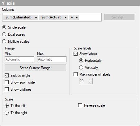
Single scale
Option |
Description |
Columns |
Specifies the columns or hierarchy to be displayed on the Y-axis. |
Settings... |
[Not available in this visualization.] |
Single
scale |
Select this option to use only one scale on the Y-axis. The scale will be common to all the measures. |
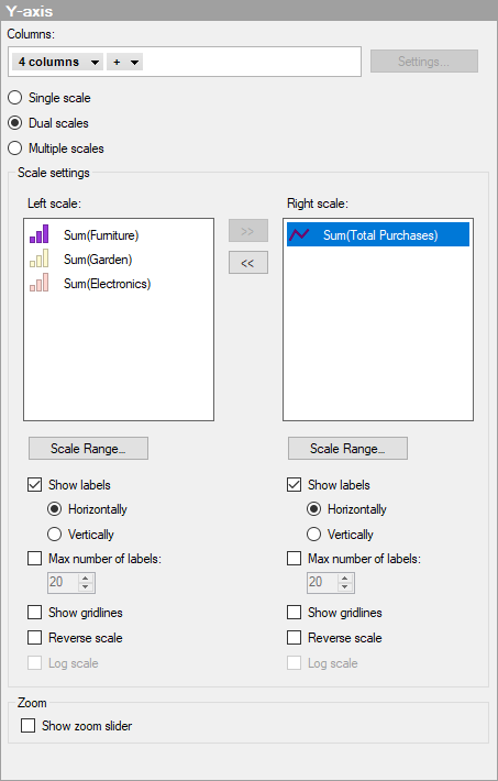
Dual scales |
Select this option if you want to show two scales on the Y-axis, one scale to the left in the visualization, and one scale to the right. Each scale can be shared by more than one measure. This option is suitable, if the magnitudes of your measures vary too much to be presented on the same scale, and two scales are enough to meet your needs. Still more than two measures can be shown as measures can share scale. |
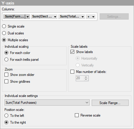
Multiple
scales |
Select this option to show more than two scales on the Y-axis. By default, you get one scale for each color that is defined on the Series by axis, and the different scales can be displayed on the left as well as the right side in the visualization. For example, use this option if you want to display several measures of very different magnitudes in the same visualization. |
Range |
|
Min |
Determines the lower value of the axis range. Leave the field blank to automatically adjust the range to the lowest value currently in the filtered data. |
Max |
Determines the upper value of the axis range. Leave the field blank to automatically adjust the range to the highest value currently in the filtered data. |
Set
to Current Range |
Allows you to set the axis range to the currently filtered values. |
Include
origin |
[Available for continuous axes only.] Always includes the value 0 on the axis, regardless of filtering. |
Show
zoom slider |
Shows a zoom slider that you can manually manipulate to view only those parts of the combination chart you are interested in. |
Show gridlines |
Specifies whether horizontal gridlines should be visible. |
Scale
labels |
|
Show
labels |
Specifies whether scale labels should be visible. |
Horizontally |
Shows scale labels horizontally. |
Vertically |
Shows scale labels vertically. |
Max
number of labels |
Select the check box to specify a maximum number of scale labels to be shown. Limiting the number of labels can improve readability on axis scales with many values. |
Scale |
|
To the left
|
Select this option to place the scale on the left-hand side in the combination chart. |
To the right
|
Select this option to place the scale on the right-hand side in the combination chart. |
Reverse
scale |
Reverses the current sort order, so that the lowest value is displayed at the top of the scale. |
Dual scales
Option |
Description |
Columns |
Specifies the columns or hierarchy to be displayed on the Y-axis. |
Settings... |
[Not available in this visualization.] |
Single
scale |
Select this option to use only one scale on the Y-axis. The scale will be common to all the measures. |
Dual scales |
Select this option if you want to show two scales on the Y-axis, one scale to the left in the visualization, and one scale to the right. Each scale can be shared by more than one measure. This option is suitable, if the magnitudes of your measures vary too much to be presented on the same scale, and two scales are enough to meet your needs. Still more than two measures can be shown as measures can share scale. |
Multiple
scales |
Select this option to show more than two scales on the Y-axis. By default, you get one scale for each color that is defined on the Series by axis, and the different scales can be displayed on the left as well as the right side in the visualization. For example, use this option if you want to display several measures of very different magnitudes in the same visualization. |
Scale settings |
|
Left scale/Right scale
|
Lists the measures displayed on the left and right scale, respectively. Use the arrows to move a measure from one scale to the other. |
Scale Range
|
Opens the Scale Range dialog where you can specify the range of the selected scale, and also determine whether to include the origin (0, 0). |
Show labels
|
Specifies whether scale labels should be visible. |
Horizontally
|
Shows scale labels horizontally. |
Vertically
|
Shows scale labels vertically. |
Max number of labels
|
Select the check box to specify a maximum number of scale labels to be shown. Limiting the number of labels can improve readability on axis scales with many values. |
Show gridlines
|
Specifies whether gridlines should be visible. |
Reverse scale
|
Reverses the current sort order on the scale. |
Log scale
|
[Not available in this visualization.]
|
Zoom |
|
Show zoom slider |
Shows a zoom slider that you can manually manipulate to view only the interesting segments of the combination chart. |
Multiple scales
Option |
Description |
Columns |
Specifies the columns or hierarchy to be displayed on the Y-axis. |
Settings... |
[Not available in this visualization.] |
Single
scale |
Select this option to use only one scale on the Y-axis. The scale will be common to all the measures. |
Multiple
scales |
Select this option to show more than two scales on the Y-axis. By default, you get one scale for each color that is defined on the series by axis, and the different scales can be displayed on the left as well as the right side in the visualization. For example, use this option if you want to display several measures of very different magnitudes in the same visualization. |
Individual
scaling |
|
For
each color |
Use this option to get one scale for each color that is defined on the Series by axis. This gives you the possibility to display more than two scales on the Y-axis. Note that you should apply true categorical coloring before using this option. If you use a continuous column on the color axis, you may end up with a different result than the expected. This applies even if the continuous color mode looks "categorical" at first sight. |
For
each trellis panel |
Use this option to display one scale for each trellis panel. |
Zoom |
|
Show
zoom slider |
Shows a zoom slider that you can manually manipulate to view only those parts of the combination chart you are interested in. |
Show
gridlines |
Specifies whether horizontal gridlines should be visible. |
Scale
labels |
|
Show
labels |
Specifies whether or not scale labels should be visible. The scale labels are always displayed horizontally when multiple scales are shown. |
Horizontally |
Shows scale labels horizontally. Note: Only available for individual scaling for each trellis panel. |
Vertically |
Shows scale labels vertically. Note: Only available for individual scaling for each trellis panel. |
Max
number of labels |
Select the check box to specify a maximum number of scale labels to be shown. Limiting the number of labels can improve readability on axis scales with many values. |
Individual
scale settings |
|
[Drop-down list] |
Select the scale for which you wish to change the settings. Select All scales to change settings for all scales simultaneously. |
Scale
Range... |
Opens the Scale Range dialog where you can specify the range of the selected scale, and also determine whether to include the origin (0, 0). |
Position
scale |
Specifies which side of the visualization the scales should be positioned. |
To
the left |
Select this option to place the selected scale on the left-hand side in the visualization. |
To
the right |
Select this option to place the selected scale on the right-hand side in the visualization. |
Reverse
scale |
Reverses the current sort order so that the lowest value is displayed at the top of the scale. |
See also: