How to Use the KPI Chart
A KPI chart is a visualization that shows Key Performance
Indicators. The KPIs are factors used for monitoring how well a company
or organization is doing.
To create a new KPI chart:
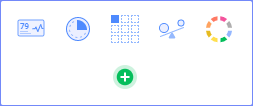
On the authoring bar, click
 to open the
Visualization types flyout.
to open the
Visualization types flyout.
Drag the KPI
chart visualization to the wanted position on the analysis
page.
Response: A first attempt to set up a KPI chart
is made.
Adjust the visualization to
display the KPIs of your choice. How to add a KPI is described below.
To add a new KPI to a KPI chart:
You have several options to visualize performance; Show
the primary, actual Value, show a Comparative value, show a sparkline,
and indicate performance through coloring tile backgrounds.
Right-click the KPI chart
to display the pop-up menu.
Select Add
KPI.
Response: A first attempt to set up a suitable
KPI is made by the application, but you probably want to adjust the
settings in the opened KPI Settings dialog.
In the dialog, select the
Values page.
On the Value
axis, specify the column or expression to use for calculation of the
KPI value to display as the primary value in a tile.
Response: The displayed value in the tile is the
result of this calculation for the most recent time period. See the
Time axis setting in the next step.
On the Time
axis, select the column or hierarchy to use for defining the time
periods for which the Values above should be calculated. The displayed
Value is the result for the most recent time period.
Note: You can display this time period in the tile
by selecting the Show time in tile check
box.
Comment: When creating a KPI, sparklines showing Value over Time
are displayed in the tiles by default. You can remove the sparklines
from the tiles by clearing the Show sparkline
check box on the Appearance page of the
KPI Settings dialog.
Under Tile
by, specify the column or hierarchy to define into which categories
the KPI should be split.
Comment: The category is displayed in the upper
left of the tile.
On the Comparative
value axis, specify the column or expression to use for evaluation
of the primary Value.
Comment: The result of the evaluation is displayed
in the lower left of the tile.
If you want to let colors
indicate a certain performance, go to the Colors
page in the KPI Settings dialog.
In the Columns
drop-down list, specify the column or expression on which the coloring
of the tiles should be based. The coloring can, for example, be based
on the primary values, the comparative values, or values from any
other calculation.
Comment: Click the Add
Rule button to define rules for how the tiles should be colored.
- Click Close.
Comment: Alternatively when adding a KPI, you can drag
columns from the Data in analysis flyout
to drop targets in the KPI chart to specify what to display on the
various axes in the KPI. The drop targets are:
They represent, from left to right, the Value
axis, the Time axis, the Tile
by axis, the Comparative value
axis, and the Color by axis. Note that
there is one row of drop targets per KPI in the KPI chart. Using the
drop target at the bottom will add a new KPI to the chart.
To change the display text for Value or Comparative
value in a KPI:
By default, the expressions that are specified on the Value
and Comparative value axes are displayed in the tile. You can change these
display texts.
Right-click a tile in the
KPI to display the pop-up menu.
Select KPI
Settings.
Go to the Values
page.
On the Value axis selector,
or Comparative value axis selector, click the arrow.
Make sure the column
selector is expanded.
In the Display
name field, type the wanted display text.
To edit a KPI:
Right-click a tile belonging
to the KPI you want to edit.
In the opened pop-up menu,
select KPI Settings.
Response: The KPI Settings dialog for the KPI in
question opens.
Adjust the settings to display
the values of your choice.
To sort tiles alphabetically:
You can sort the categories represented by different tiles
in a common alphabetical order. The sorting includes tiles from all existing
KPIs in the KPI chart.
Right-click the KPI chart
to display the pop-up menu.
Select Sort
Order > Alphabetical.
Comment: If you want to display the tiles the other
way around, select Sort Order > Reversed Alphabetical.
To
sort tiles by performance (using columns and expressions):
You can display the tiles in a 'Best first' or 'Worst first'
order using measures that you specify per KPI. The sorting includes tiles
from all existing KPIs in the KPI chart. For example, the 'Worst First'
common sort order makes it possible to gather tiles that show bad results
from different KPIs at the very top of the chart.
Right-click a tile belonging
to the KPI you want to include in the sorting.
In the opened pop-up menu,
select KPI Settings.
Go to the Sorting
page.
Under Sort
tiles by, specify the column or expression for the measure
to use for sorting the tiles in this KPI. The sorting is only put
in effect if 'Best first' or 'Worst first' is used.
Click Close.
Repeat steps 1 to 5 until
you have specified a sort order for each KPI you want to include in
a 'Best first' or 'Worst first' sorting.
Right-click the KPI chart.
In the opened pop-up menu,
select Sort order > Best First, alternatively
Sort order > Worst First.
To add actions performed when clicking a tile:
Open the KPI
Settings dialog, and go to the Actions
page.
Select the Perform
action on click check box.
Click Settings....
Response: The Action
Settings dialog is displayed.
Type a good Description
explaining what will happen when clicking the tile.
Add the desired actions and
click OK.
Click Close.
To show the scale for a KPI sparkline:
Open the KPI Settings dialog,
and go to the Appearance page.
Make sure the Show
sparkline and Show scale check
boxes are selected.
If you want to include the
value 0 in the scale range, select the Include
origin check box.
Click to select whether to
use One scale for all sparklines in this KPI
or Multiple scales.
Comment: Use One scale for all sparklines in this
KPI, if you want to use a common sparkline scale for the Value axes
within the KPI tiles. Use Multiple scales to use different scales
within the KPI tiles. This will maximize the Value axis variation
within each sparkline.
Click Close.
To specify accepted tile width in the KPI chart
You can specify the minimum tile width that you accept
in the grid of tiles in the KPI chart. If the width falls below this value
due to lack of space in a row of tiles, tiles will be moved to the next
row in the grid.
Right-click the KPI chart,
and select Properties.
Open the Appearance
page.
Under Tile
width not less than (in pixels), specify the minimum tile width
that you accept.
Click Close.