Numerous features are available to make dashboards work and look the way you want. Most of them are generally applicable when working with analyses; they are not specific to dashboards. The features that are listed below are, however, described from a dashboard perspective. Some of them affect the dashboard as a whole, and some are only tips on minor settings that might be of use. The features are not listed in any specific order.
Quick and compact visual summaries
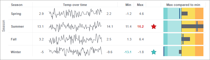
It might be important in your dashboard to quickly get an overview of a situation, and the more detailed information can be left out for the moment. For example, you might want to be able to immediately spot specific values, see trends, make comparisons, or get noticed about issues. For these purposes, you can use a graphical table, which presents information in a condensed format through display of sparklines, calculated values, icons, and bullet graphs that update dynamically. The image below shows you examples of these graphical table display options.
Note that sparklines, calculated values, icons, and bullet graphs can be displayed in text areas as well.
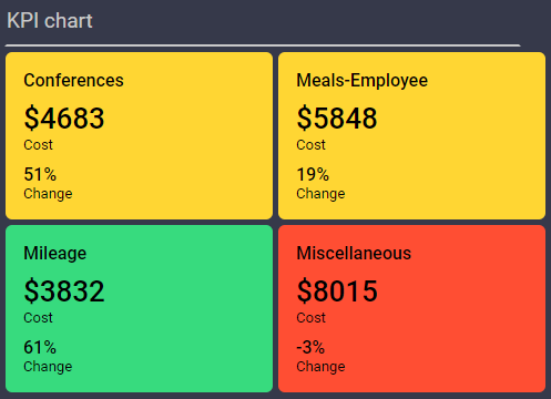
Another visualization that provides information at a quick glance is the KPI chart. It shows KPIs, Key Performance Indicators, which measure factors that are crucial when monitoring the current performance of, for example, a company. By letting colors indicate the performance, you can easily scan the current situation. The KPI chart is well suited for small screens.
Navigating in the dashboard
A dashboard can consist of more than one analysis page, and there are different ways to navigate the user through them. You might want to use page tabs with descriptive titles, which the user can choose from, or you might want to guide the user through a step-by-step workflow, that is, in a certain order by clicking Next-, Previous-, and numeric links. Another option to control the workflow is the use of clickable items in text areas, graphical tables, and KPI charts. Then it might be beneficial to turn off other navigation modes.
For finding what might be the most suitable option for your dashboard, see more details in Pages and Guided Analyses.
Descriptive naming of items
If the names of items are too long, or difficult to understand, you can change them. You can rename the following:
Text areas
The use of text areas on the analysis pages is a powerful means to add the following:
Explanatory and instructional texts.
Images for decoration or information purposes.
Links, buttons, and images, which, when clicked, perform actions such as open web sites, switch to another page, apply a bookmark, execute a script, or refresh a calculation.
Controls from which you handle the filtering in the analysis. See also Filtering schemes below.
Controls from which you handle various configuration properties such as switching column on an axis.
You can use the text area features, for example, to control how the user should navigate through the analysis, and to gather controls in the same place instead of using different panels, which might free space.
Filtering schemes
It might be useful to add filtering schemes, which give you more freedom to control how the filtering should work in the dashboard. By default, any filtering is applied to the entire analysis, that is, to all pages. The use of filtering schemes makes it possible to apply different filtering to the various analysis pages, and even to the separate visualizations on a page.
If you use filter controls in the text area, you open up a capability that is not available when using filters in the Data in analysis flyout or the Filters panel; in case visualizations on the same page use different filtering schemes, you can filter one visualization in one way and another visualization in another way. This is possible because, in the text area, each filter control is connected to a selected filtering scheme.
Note: You can also let a visualization stay unaffected by any filtering by turning off the filtering completely.
Hiding redundant information
When designing a dashboard, it is worth considering whether some information might be redundant and therefore could be removed. Unnecessary information clutters the dashboard and distracts from what should be the focus. Besides, removing information frees up space. Tips on what you can do are:
Adjust (or maybe even remove) the legend to show only relevant items. Consider hiding the title and column selector of items in the legend.
Turn off panels that are not used. Keep in mind that the text area can be used instead for certain controls, for example, specification of filters and properties.
If the Filters panel must be visible, hide filters that are not used.
Consider whether the (All) and (None) options should be visible in radio button filters.
Decide whether the visualization title bar adds value or should be hidden. Sometimes any needed information can be displayed in the visualization descriptions instead.
Consider whether selectors and scale labels should be visible.
In the map chart, hide controls that are not used.
In the table visualizations, hide columns that are not of interest.
When action controls are used for guiding the user through the analysis workflow, consider whether page navigation at the bottom or top of the window needs to be available.
Adapting to different screen sizes
Dashboards might be consumed on different screen sizes, from cell phones to wall screens. There are a lot of features that are useful when designing dashboards for the different platforms. For information, see the following topics:
What is most important is testing that the created dashboard works on the devices, where it is intended to be used.
Interaction
Dashboards might be designed for viewing only, or for interactivity. If the user is supposed to perform certain actions, make sure there are instructions available in text areas (see the Text areas section above). For example, give instructions on which filters to use or properties to change, or which items to mark to view details in a details visualization. As mentioned earlier, you can place links and buttons in text areas, which, when clicked, execute specified actions. An example of an action is applying a bookmark.
Look and feel
There are plenty of visual appearance features that can be used to design a good-looking dashboard.
The canvas visual theme impacts the overall look and feel. You can easily switch between the predefined visual themes, light and dark, alternatively customize your own visual theme. In the Edit custom theme dialog, you can change the general appearance of borders, background colors, gaps, and many other details.
In the visualizations, predefined
color schemes
are available for selection. You can import other color schemes, or
create your own.
To make the dashboard easier to grasp, use consistent colors. For example,
if a green bar in a bar chart represents the category 'Male', use
the same color also elsewhere for the 'Male' category.
Consider using colors to draw attention to, or indicate, what is important.
Make sure the colors used in the visualizations are distinguishable.
You can add images in the text areas, for example, logotypes.
See also: