The following example gives an idea of how you can create a KPI that shows the latest value and then compares it to a value of another period of time. For a more detailed description of creating a KPI, see the Basic KPI Chart Example.
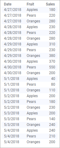
The data table below lists daily sales for apples, pears, and oranges for a time period.
Assume you want to follow up how the selling goes for each fruit type. In the KPI, you want to
display the latest sales figures per day and fruit type as the primary value in the tiles.
get an indication of the relative performance of the sales compared to the previous day, expressed in percent.
quickly locate the tile for a specific fruit type by means of the tile background colors.
Primary value
To display the latest sales figures as the primary value, Sum(Sales) is selected on the Value axis on the Values page of the KPI Settings dialog, and Date(Day of Month) on the Time axis. Moreover, the KPI is tiled by the Fruit column:
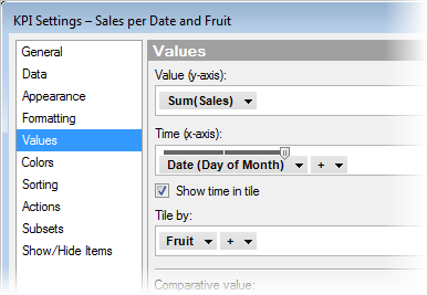
In addition, the Show time in tile check box is selected, which will display the time period the value is based on.
Comparative value
To get an indication of the relative sales performance compared to the previous day, an expression must be entered on the Comparative value axis. Shortcuts to different expressions are available in the column selector. Selecting Difference % as Aggregation method provides the needed expression directly. The expression can be viewed at the bottom of the expanded selector.
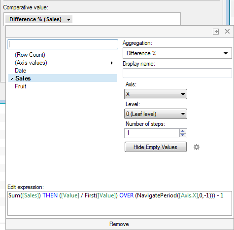
Via the different drop-down menus to the right in the expanded selector, you can change the NavigatePeriod() part of the expression easily. To compare present daily sales to the sales the day before, the following is specified in the menus:
The X setting determines which axis the NavigatePeriod() expression should work on (X represents the Time axis)
the 0 (Leaf level) setting tells to navigate on the lowest level of the time hierarchy (in this example 'day' is the lowest level, because the hierarchy on the Time (x-axis) is set to Date(Day of Month))
and on this level, the -1 setting navigates one step backwards in time (in this case one day backwards). For example, if you would like to make a comparison of the present sales to the sales made one week ago, you can simply select -7 instead.
Color value
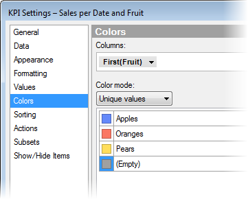
In the Basic KPI Chart Example it is already described how to color the tile backgrounds by values resulting from an evaluating expression. Below, another type of expression is used.
To locate a specific fruit type, each type is assigned a specific color, for example, apple tiles can be assigned a red color, pear tiles a green color, and orange tiles an orange color. To do so, you can make the settings below on the Colors page of the KPI Settings dialog:
The resulting KPI
After adjusting the formatting of the primary value and the comparative value on the Formatting page of the KPI Settings dialog, and changing the display names of the axes, the result of the different settings described above looks like this:
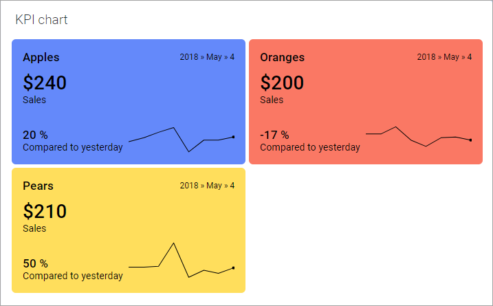
Note: In the image above, also sparklines are displayed to indicate the performance over time. Whether or not sparklines should be displayed is specified on the Appearance page of the KPI Settings dialog.