Using More than One Scale on an Axis
By default, there is only one scale on an axis, and all
measures are shown on this scale. There might be times though, when the
measures are of completely different magnitudes, or use different
units. Then you might benefit from using more than one scale on the axis
to visualize the measures.
As an example, imagine a bar chart containing two bars,
each of the bars representing a certain column. One bar represents the
total precipitation during a month, and another bar the average temperature.
These two measures probably differ a lot, and might have need for two
scales on the value axis.
The measures are based on your settings on the color axis.
That is, the colors on the color axis can represent either different columns
(short/wide data) or categories within a column (tall/skinny data).
There are two options to add more scales, Dual
scales and Multiple scales. They are
supported in bar charts, line charts, combination charts (in combination
charts, the Series by axis is used for the coloring settings), and scatter
plots.
Dual
scales
When you use dual scales, there is one scale to
the left and one scale to the right on the Y-axis/Value axis. Each
of the scales can be shared by more than one measure.
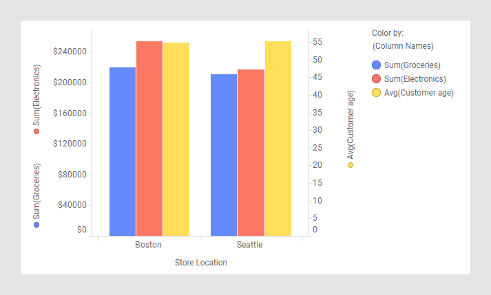
For example, in the bar chart below, two columns
share the scale to the left. To the right, another scale is used for
the third column, because the unit is different and the values are
of totally different magnitudes.
For information about how to assign measures (columns
or categories) to each of the two scales, see the Y-axis/Values page
of the properties for the visualization type in question.
Multiple
scales
When you use multiple scales, by default you get
one scale for each color that is defined on the color axis. This means
that no scales are shared.
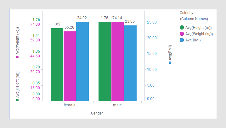
An example of a bar chart with three scales is shown
below. The scales are differentiated by their colored scale labels.
To specify which side of the bars a certain scale
should be located, see the Y-axis/Values page of the properties for
the visualization type in question.
For a trellised visualization, it is possible to display
one scale per trellis panel instead of per color.
Moreover, in a line chart, you have the option to display
lines normalized, so that all lines are shown on a scale with the maximum
value set to 100%, and the minimum value to 0%.
Note: You can also make individual
settings for each scale, see the Y-axis/Value Axis page of the properties
for the visualization type in question.