In the Edit Custom Theme dialog you handle overall appearance settings as well as settings regarding details. The starting point is one of the predefined themes, light or dark.
Because the combinations of visual settings are numerous, experimenting is recommended when customizing a visual theme. You will instantly see the result of a changed setting.
Some settings are described below.
To reach the Edit Custom Theme dialog:
On the menu bar, select Visualizations > Canvas styling > Edit custom theme.
Response: The Edit Custom Theme dialog opens.
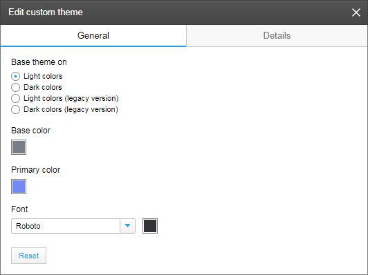
Edit Custom Theme dialog
In the General tab, you first specify on which predefined theme to base your custom theme, the theme with Light colors or the theme with Dark colors. (If you want older analyses to keep their schemes, make sure the legacy version is selected.)
You use Base color to define the color of label texts, and the general background color in panels and the page navigation area. The Primary color defines the color of details like filter sliders or active page indication.
The Font selector includes a list of preferred fonts, which can be defined by the Spotfire administrator, to help ensuring that an analysis will look the same for everybody that uses the analysis, including those who are viewing the analysis with web clients.
Note: If you use a font that is not available on the Web Player or Automation Services service host, other users might not get the same experience when looking at the analysis as you do. Fonts might be replaced with other fonts. This is particularly important if the node manager for the service is installed on a Linux host, because the fonts on Linux often differ from Windows fonts. If you want to use a specific font that is currently not included in the Preferred fonts section, you might want to discuss with an administrator whether the font can be installed on the node manager host and added as a PreferredFonts preference.
In the different sections of the Details tab below, visual attributes can be set for specific parts of the user interface. For more information about the different parts, see Custom Themes Overview.
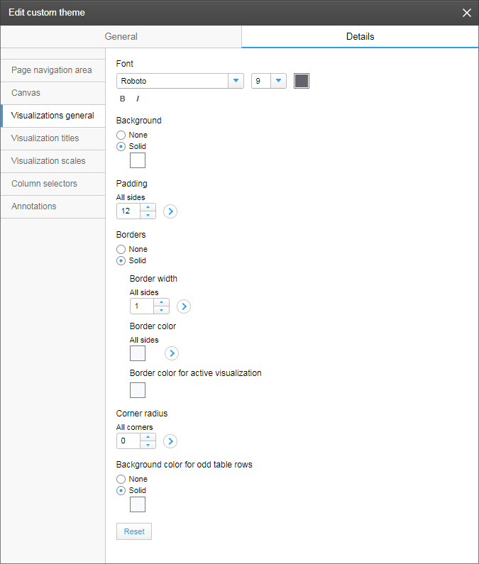
The image above shows one of the sections, Visualizations general. From this section, detailed settings applied to visualizations in general can be made. For example, you can give the visualizations a background color (this also affects the page navigation area colors), set the padding, that is, change the distance between the actual content and the visualization border, and customize the appearance of the border, or even remove borders. Note that clicking the arrows offers options to apply a setting on certain sides or corners.
The other sections in the Details tab are described below:
In the Page navigation area section, you define the appearance of the page title text and the color to use for indicating the currently active page tab.
In the Canvas section, you can change the color of the background on top of which the visualizations are placed. This is also where you specify the distances between the visualizations, and the distances between visualizations and the surrounding panels (Padding).
In the Visualization titles section, you define the title bar position and appearance as well as the title text appearance and its position within the bar.
In the Visualization scales section, you define whether or not to show scale lines and tick marks. If shown, their colors can be set.
In the Column selectors section, you control the appearance of the column selector texts.
In the Annotations section, you control the appearance of added annotations.