
You can trellis a map chart like any other visualization, that is, you can split it into individual panels that display parts of the data. The parts are defined by the categories available in a column or hierarchy. However, the map chart is slightly different from other visualizations, because the data might be available in several map layers, and you can trellis one layer, or multiple layers.
When there is a need to trellis multiple layers, the data in the layers is typically retrieved from different data tables, but a single data table might also contain data that is displayed in different layers.
Trellising is handled in Map Chart Properties, on the Trellis page.
Main trellis layer
In the Main trellis layer drop-down list, you select which map layer that should control the trellising of the map chart. When you have selected the main trellis layer, you specify which categories to split the data by, and how the panels should be arranged.
Additional trellis layers
There might be several map layers within the map chart that could be trellised. The layers, which can be adapted to the trellis settings used for the Main trellis layer, are listed below Additional trellis layers. To trellis any of these layers, select their check boxes. Trellis layers using different data tables are synchronized through column matching.
Example of trellising more than one map layer
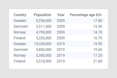
In this example, a single data table is used. The data table shows the population for some Nordic countries, and the percentage of the population aged 65 or over, in 2009 and 2019,
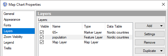
In addition to the background Map Layer in the map chart, the following layers are added in the Map Chart Properties, on the Layers page:
A Marker layer, named 65+, where the color and size of the markers represent the data column 'Percentage age 65+'.
A Feature layer, named population, where the color of the countries represent the data column 'Population'.
On the Trellis page in the Map Chart Properties, the 65+ layer is defined as the Main trellis layer, and the data in this layer is split per 'Year':
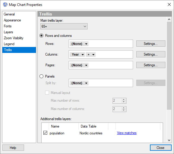
To also trellis the population layer by Year, its check box is selected below Additional trellis layers as shown above. The colors of the countries will now indicate the differences in the populations of 2009 and 2019 (the difference in colors is most noticable if you compare the two darker red colors for Sweden) .
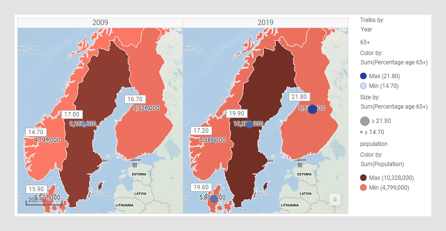
Note: If you trellis only by the 65+ layer, and do not trellis by the population layer, the colors of the countries in the 2009 panel will be identical to the colors of the countries in the 2019 panel. This is because the trellis settings would affect only the 65+ layer, while the population data would be rendered identically in both the panels (smeared data).
Note: Trellising multiple layers by Subsets is not supported.