Scatter plots are used to plot data points on a horizontal and a vertical axis in the attempt to show how much one variable is affected by another. Each row in the data table is represented by a marker whose position depends on its values in the columns set on the X and Y axes.
A third variable can be set to correspond to the color or size of the markers, thus adding yet another dimension to the plot.
The relationship between two variables is called their correlation. If the markers are close to making a straight line in the scatter plot, the two variables have a high correlation. If the markers are equally distributed in the scatter plot, the correlation is low, or zero. However, even though a correlation may seem to be present, this might not always be the case. Both variables could be related to some third variable, thus explaining their variation, or, pure coincidence might cause an apparent correlation.
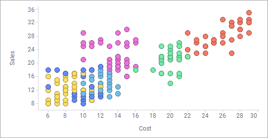
In the scatter plot example below, sales is plotted against cost for a number of different products (colored by product). It shows a low positive correlation.
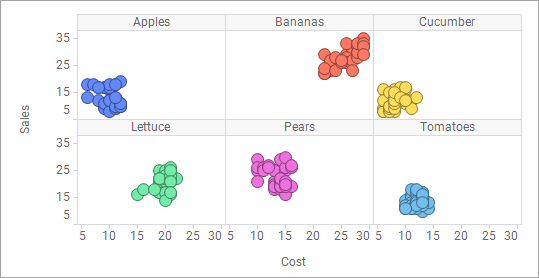
Each product can be shown separately using trellising:
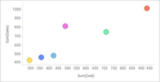
The scatter plot can also be used together with aggregation (for example, Sum or Average) by using the setting Marker By. In this case, the values for a certain category are bundled together to display a single marker for each category. The aggregated markers can also be sized by the count of items within each category, or by any other column.
Marker by
The markers now show the Sum of Sales for each product, as you can see on the axis selector for the Y-axis.
Dual scales or multiple scales can be used on the Y-axis, when you want to compare several markers with significantly different value ranges.
Labels
Labels can be used in visualizations to identify and describe markers and the data associated with them. In the scatter plot below, labels show which category each of the marked markers belongs to.
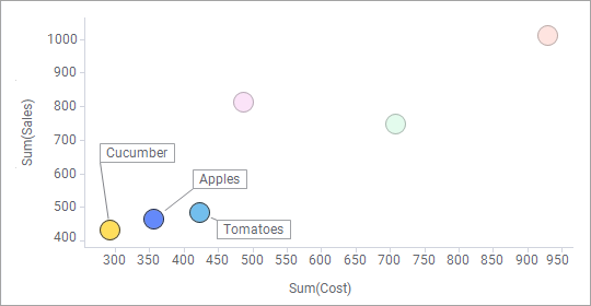
In a scatter plot, you can interact with the labels and move them using drag-and-drop operations. Click on a label to mark the corresponding marker, and mouseover a label to highlight both the label and the marker. If you move a label, it will stay in the new position until you reset the label positions from the right-click menu in the visualization. If you select to show labels for all markers, the labels will be visible for all markers at all times. You can also select to show labels for marked markers only. Labels will then appear every time you mark one or many markers. To add labels and/or change label settings, open the Labels page of the Scatter Plot Properties dialog.
Shapes
You can change the shapes of the markers to add another dimension to the visualization, or to get a view that better suits your data. For example, you can have the marker shapes correspond to the different values in a column, or display the markers as pie charts. Another option is to use tiled markers. This means that all the markers will have the same size, and be displayed in a grid-like layout as seen in the example below.
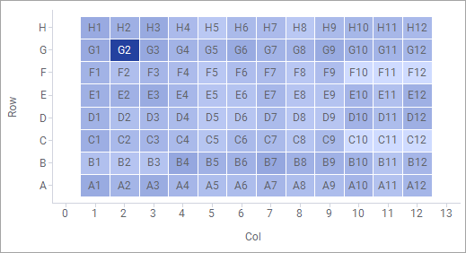
This example shows the results of an experiment conducted on an assay plate consisting of 96 wells. Each marker in the scatter plot represents a well on the assay plate, and the markers’ colors represent the results of the experiment for each of the wells on the plate. Using this setup to copy the actual layout of the assay plate is a way to enhance the readability of the data. It becomes easy to notice that the well represented by the marker G2 stands out compared to the other wells. Labels are always centered and displayed directly on tiled markers. Therefore, they cannot be moved around as is otherwise possible in a scatter plot.
Density plot
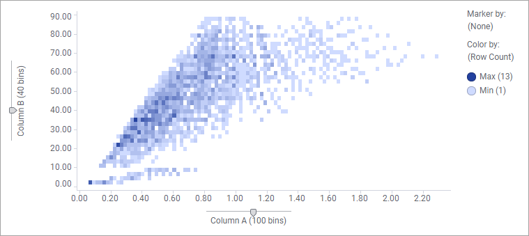
The density plot is a special case of the scatter plot. It shows how numerical data, binned into intervals, is distributed across the X-axis and the Y-axis. The markers that represent the binned values are shaped as tiled markers. The density, that is, to which extent the markers overlap each other totally, is visualized by coloring the tiled markers differently.
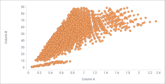
For example, in the
scatter plot below, it seems that many markers overlap each other totally.
By binning the numerical data on the X-axis and the Y-axis, setting Marker by to (None), and letting colors reflect how many data rows the tiled markers represent, you get the scatter plot below that indicates the density.
Note: Because the density plot is created from a scatter plot visualization, it is not represented in the Visualization types flyout. However, if you select two numerical columns in the Data in analysis flyout, a pre-configured density plot is one of the visualizations that is recommended to you. Then you can simply create it by dragging it to the visualization canvas. If you want to create from scratch, see To create a density plot.
Note: If you use tiled markers, and the axes’ scales have a large number of values, then the markers may become too small to be seen. The reason for this is that the grid layout makes it necessary for each value on the scales to have a unique position, even if no marker is located at each of these allocated positions. Therefore, with a large number of values on the scale, the markers must become very small to fit in the grid.
All visualizations can be set up to show data limited by one or more markings in other visualizations only (details visualizations). Scatter plots can also be limited by one or more filterings. Another alternative is to set up a scatter plot without any filtering at all. See Limiting What is Shown in Visualizations for more information.