As explained in the Hierarchies topic, data can be organized hierarchically by adding more than one column to the column selectors on an axis. Instead of adding multiple columns on the axis, you can structure the data hierarchically by adding a fixed hierarchy. In a fixed hierarchy, the columns, and their relative positions, are already defined. Typically, product categories and the products therein, or geographical data like continent/country/city, etc., are suitable for structuring using fixed hierarchies.
Besides, a fixed hierarchy is associated with a hierarchy filter, which consists of an expandable tree view where the categories at the different levels are represented by check boxes. To set up a fixed hierarchy, see Creating a Fixed Hierarchy.
Using a fixed hierarchy on an axis will display a hierarchy slider that makes it possible to easily switch between the levels in the hierarchy.
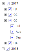
Example of the Hierarchy Slider
Suppose you have a fixed hierarchy called Date of Sale with the following hierarchy filter. The hierarchy contains Year/Quarter/Month.
Drag this hierarchy from the Data in Analysis flyout or the Filters panel to the axis selector of the category axis of a bar chart. This is the result:
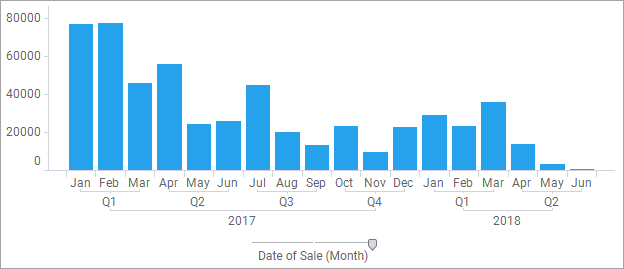
The labels underneath the bar chart state which bars represent the sales for each separate month, but they also show which months are part of a quarter, and which quarters are part of a certain year.
You will note that there is only one axis selector, unlike in the example where many columns are used on the axes to build a hierarchy. You will also note that there is a slider on top of the axis selector. A slider will appear for all fixed hierarchies. Using this hierarchy slider, you can change the level of detail of the visualization. If you drag the handle of the hierarchy slider one step to the left, this is what would happen to the bar chart:
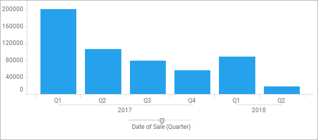
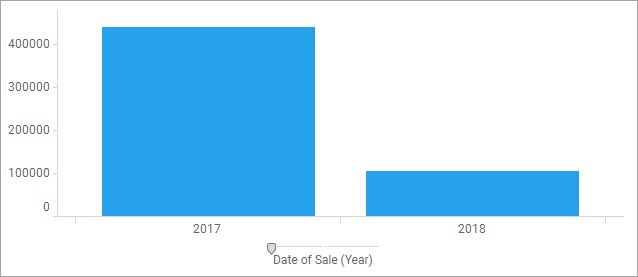
The bars are now automatically updated to show the total sales for each quarter, instead of for each month. Dragging the handle yet another step would update the bar chart to show the total sales for each year.
Time Hierarchies
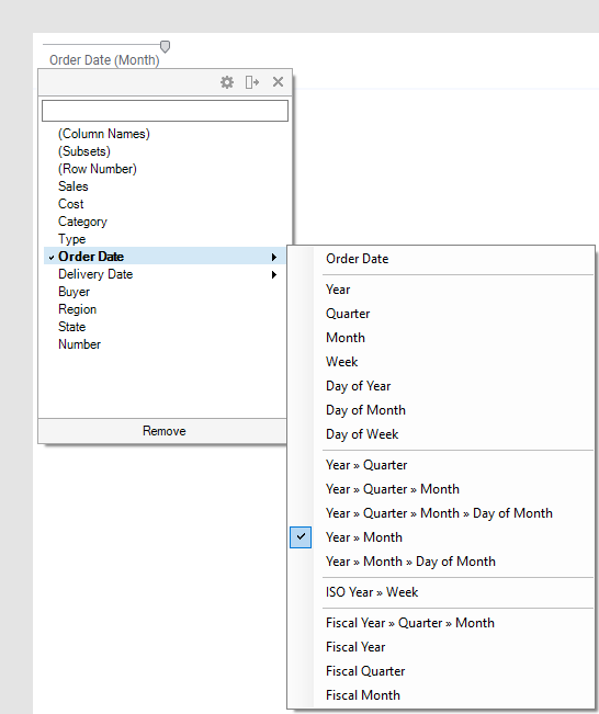
When you are working with time-series data (Date, Time, DateTime or TimeSpan columns), you can set up a hierarchical structure directly from the column selector. You simply select the time-series column in the column selector menu, and in the menu that opens, select the hierarchical structure of your choice. The hierarchy slider, allowing you to quickly change the time resolution, will be shown immediately.
See Working with Time Hierarchies for more details about how time-series data can be handled.
Note: If you instead
select a single time part you will not have the hierarchy slider available
in the visualization and the only time part available will be the one
you selected: