Creating a 100% stacked bar chart
In a 100% stacked bar chart, the bars are split into colored bar segments placed on top of each other. Each bar height is 100%, and the colored bar segments represent the components' relative contributions to the total bar.
About this task
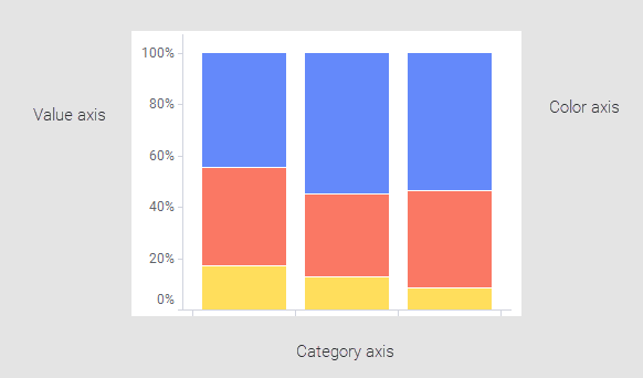
In the common stacked bar chart, described in Creating a stacked bar chart, the absolute values of the components make up the bars, which result in different bar heights. The 100% stacked bar chart differs from the common stacked bar chart by expressing the values of the components as percentages of the entire bar as shown above. This way the differences between the components are more put on view; not the actual values.
Before you begin
Procedure
-
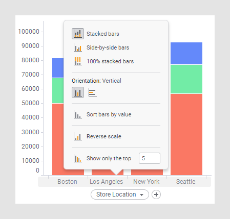
Click the highlighted area to access a pop-up menu.
Example
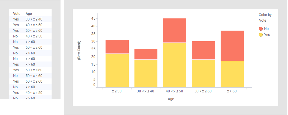
Those taking part in a survey answered Yes or No to a question. Because there was an interest in examining any differences by cause of age, they were placed in age groups. How many answered Yes and No, respectively, is shown in the stacked bar chart split per age group.
Changing the bar chart to a 100% stacked bar chart shows the Yes and No components' relative contributions to each bar.
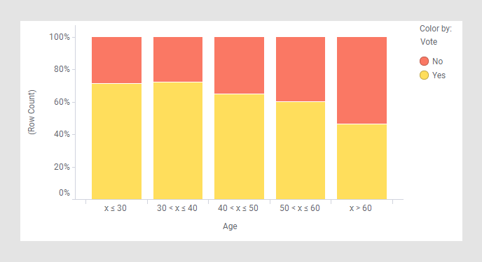
The trend seems to be that the older participants, the more they answered No.