K-Means Predictor - MADlib
The K-Means predictor (MADlib) operator output is simply the assignment of the input data members to the k number of clusters, the centroids already predetermined by the K-Means (MADlib) operator.

Information at a Glance
|
Parameter |
Description |
|---|---|
| Category | Predict |
| Data source type | DB |
| Send output to other operators | Yes |
| Data processing tool | n/a |
Unlike the Regression or Decision Tree/CART operators, the k-means predictor does not provide a final answer or prediction. Rather, it provides an overall understanding of the inherent structure of the data set the modeler is analyzing. This might be very helpful for understanding the inherent demographic groupings of a consumer data set.
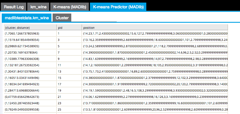
The first results tab in the following image shows the (cluster, distance) cluster assigned to each point and the distance between the point and the cluster centroid, the pid or point ID, and the position of the point itself.
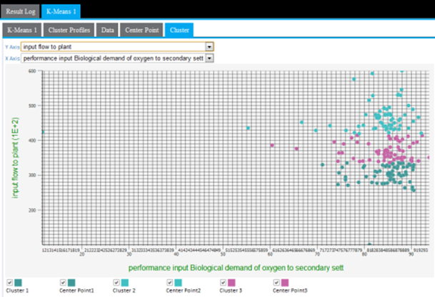
The Cluster results tab displays a cluster graph, which is a visualization of each cluster's member values based on two of the variable dimensions used for the k-means analysis.
Input
Configuration
| Parameter | Description |
|---|---|
| Notes | Notes or helpful information about this operator's parameter settings. When you enter content in the Notes field, a yellow asterisk appears on the operator. |
| MADLib Schema Name |
The schema where MADlib is installed in the database. MADlib must be installed in the same database as the input data set. If a madlib schema exists in the database, this parameter defaults to madlib |
| Points Column | The
Points column in the input data set contains the array of attributes for each point.
This parameter must be an array type. |
| Distance Function | Calculates the difference between the cluster member's values from the cluster's centroid (mean) value. The distance can be calculated in the following different ways:
Cosine - Measures the cosine of the angle between two vectors. For
n dimensional vectors
Euclidean - The square root of the sum of the squares of distances along each attribute axes. For
n dimensional vectors
Manhattan - The Manhattan, or taxicab, metric measures the distance between two points when traveling parallel to the axes. For
n dimensional vectors
Squared Euclidean (the default) - The default method for calculating the straight line distance between two points. It is the sum of the squares of distances along each attribute axes. For
n dimensional vectors
Tanimoto - Measures dissimilarity between sample sets. It is complementary to the Jaccard coefficient and is obtained by subtracting the Jaccard coefficient from 1, or, equivalently, by dividing the difference of the sizes of the union and the intersection of two sets by the size of the union. As with Dice similarity, 0-1 vectors are used to represent sets. Then the Jaccard Similarity of sets A and B represented by set-vectors
User defined - Specified by the user. See User-Defined Distance |
| User-Defined Distance | If, for
Distance Function, you specify
User-defined, provide the function.
The modeler might try to start with the default Squared Euclidean method, then experiment with the various other calculation methods to determine whether the cluster results seem more intuitive or provide more business insight. |
| Output Schema | The schema for the output table or view. |
| Output Table | Specify the table path and name where the output of the results is generated. By default, this is a unique table name based on your user ID, workflow ID, and operator. |
| Drop If Exists | Specifies whether to overwrite an existing table.
|
 and
and
 , it is calculated using the dot product formula as:


 and
and
 is given by:
Output
The output can only be displayed in two dimensions at a time. Therefore, the modeler must review all the possible clustering diagrams in order to get an overall assessment of which attribute dimensions have the greatest influence on the clustering.
Cluster graphing can be toggled on and off per cluster. Therefore, the graph can be viewed showing one cluster at a time, which helps understand just the spread of members per cluster and visually see their distance from their center, as in the following example only showing cluster3 results.
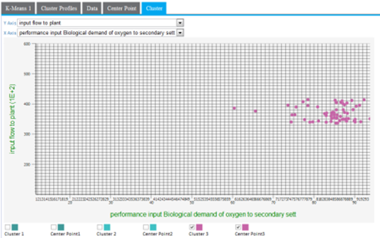
A lot of cluster overlap for two variables might indicate that they are not as significant in the cluster analysis, or that there is not much variation of the overall population for those particular variables. The following example shows a more intermingled cluster visualization when the y-axis dimension is changed from input flow to plant to output pH.
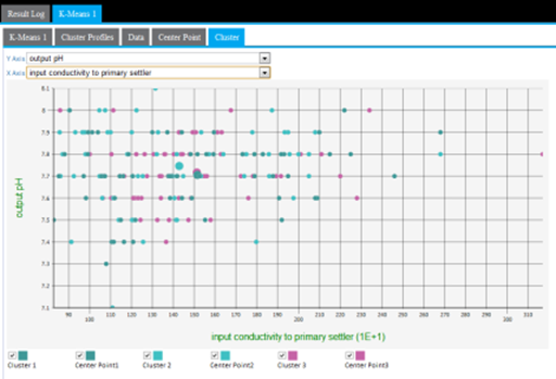
Another cause of cluster overlap might be that the variable values were not appropriately normalized before the analysis was run. For example, when minimizing the distance in the cluster, a difference in pH of "7" is not as significant as the difference in input flow to plants value of "10,000."